2023-11-16 update: since release 3.8, which happened yesterday on my tablet, straight lines are now available as a new feature!
I recently acquired a second-hand e-ink tablet. The reMarkable2 comes with very little but specific features which optimize for efficient note-taking mainly, and for some sketching.
For the latter, the only assistance available is a few templates that afford guide lines, and the possibility to work with layers. In both cases the handling tools consist of a couple of erasers and a selection tool which lets you resize, rotate, copy and paste (except for what you typed as text, it only works for what you put on “paper” with the “pen”). No warping, no inversion, no tool to create any common shape or make a straight line.
Yet it knows of straight lines because when you use the highlighter on a PDF or EPUB file, it can “snap to text” and your highlighter strokes are transformed into straight lines.
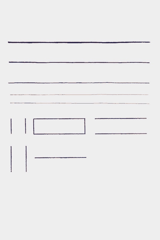
I don’t know how others manage, when they prefer not to “jailbreak” (for lack of a better term) their tablet, but I don’t care whether I can display a custom image while my tablet is sleeping, but I do care about straight lines and shapes that are scalable. So I drew some and made a PDF of the pages.
Note: the illustration pictures are post processed with a filter to give them a slight background that changes the colour (the eggplant colour should in fact be black, the red is in fact much more vivid.)
I made horizontal lines of varied thickness and length, a few vertical lines too, and a rectangle.
When I need a line, I navigate to this page in my templates folder, use the selection tool to copy it, navigate to my destination page, and tap the pen. Then I drag it where I want, stretch it or shrink it, rotate it if I need. And repeat as often as needed.
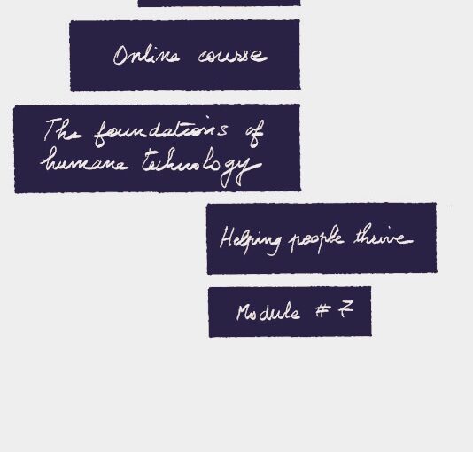
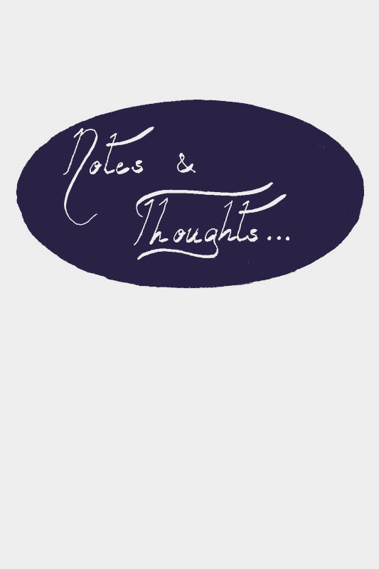
For this cover page label, I used one of the black oval shapes I hand-drew, copied it with the selection tool, navigated to my notebook page, pasted it, and gave it the size I wanted.
Then I added a new layer. I chose the calligraphy pen, thick size, and white ink and wrote. The layer protects the oval if you erase or select and move your words.
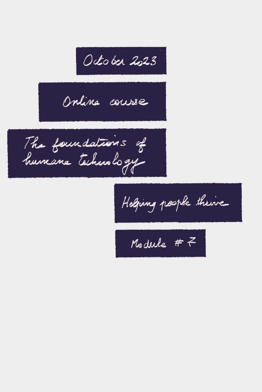
This is exactly the same instructions as the oval label, but selecting all the black boxes of various sizes and using the medium-sized calligraphy pen nib.
In this particular notebook, I used the same cover page for each of the modules. I duplicated the first one, moved it to the right place, selected the layer where I wrote and made changes.
This is page 14 of the PDF I made. I duplicated the whole page and moved it as cover page of a new notebook. I could have selected the shape, copied it, and pasted it elsewhere, but I wanted the circles at exactly the same place.
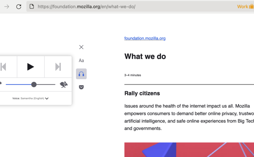
I ❤️ the Firefox feature called Reader View. I’ve been a fan for many years and I use it often. A lot of the time, I click the “listen” button, and I read while the text is being read to me.
BUT, if you leave the popin (clicking it a second time shelves it back) in order to use the pause/skip/speed buttons and slider while you read along, it blocks some of the text as the text automatically scrolls. See what I mean:
Because there’s a lot of empty space on the left side in reader view, I thought it should be possible to get the popup to be drawn over the empty space on the other side rather than overlapping the text.
I initially applied this:
** for the "reader view" popup to NOT overlap the text **/
.dropdown .dropdown-popup {
inset-inline-start: -260px !important;
}
Then, my colleague Bert Bos (who knows a thing or two about CSS because he co-invented it with Håkon Lie) advised me to use the below, for the toolbar to stay at the left margin, and as long as that margin is wider than the popup, it will not overlap the text.
/* Put the toolbar in the reader view as far left as possible. */
#toolbar.toolbar-container .toolbar.reader-toolbar {
margin-inline-start: 1px !important;
}
I’m much happier now; this is how it looks:
Add a user stylesheet
In the Firefox address bar, type 'about:profiles' and click the button “Show in Finder” (or similar if not on Mac OS) next to “Local Directory”
Open the “chrome” directory (or create it if it does not exist)
Edit the file 'userContent.css' (or create it if it does not exist)
Paste the custom snippet and save the file: /** Put the toolbar in the reader view as far left as possible. **/ .dropdown .dropdown-popup { inset-inline-start: -260px !important; }
In the Firefox address bar, type 'about:config' and set 'toolkit.legacyUserProfileCustomizations.stylesheets' to true
Open the menu Tools > Browser Tools > Web Developer Tools
Click the three-dot menu, and choose “Settings”. Under “Inspector”, check the “Show Browser Styles” checkbox
Restart Firefox
Enjoy!
Vote it up as an idea in Mozilla Connect
I put it on the Mozilla Idea Exchange and if you think this change should be the default, please vote it up!
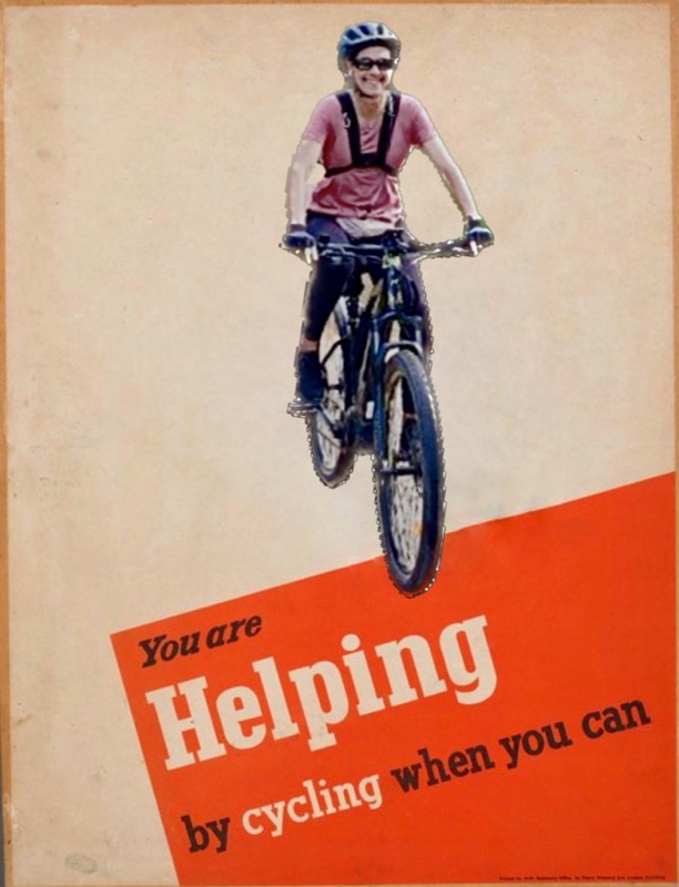
Even though today’s context is different from when the original poster was made, we still ought to save fuel, avoid carbon emissions, and generally exercise! 💪
I may use this as my avatar on some platforms maybe.
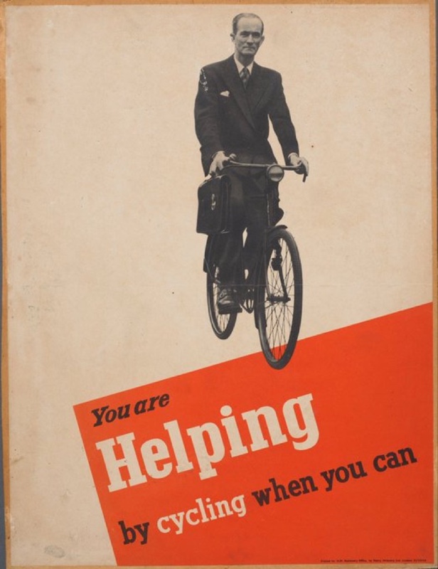
Original propaganda poster from the early 1940s
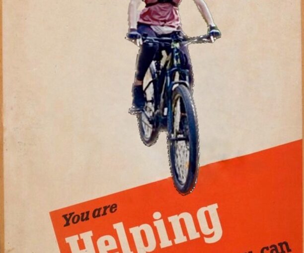
I used as background the poster ‘You are helping by cycling when you can’, printed in Britain in the early 1940s during the Second World War to remind people to conserve fuel resources which were rationed.
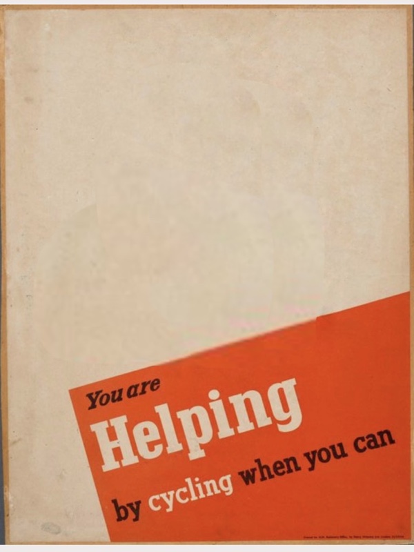
Look, I made a template!
Template poster ‘You are helping by cycling when you can’
I made the honorable black and white cyclist disappear, and share it here, so you can save it, in case you’d like to edit yourself IN and state you care about saving fuel, avoiding carbon emissions, or generally exercising! 💪
Make your own!
Here’s how I did it on iPhone with the built in Photos app, and Tayasui Sketches (I think you can get by with the free version).
In Photos:
choose the photo of you in your camera roll
long press yourself till you see the outline and the “copy|share” button appear
Tap “copy”
In Tayasui Sketches:
select “New drawing”
at the top, in the … menu, select “import” then select “Photos”
choose the template image I provided
… menu, “import”, choose “paste”
Adjust and 🎉 tada!
Show me the results?
If you’ve followed this tutorial of sort, share your version, please!
I joined the “Team iPhone” in November 2008, with an iPhone 3G. Yet photos I may have taken with it (it’s impossible to believe I didn’t) are lost; the first iPhone photos I have in my camera roll are from November 2011, using an iPhone 4.
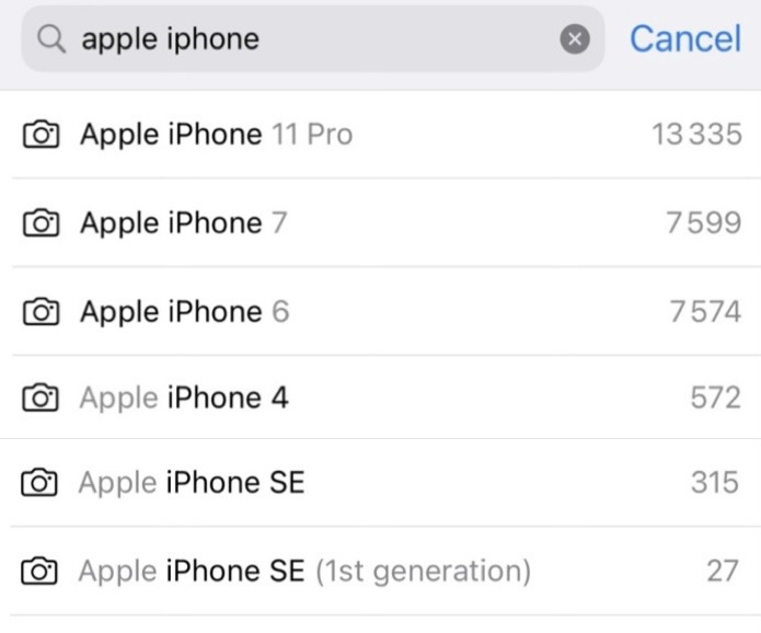
Screenshot of my camera roll counting photos taken with the various iPhones I have owned over time
Equipment: iPhone & thumbs
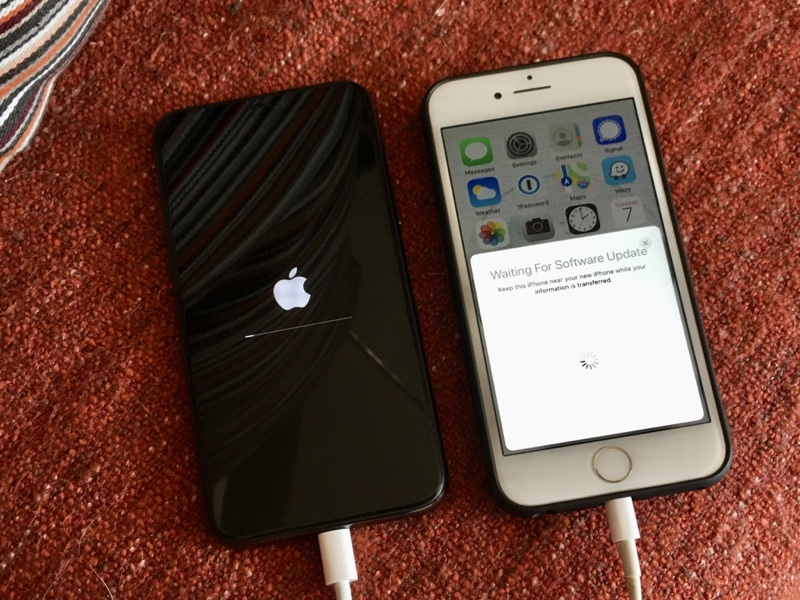
April 2020: iPhone 11 Pro being set up by being near my iPhone 7 (picture taken with my work phone, an iPhone SE)
I don’t remember if something was wrong with my previous iPhone or if I simply wanted the three-lens new one, but I saved money and bought it, certain I was going to like it. I LOVED it. This is me when I realised how good the photos were: 🤯🤗👌🤩
The iPhone 11 Pro, equipped with three lens, completely blew my mind, and continues to, still after three years. It’s not just the hardware, the software it comes with is really good! Lowlight conditions aren’t a problem. Macro isn’t very good though, but it’s not terrible either.
No wonder my picture count has exponentially increased! True, I no longer use my digital still camera. True, I started exercising that same year and being out and about creates many photo opportunities.
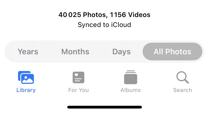
Screenshot from the Photos app with the total count of images (40025) and videos (1156)
Anyway. That’s it. That’s my current equipment: the iPhone and my thumbs.
Software (well yes, apps)
iOS Photos
The Photos app that comes with the iPhone is decent. It does two things: sorting and editing.
If the camera roll allowed custom tagging and if it exposed which albums you’ve put your images in, the Photos app would be PERFECT. Coming from Adobe Lightroom which raised cataloging to the level of art, using the camera roll is frustrating.
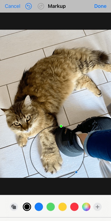
The editing features and results are very good. there’s even a “markup” feature that lets you do all kinds of interesting things to edit images, such as highlight things on them, draw in colours, add shapes or borders, etc. Note: markup turns off “live photo” so you need to do this last (or duplicate as still photo and markup the duplicate.)
Autumn 2023 update: iOS 17 botched “Markup” pretty good. The “magnifier” tool is gone (vote it up in the Apple forum). The rest of the tools are confusingly implemented. Boo hiss.
The “magnifier” feature via “markup”, when editing a photo
Note: All of the iPhone photos are post-processed whether you edit them yourself or not. So, if someone with a recent iPhone claims their photos are untouched, it’s a lie. They may not know it, but their iPhone does some initial work to make the photos stand out.
Snapseed
The perfect companion to the built-in iOS photo editor is Snapseed (also for Android), a free and ancient (I’ve been using it for more than 10 years) app which Google developed or bought (please, hold off any skepticism or contempt!), that looks like a mobile version of Adobe Lightroom, is versatile, rather easy to use, and extensively powerful. It just works.
I often use both iOS Photos and Snapseed, and go back and forth between the two, as part of my image editing flow.
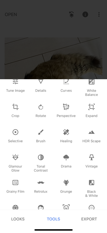
Screenshot of the tools drawer of Snapseed
Moldiv
Moldiv is an ancient, free app that I use when I need photo collages, of various ratios, not just squares. (Over the years it has expanded and does other things that I have not tried.)
Anecdotally, I used Moldiv to create the image at the top, based on three different screenshots (that’s why the search string used is displayed in bold in the Photos app search drop-down, and there are three different strings in bold in the composite image at the top of this post.)
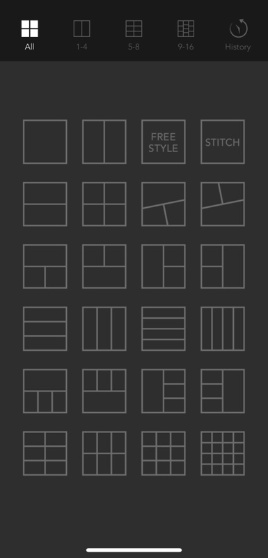
Screenshot of the pane to choose among many pages which shape to assemble images
iOS Shortcuts
I use a few shortcuts that are specific to Photos, mostly to resize images, but also to automatically resize and move the resulting image to an existing album. Here are three examples of how Shortcuts are part of my image editing process:
I have a Pixelfed album in my camera roll. For any new or old photo I wish to prepare to upload to Pixelfed, I select it after having edited it, and apply a shortcut (I created it myself, and a few others for similar use-cases) that resizes it down to 800 pixels on the longest edge, and moves the resulting image to my Pixelfed album. Then all I need to do is select it from that album when I am ready to post. The advantages are that I don’t fill up too quickly my Pixelfed account space (which is on someone else’s server), my original photos can remain in their original resolution on the camera roll, and there’s a specific album just for this account.
Another Shortcut that I love is “make gif” (“live photo” must be enabled in the camera settings for it to work): it stitches all the frames the iPhone records as part of the photo, into a three-second or so sequence which then loops.
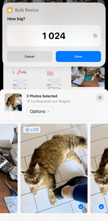
My last example is about a shortcut called “bulk resize” which compresses (pretty well) and resizes to your desired dimensions (on the longest edge). If like me you use iCloud, are OK to pay a couple coins every month for the 200GB plan, and have over 40,000 photos in your camera roll, you may want to bulk resize photos in order not to run out of cloud space. I resize everything except the photos of people, the photos where I want “live photo” to be kept, and photos of my drawings and paintings.
Two photos selected on which I’m applying “bulk resize“. An overlay rolls down with default size of 1024 that I could change before running it.
Editing routine
Sort (aka delete massively)
Keep only those photos that catch my eyes or have potential or perfectly render what I had wanted to capture or convey
Move to post-processing
Typical adjustments
Here are the most common and most useful elements of post-processing for me, in roughly that order (some actions are available only in Snapseed or are just way easier there):
Choose the best moment or frame in the few seconds that are recorded for each photos as part of the “live photo” feature (it needs to be enabled in the settings, and it’s a super wonderful feature!)
Straighten horizontally and/or vertically
Crop out anything that doesn’t belong or distract from the subject
Try the presets, sometimes they work really well, and you can choose how much of the effects you want.
[Snapseed] Adjust the white balance (the color picker is convenient)
Reduce highlights & increase shadows
Fiddle with the contrast maybe
Boost vibrancy most probably
Increase or diminish definition (globally or selectively)
[Snapseed] for portraits not taken using the portrait mode, try to apply some levels of “glamour glow” among the many presets
[Snapseed] Is grain desirable? (It’s way easier to add it than to remove it.)
Does monochrome work better?
Find the right balance between noise in dark parts and definition
[Snapseed] Selective tweaks to enhance some features of the image (for example darken areas so that other parts of the image are promoted, or lighten someone’s eyes just a bit, or remove the colour of some objects so that they become less visible.)
[Snapseed] Erase distractions (from red eyes to ugly lamp posts however small, or even people in the background, or objects, anything that is small enough if it’s part of the focus or not too obvious so that the “healing” is invisible.)