My image editing routine on desktop

I also covered my image editing routine on mobile.


Equipment

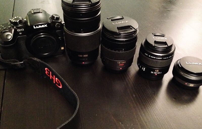
I used to carry a fabulous Panasonic DMC-GH3 digital camera (and before then there were six other cameras), along with several wonderful lenses (the ultra flat and very bright 20mm / F1.7, the super versatile 14-140mm / F4-5.8, the 100-300mm / F4-5.6 sniper lens for wild animals, and my beloved Leica Elmarit 45mm / F2.8 which is so perfect for portraits in low light, not just for macro.)

Black digital camera next to four lenses ordered by size on a dark wooden table
Panasonic Lumix DMC-GH3 camera and lenses: 100-300mm / F4-5.6, 14-140mm / F4-5.8, Leica Elmarit 45mm / F2.8, 20mm / F1.7

I also used to carry around my neck a usb GPS dongle whose recordings could somehow be reconciled with my RAW photos, and which allowed me to visualise my photographic tracks on a map, and to add geolocation data to my pictures, that I would then spend significant but enjoyable time post-processing and posting to Flickr.

Me, white woman, bending forward and smiling by the ocean in the sun. I wear sunglasses on my head and a lanyard around my neck.
The USB GPS dongle around my neck, tucked in my swimsuit top, photo of December 2015, Hawaii, USA

Hardware & software

To do that, I needed a computer on which I ran Adobe Lightroom, and a couple of external hard drives (one for storing my photos, my Lightroom catalogs; and another drive to back everything up.)

I also used the “Web” tab in Lightroom to export collections into a custom HTML template and generate index pages, medium and thumbnail versions of the photos into the appropriate folders that I would then copy to a third external hard drive (where my personal website content was saved) which I would then “rsync” to actually mirror everything on the website in production.

The last time I did all of that was a long time ago (in December 2014), but I have done it countless times and I remember lots of it; from the layout of Lightroom and sliding cursors, to my gestures along every step of the workflow.

Editing routine

  • Sort (aka delete massively)
  • Keep only those photos that catch my eye or have potential or perfectly render what I had wanted to capture or convey
  • Move to post-processing

Essential adjustments

Here are the most common and most useful elements of post-processing for me, in roughly that order:

  • Straighten horizontally and/or vertically
  • Crop out anything that doesn’t belong, or which distracts from the subject
  • Adjust the white balance
  • Reduce highlights & increase shadows
  • Fiddle with the contrast maybe
  • Boost vibrancy most probably
  • Increase or diminish definition (globally or selectively)
  • Is grain desirable?
  • Does monochrome work better?
  • Find the right balance between noise in dark parts and definition
  • Selective tweaks to enhance some features of the image (for example darken areas so that other parts of the image are promoted, or lighten someone’s eyes just a bit, or de-saturate the colour of some objects so that they become less visible.)
  • Erase distractions (from red eyes to ugly lamp posts however small, or even people in the background, or objects, anything that is small enough if it’s part of the focus or not too obvious so that the “healing” is invisible.)

What happened after December 2014?

I can not close this post and give way to the next one (about my image editing routine on mobile) without tying that loose end.

There is a number of reasons why I stopped carrying the photo gear I love so much and no longer sat at the computer to edit photos and post to flickr and my website. These are the main ones:

  • iPhone cameras and built-in photo software became really good for such small and portable devices, and really convenient.
  • Work was competing for time, after I was give more responsibilities.
  • My longtime relationship ended and I couldn’t bring myself to even get the damn pictures out of the SD card, let alone look at them and do anything with them.
  • Then, four months after I had resolved to pick it up again in 2017, the iMac I had lusted after for years and finally saved enough to purchase got stolen when my home was broken into.
  • Lightroom stopped being a software you own; Adobe moved to a subscription model and I was not willing to pay for software I use once every few years.

Pas d’entraide pour le Tenthrède

Aujourd’hui dans le blog beauté du jardin, je m’arrête sur le tenthrède et ses larves : la plaie des rosiers.
Le tenthrède est un insecte volant et silencieux, assez semblable à une mouche, en plus fin et un peu plus long, noir de tête, pattes, thorax, ailes, et jaune orangé d’abdomen :

Aux beaux jours il courtise les rosiers pour assurer sa descendance dont les larves sont friandes de feuilles de rosiers. On le trouve sur une feuille ou une tige, où il pond :
Gros plan sur un tenthrède accroché à une tige en train de pondre. Le long de la tige on voit de plus ou moins longs sillons foncés pour les œufs.
Les longs sillons foncés qui figurent sur la photo précédente abritent les œufs. Après un temps indéterminé, les larves deviennent rapidement de fausses chenilles à six pattes, vertes à points noirs et à têtes jaunes orangées :
Gros plan sous une branche de feuilles de rosier: trois fausses chenilles à six pattes, vertes à points noirs et à têtes jaunes orangées sont en train de manger les feuilles.
Les chenilles mesurent quelques millimètres pour les plus jeunes jusqu’à 2 cm, et dévorent les feuilles en ne laissant que les nervures :
Plan plus large de la branche de feuilles de rosier. Il ne reste plus de la feuille du bout que la nervure centrale.
On reconnaît assez bien une feuille parasitée, justement à son absence de … feuille ! En quelques jours, les larves boulottent toutes les feuilles d’une branche. Mais parfois c’est en remarquant une poussière marron, s’il y a une autre feuille sous la feuille infestée :

Je n’ai pas trouvé d’utilité à ce parasite, ni dans mes recherches sur le Web, ni en observant. Par contre, à l’observation, ce qui est clair c’est que ça enlaidit le rosier et le prive de ses “panneaux solaires”. Alors, pas de pitié pour les fausses chenilles, ni pour le tenthrède.
Raquette électrique pour saisir l’insecte en vol, coups de sécateur pour les larves, ou écrasement entre deux cailloux, choisissez votre élimination. Et revenez-y régulièrement, ça pullule ces bêtes-là.

Dragon to test {Brush|Pro}markers (alcoholic ink markers)

As an early Christmas treat I got myself a series of Brushmarkers and Promarkers in cold and warm greys, and in colors. The pens come with a blender.

Wooden storage box with a handle full of thick pens

In theory the blender helps blend colors together by wetting the surface of paper. In practice, colors will blend in any case (except with black) but will do so more smoothly on a reasonably wet layer of color. I have probably not mastered it as I find it’s more of a smudger than it is a blender, giving edges fuzziness, even on non-bleed paper.

To test the grey series I went for a dragon that adorned an Alfons Mucha poster of 1896 for the Lorenzaccio play:

Tall narrow rectangle filled with a green dragon that adorns an Alfons Mucha poster of 1896 for the Lorenzaccio play. The dragon has its mouth open and is surrounded by geometric motifs.

I sketched the outline:

Rough pencil sketch of the dragon within a tall and narrow rectangle

I marked the outline using Uni-ball pin pens (0.05, 0.1, 0.2 and 0.5 mm):

Black ink outline of various width

Black ink outline of various width now covering the entire sketch. Pencil erased.

Then I applied layers of grey. I had to use a white ink Posca pen to cover some overlapping black lines in the moustache. Here is the finished version:

Layers of grey ink of various intensity

⚠️I learned that the alcohol ink smears pencil lines and even the Uni-ball pin pens ink, so it’s better to go easy on the outline and add those or add finishing lines afterwards.


I got a silver and black Decopatch sheet that I applied with glue/varnish to the square wooden frame and tada! The frame is now on a shelf in the room of my little boy who loves dragons.

The finished piece: the dragon occupies the left half of a square white sheet of paper. The square frame is adorned with silver and black metallic paper.

In honour of World Usability (#WUD)


World Usability Day (#WUD), generally the second Thursday of November, aims at ensuring that services and products important to life are easier to access and simpler to use, and at celebrating and educating – celebrating the strides we have made in creating usable products and educating the masses about how usability impacts our daily lives. It is about making our world work better.

This year I attended with 40 or so others, FLUPA Nice The World Usability Day local meetup where Google’s Material Design was introduced, and a small workshop was held on visually designing wireframes.

I learned that 21% of the French population are in a situation of handicap (that is 23M people) and that 80% of handicaps are invisible. W3C was mentioned for its work on WCAG, but unfortunately not for its WAI tutorials or Developer tools.

Other useful snippets:

  • Digital accessibility is a vector of social integration.
  • My priority design principles include:
    • Visible elements
    • … including visible buttons using or or two words
    • Most important elements at the top
    • Similar types of information are grouped
    • Clear hierarchy of information
    • Consistency of UX throughout
    • Sufficient font size and colour contrast
    • 2 to 3 colours (that match, preferably although it’s a matter of taste)
    • 2 font types at most, maybe a third if used in a logotype
    • Short sentences
    • A little jargon as possible
    • Consistent usage of personal pronouns
  • Given that only a handful of frameworks appear to be used to create websites nowadays, people really need to be creative in order to stand out and be identifiable.