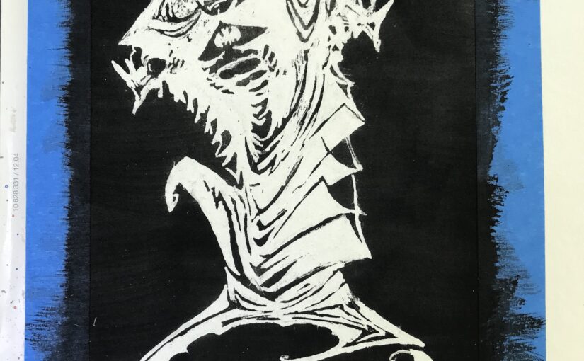
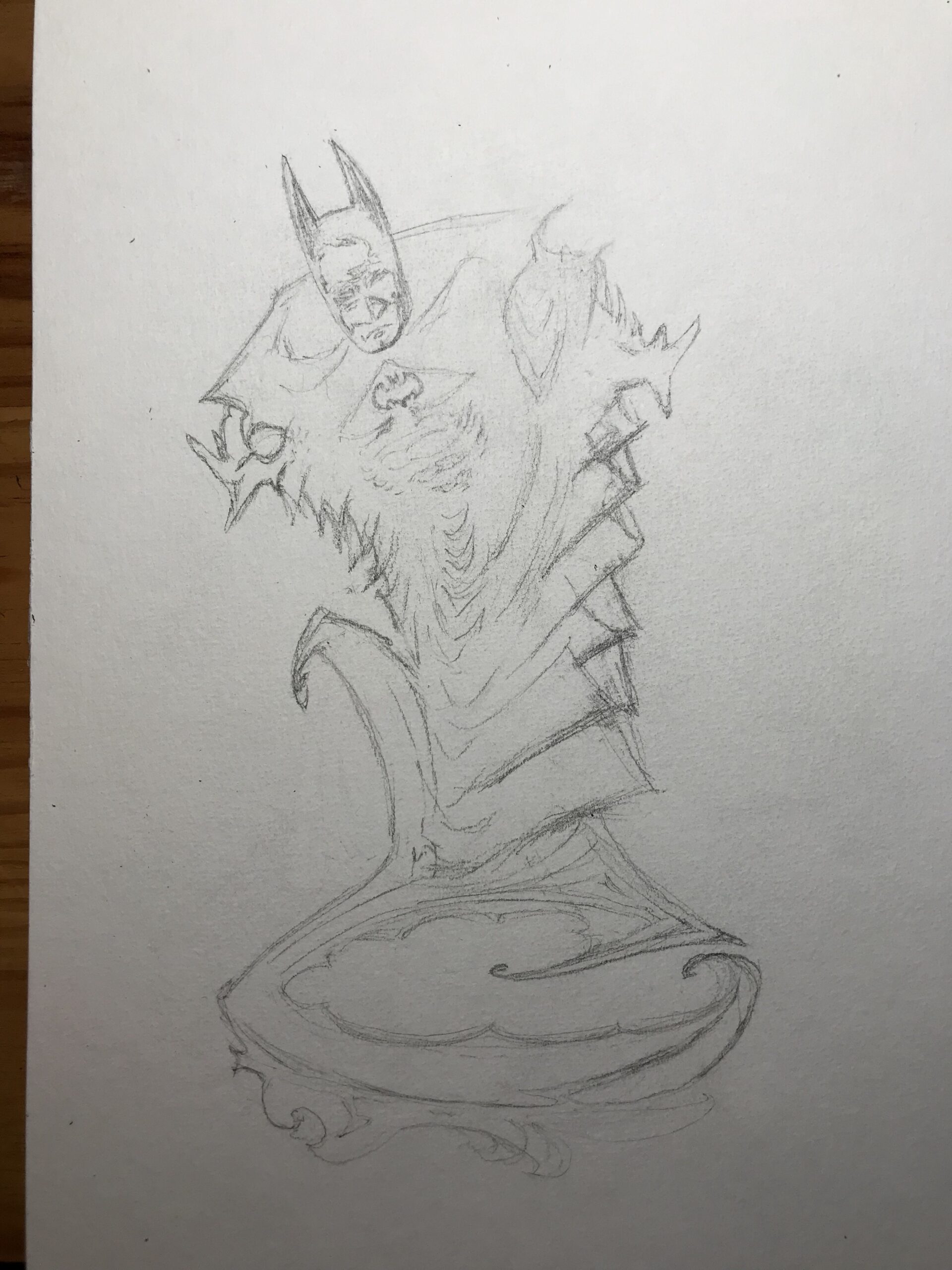
I wanted to paint a super hero as a present for my (first) godson’s 14 year-old birthday. He was going to get a real present, of course (grin). I went with a dark and pointy version of Batman by Kelley Jones, reminiscent of a genie out of a bottle.
I wanted to paint the black around him. I started with pencil sketching on a thick watercolor paper:
Then I used masking fluid. This time I did not add any water. It had been painstakingly long and tedious to peel it off the last time I tried this. And given the thin white lines I was aiming for, I didn’t use a brush, but … a toothpick. After a loooong time I was done and I framed the painting with masking tape:

I prepared a wash of lamp black and stroked with a synthetic and quite large flat brush. It was barely grey, so while the paper was still wet I added pure black, and another time , and another time. After the paper had dried, I peeled off the gum. It took me an hour. Tedious and painstaking again. I have no idea what I am doing wrong, and it’s possible the fluid I have is too old (I’ve had it for twenty years), or it’s my Hannemühle paper that isn’t right, but clearly this isn’t supposed to be so hard. Anyway, here goes the result:
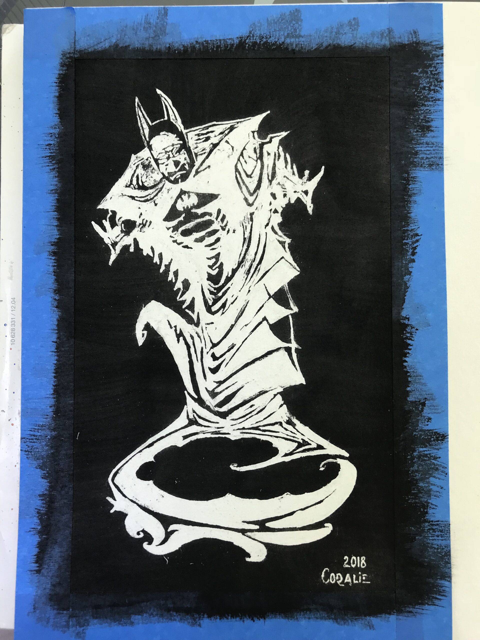
And here is the final result once fitted in its 20×30 cm frame:

Day: June 10, 2018
Art: Daisies
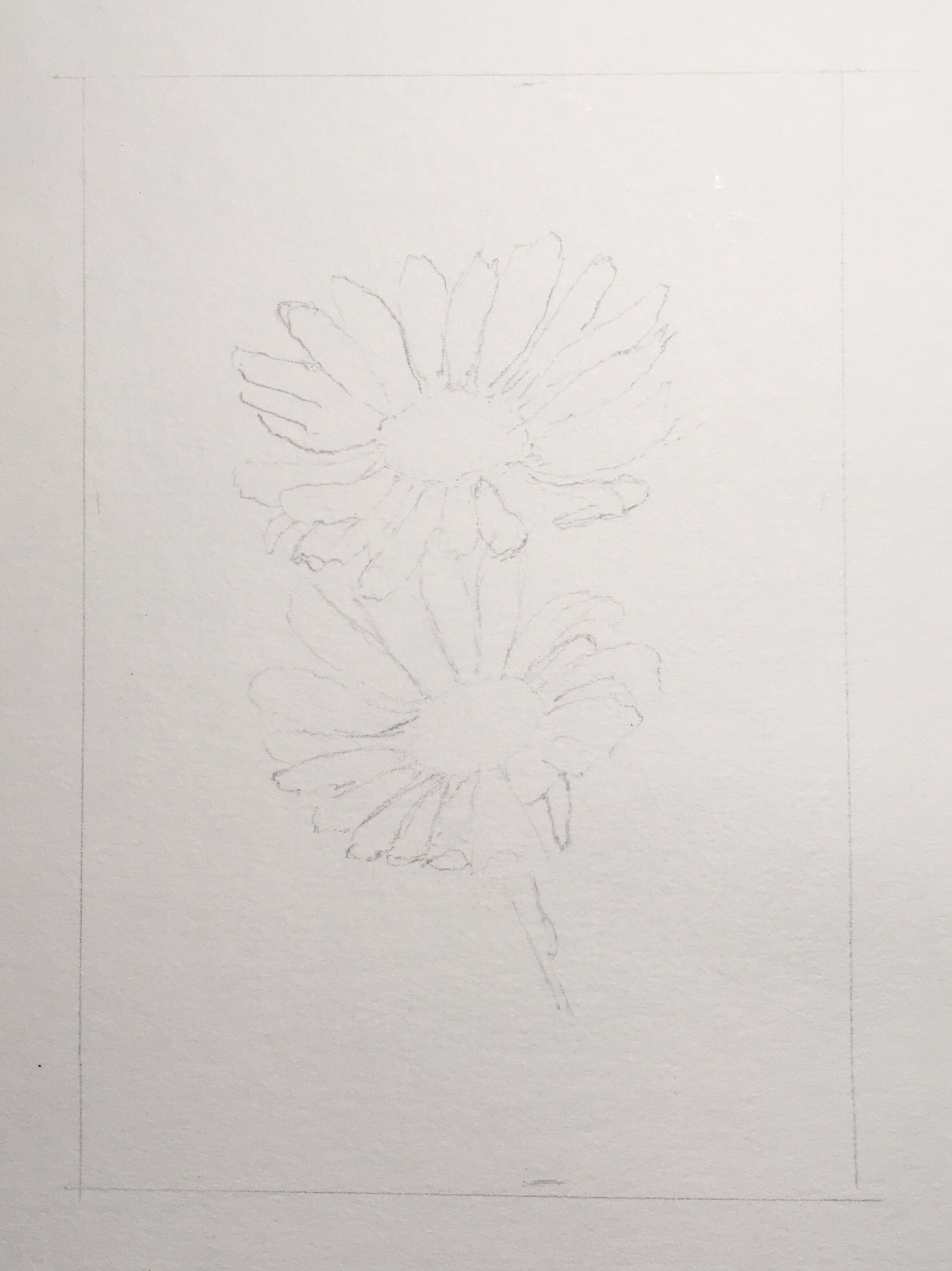
In trying to master how to use masking fluid, I painted daisies. Here’s the pencil sketch:
I poured masking fluid in a small container, added a bit of water and applied it on paper using an old brush:
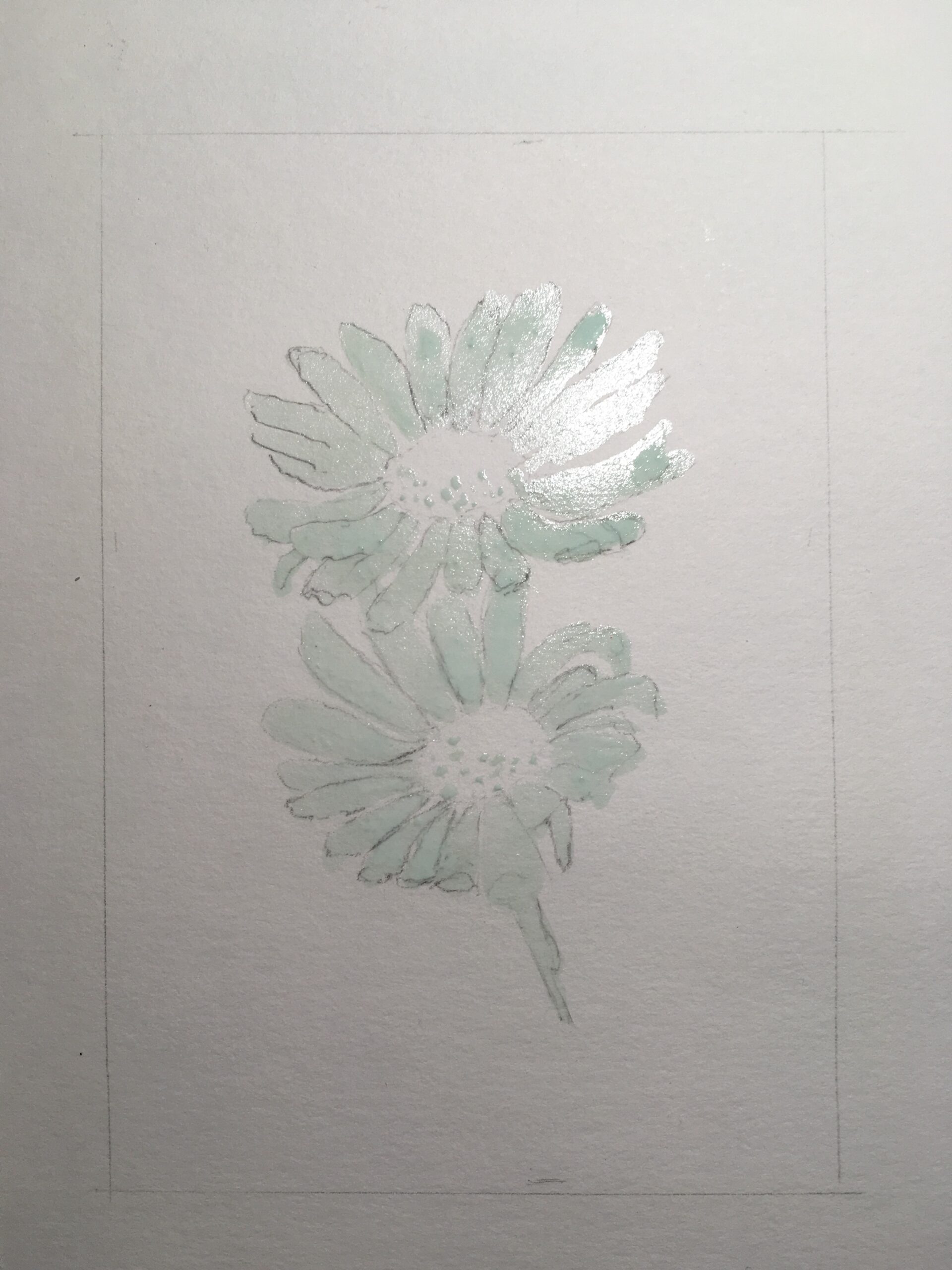
Once the fluid was dry, a used a wash of sap green and another of ultramarine, making sure to paint over the fluid but avoiding the center, so that areas between the petals that were not protected would be colored:
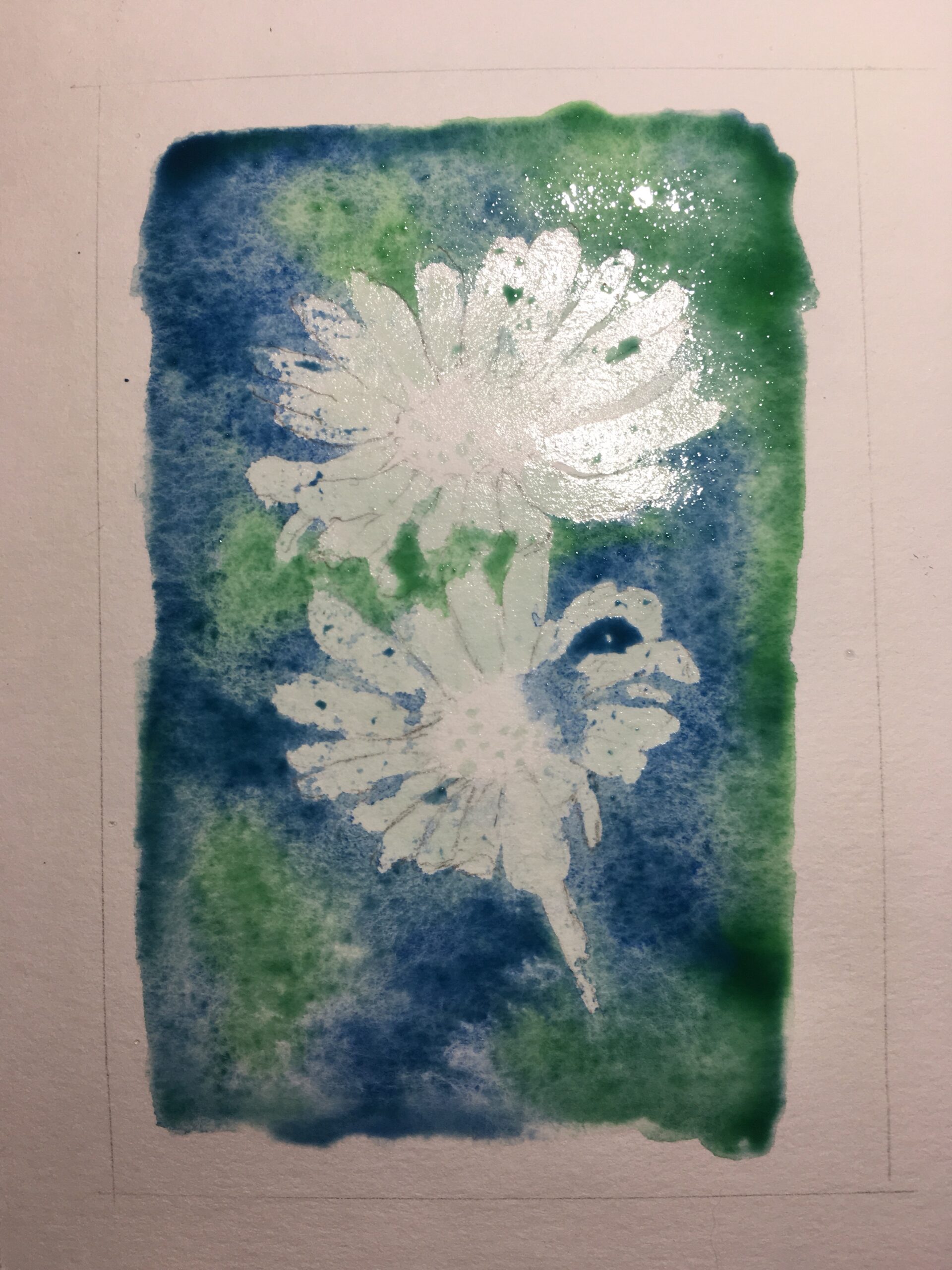
Once dried, I peel the fluid off the petals, leaving the dots at the center untouched. The dry fluid had turned into some rubber-like gum. Unfortunately, a fair amount of paper was torn in the process:

For the shadows on the petals I used light blue, thin violet, some of my ultramarine wash. I used yellow at the center:

To the yellow I added some burnt sienna and a bit of red, I painted the stem with two shades of green, and once the paper was dry, peeled off the remaining dots of gum at the center:

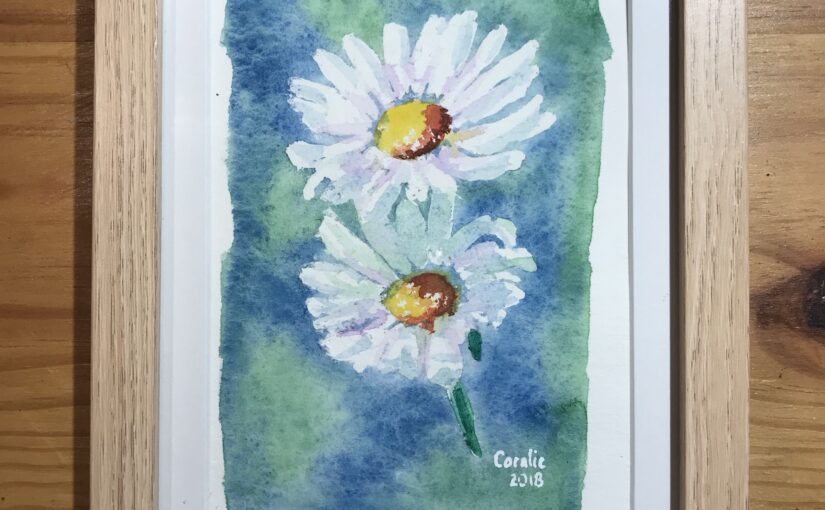
Here is the result (9×14 cm), framed (15×20.5 cm), and ready to be given to Caroline as a gift:

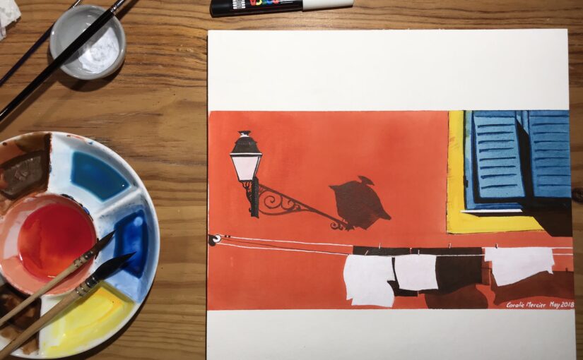
Vieux Nice (opus 2)
I complemented Vieux Nice (opus 1) with a particular scene I had in mind.
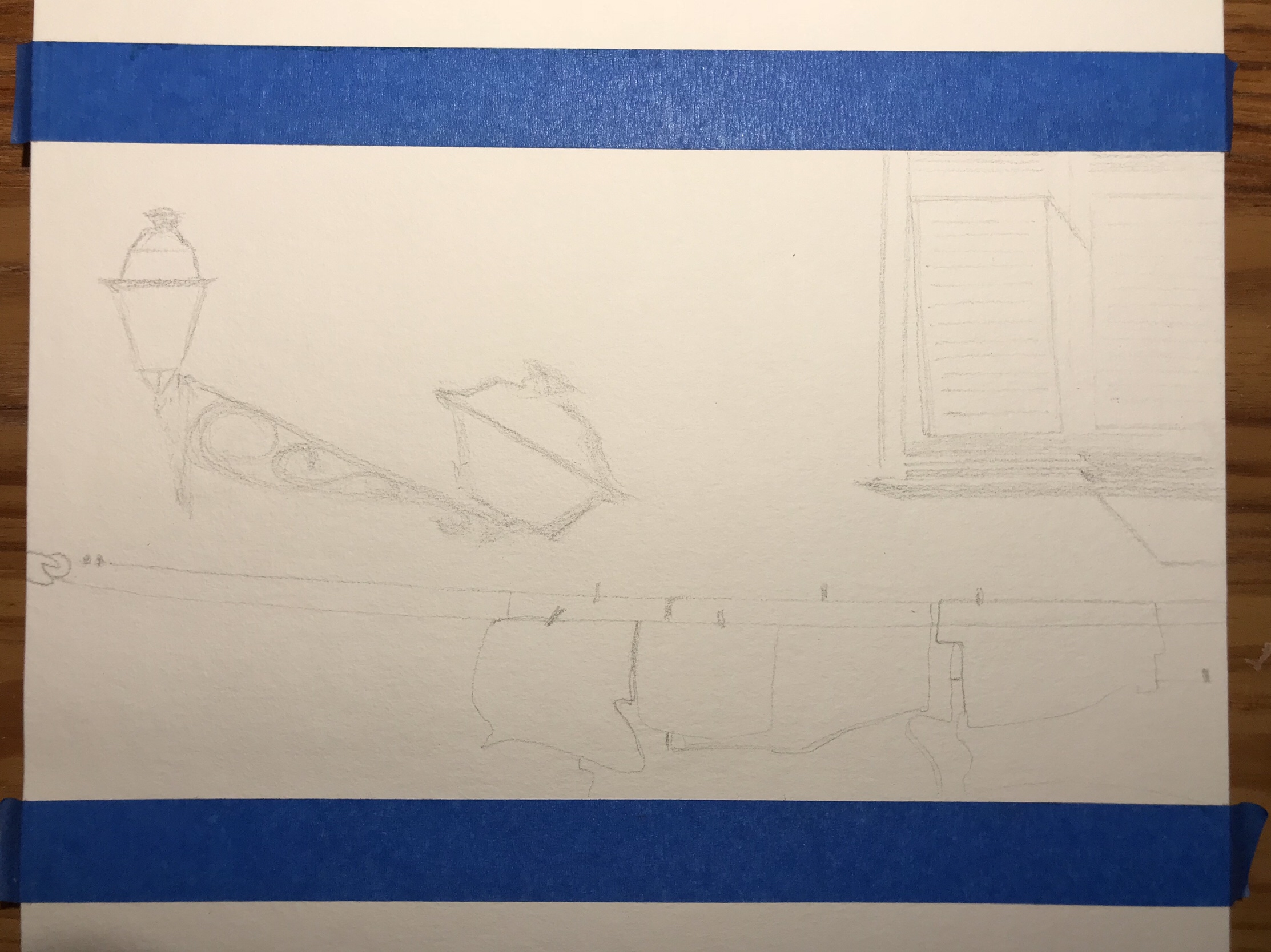
Pencil sketch on a thick watercolor pad, having delimited the same size as the opus 1 painting:
I mixed orange and crimson for the façade that I applied with a large synthetic brush, and wiped paint with less than more success where the lamp and some clothes needed to be white. I applied some yellow around the window:

For the window blinds I used a mix of turquoise and ultramarine:

While the light blue was drying, I worked with burnt sienna and black on the lamp, and then painted details on the blinds with ultramarine:

I used burnt sienna for the shadows, included that of the clothesline, and black for the clothes in the back and shadow of the window blinds. I added an extra layer of blue for shadows and contrast on the blinds and let that dry:

With more black I finished the shadows between the blinds, corrected the shape of the lamp and added details around it. Then I grabbed a white Posca pen and traced the clotheslines, added white to the top of the lamp, and marked the window sill. I then used white watercolor to paint the white clothes:

Having painted white the glass of the lamp, the painting was finished. Here is it, in a 40×30 cm frame, ready to be given to the same friend to whom I gave opus 1:

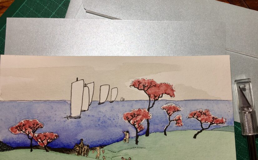
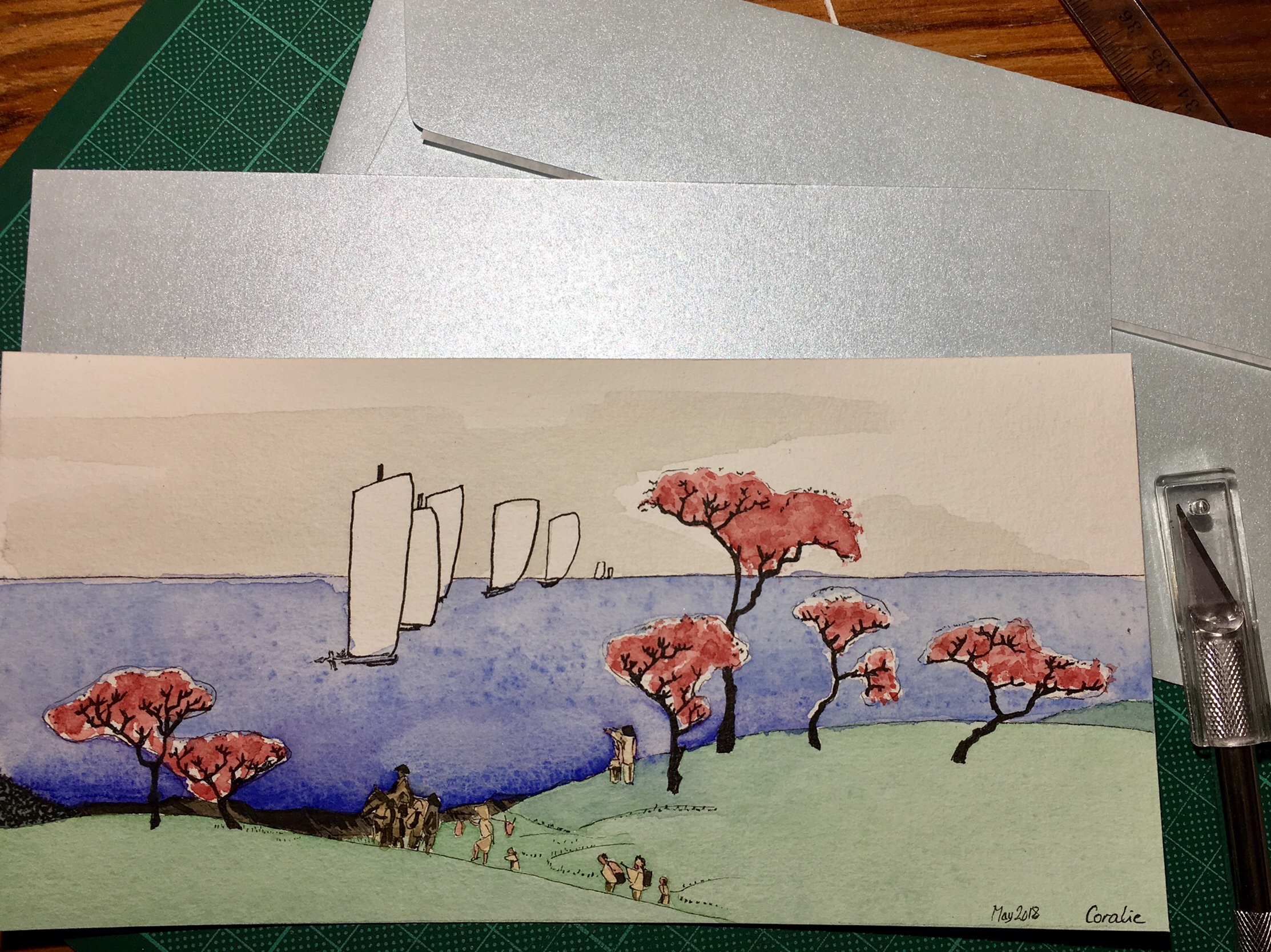
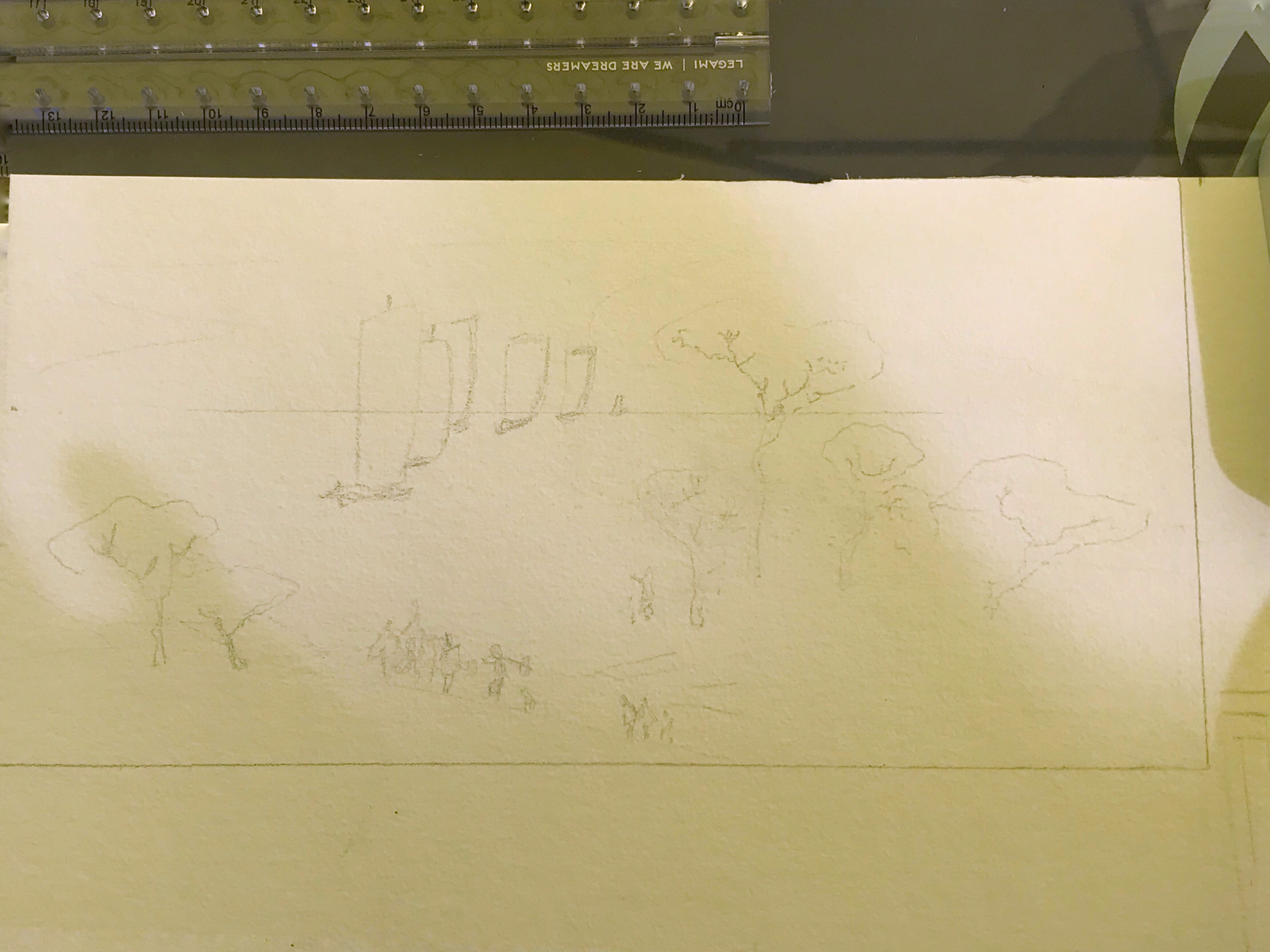
Hiroshige’s ‘Cherry trees at Goten-Yama’
This is Cherry Trees at Goten Hill, from the series Twelve Views of Edo, done around 1835 by Hiroshige:
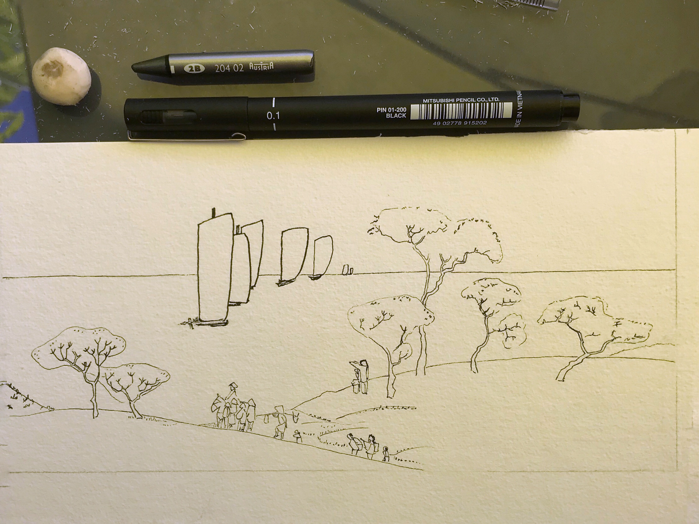
After sketching in pencil, I used a 0.05 mm and 0.2 mm (for the closest sailboats) Uni-ball pin pen to create the outline:
Then I used watercolor. Light grey for the sky, green for the grassy hill:
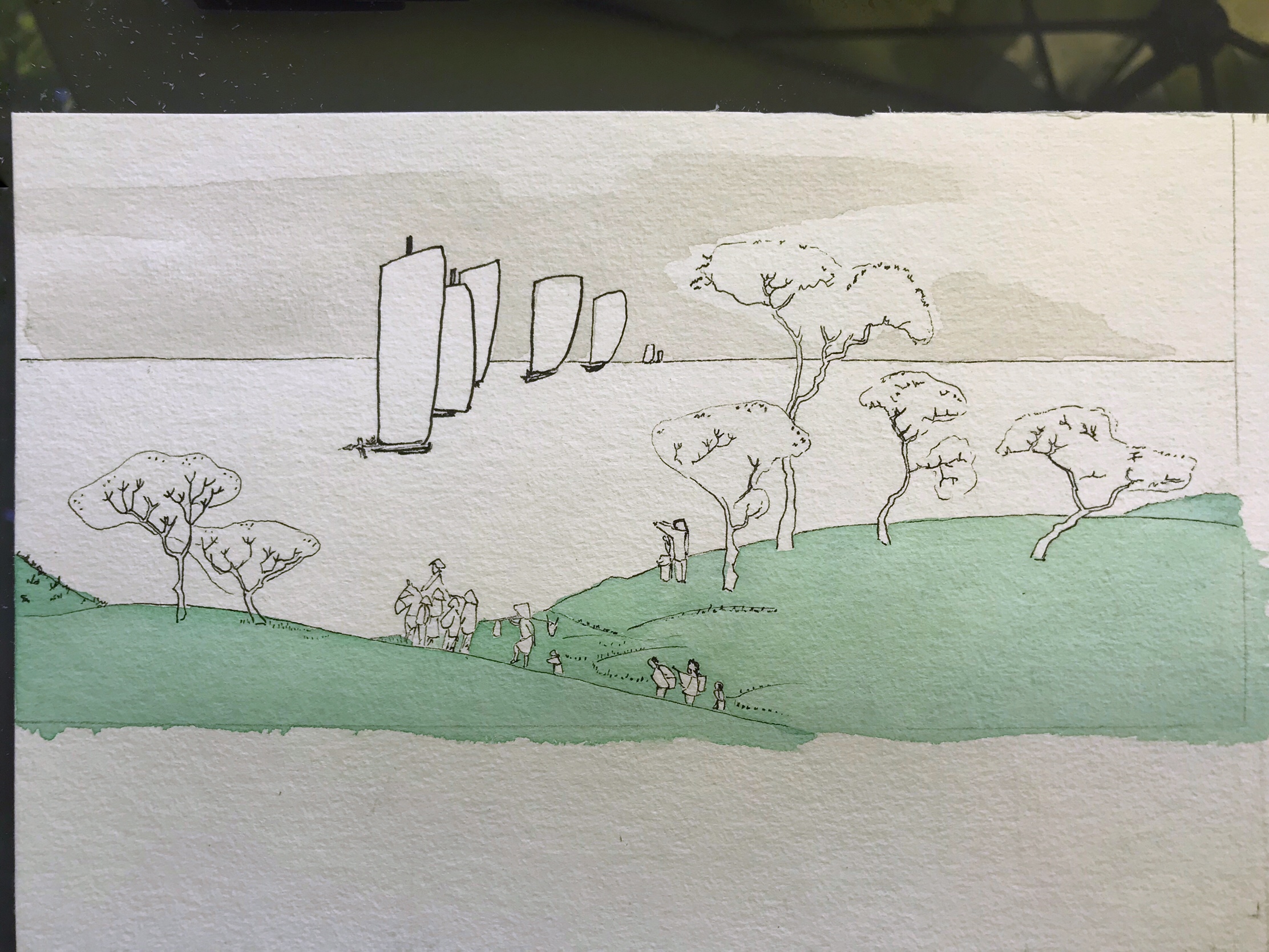
I added the roofs of wooden shacks right behind the hill, as I decided I wanted them. Then I continued painting, adding burnt sienna to my grey mix for the roofs, and using a wash of Prussian blue for the sea:
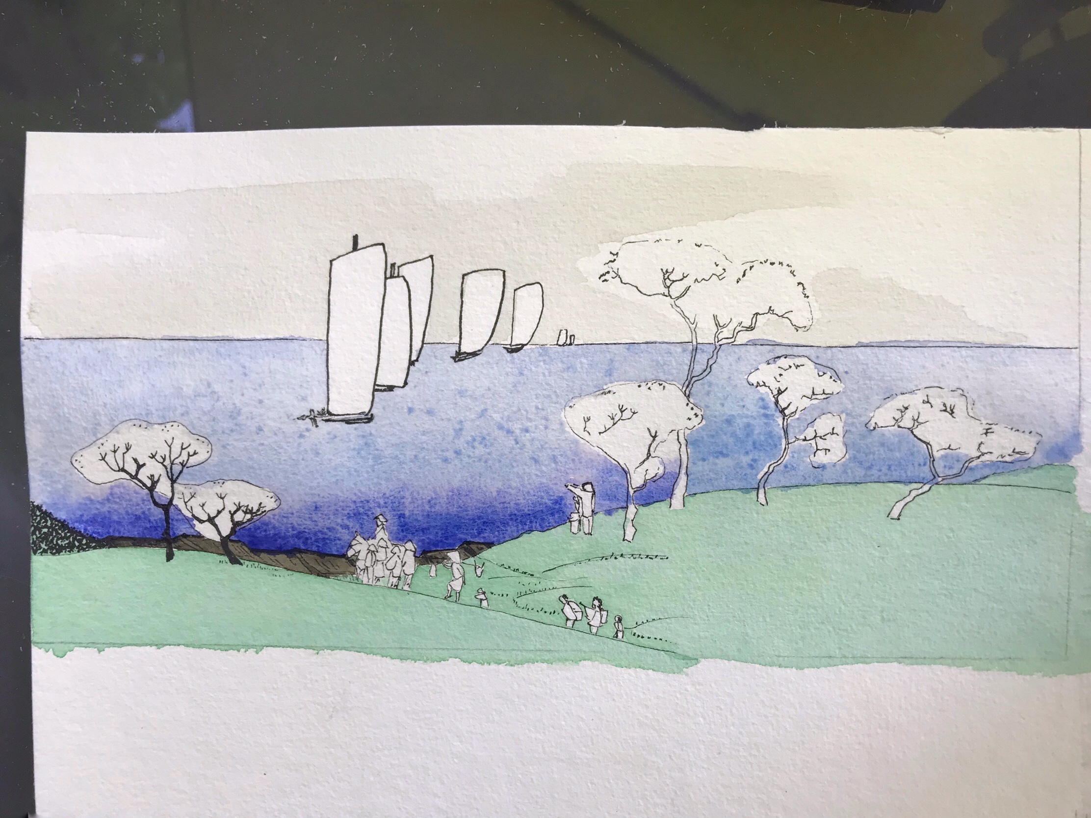
I darkened the sienna and grey mix to add contrast to the roofs, started to paint the figures in grey and light ochre. For the cherry blossom, I used alizarin crimson:
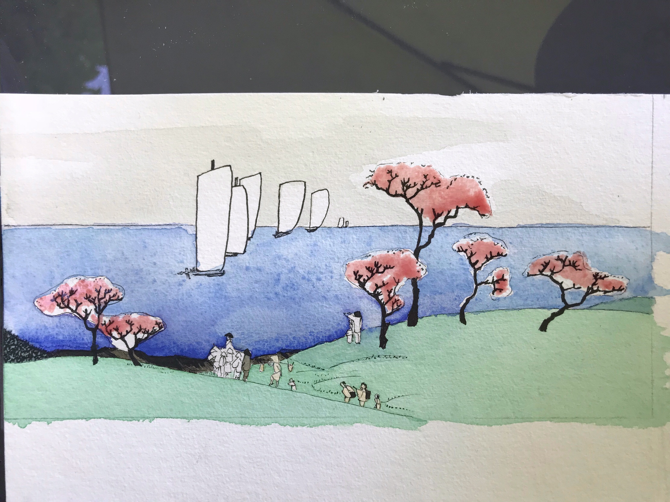
I ended up applying too much dark sienna to the roofs, that I couldn’t fix and darkened the figures as well. More alizarin crimson for contrast in the blossoms, and I was done:
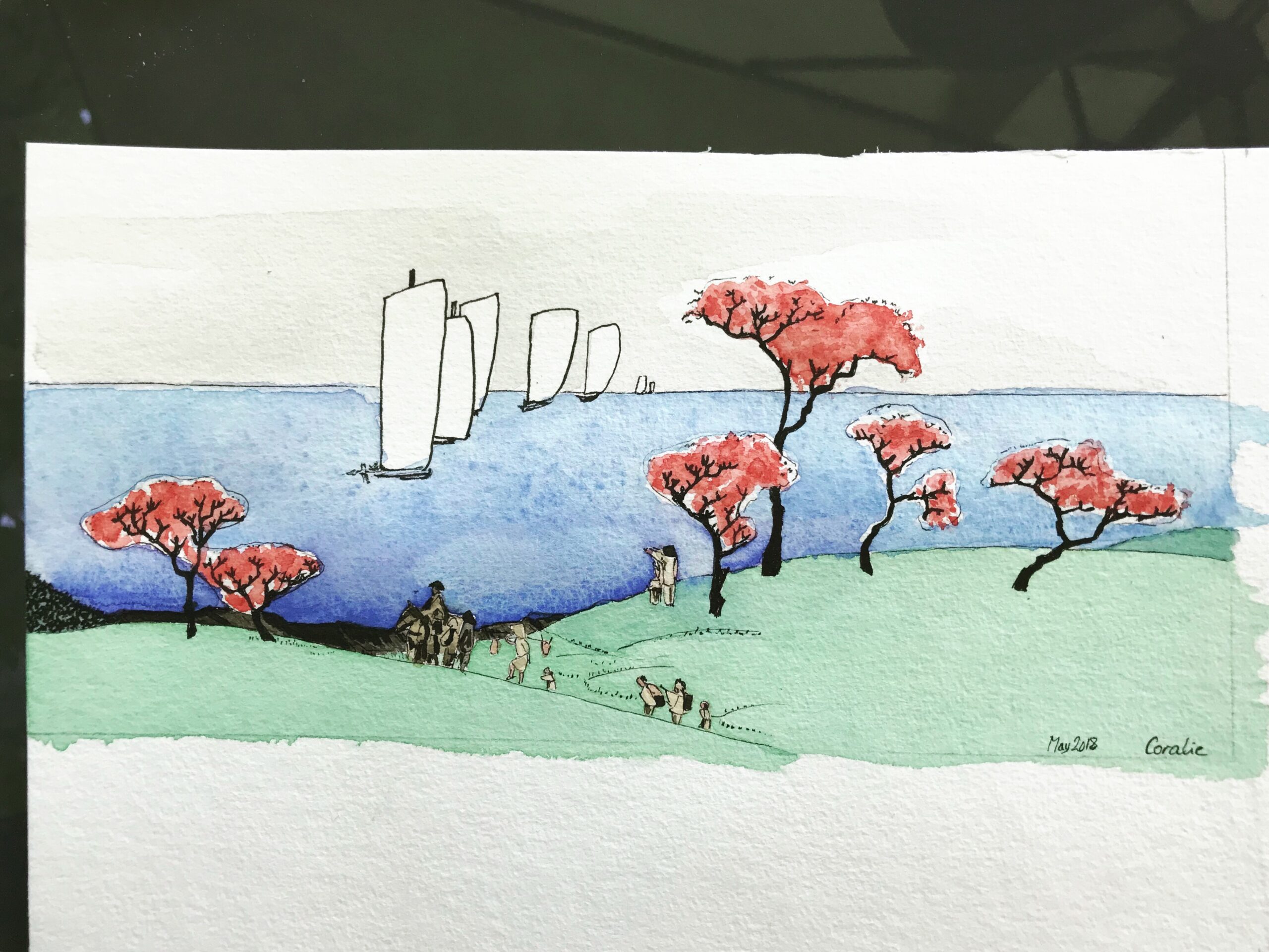
Finally I cut it and taped it to a metallic blue card, and was ready to write the birthday card for a friend: