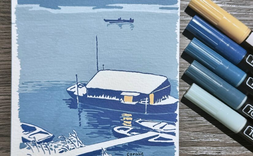
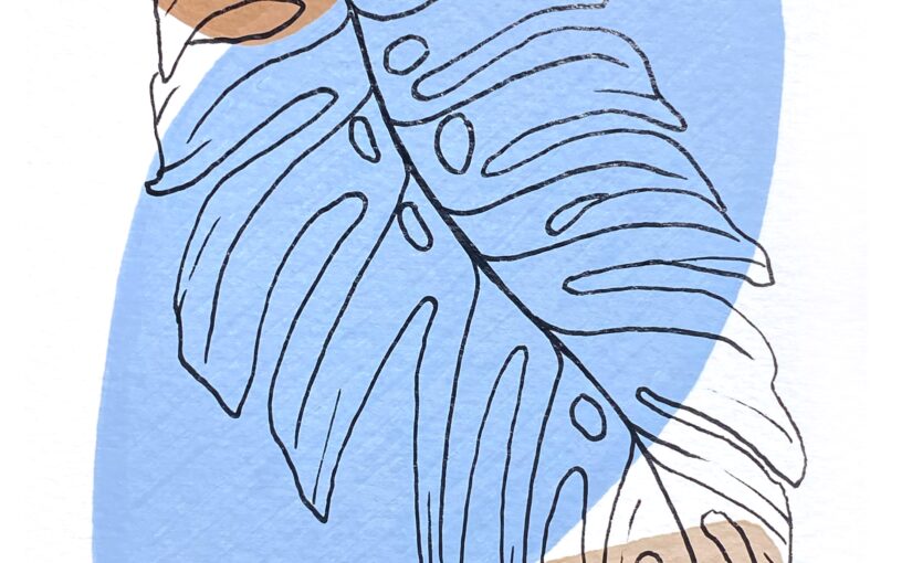
To thank the people who attended my mother’s funeral and the people who sent condolences cards, I made and sent (22) homemade cards on watercolor paper, using acrylic paint pens to create three patches of solid colors and a black pen to draw the outline of a monstera leaf in the foreground:
My mum passed away on Thursday 25 April 2024. She was found on Monday 29 April. She died in her bed, in her sleep, and didn’t suffer.
I don’t remember when I last spoke to her. Probably over a year ago. The last time I wrote about her, 8 months ago, to put into words that I had finally given up hope to get along with her, we had stopped speaking to each other 6 or so months prior.
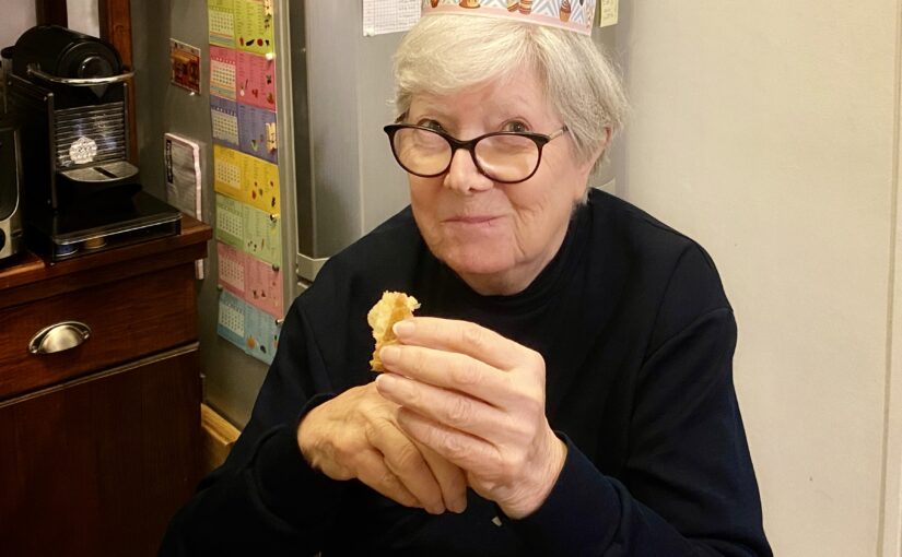
Laurence Mercier eating “galette” (cake eaten for the Epiphany)
I want to remember her as we last were on speaking terms, in January 2023 when she visited with my dad, coming back to her house on the Riviera, that she had left around 2010.
My dad had left their home in the country the Tuesday to travel to my house where he was to stay five weeks. He split the drive in two days and called her on Wednesday after he arrived. They were to call each other when needed, per their practice.
On Thursday she went about her day, made plenty of phone calls in the morning, notably to her nephew to whom she left a voicemail because he wasn’t available. She took her morning and midday medication with her meals, but not her evening pills. Apparently she went for an afternoon nap she never woke up from.
Or maybe she did. From what we later saw there, my dad, who knows her habits, assumes she got up, prepared her afternoon pot of coffee that was untouched or barely so, took out of the shelves some canned asparagus for her dinner, some salad from the fridge which she left on the kitchen table, and went back to bed carrying milk which she set on the nightstand, which she did when her stomach ached.
We heard the next door neighbors recall that when they left for work on the next early morning, they noticed that my mother’s kitchen and bedroom window blinds were already (still, in fact) open and so she must have had an early start of the day, which was unusual. They spent the weekend elsewhere.
A friend of my parents’ alerted us Monday evening that he hadn’t been able to reach her since Sunday. My dad said it wasn’t usual and asked if he could drive there to check on her, which he did. It was a shock to him, probably compounded by the fact that he liked her very much. I am glad he went with his adult son, so he had some support and help while the medics and gendarmes did their things.
Her death was a surprise. She was rather healthy for an 82 year-old woman, with a stabilized diabetes and no other known conditions. She was rather active, busy and very driven although she would sometimes suffer sudden bouts of depression where she did nothing for days. But it wasn’t the case in the end.
My father was particularly stunned. His health has been bad and worsening very gradually for now over 26 years. He was (we all were, I think) anticipating he would be the first of the two to pass. But my mother’s wish, which she had shared with him a few times, was to be the first to go. She could not see herself alone, and didn’t want to have to deal with things. At least she was honest! Her wish was granted.
I helped my father arrange things from here (thanks to the telephone and the Web), and by the following Friday, we grabbed my twin brother and drove there. My mother’s funeral was the next Monday.
A friend of the family’s, our (now retired) mechanic, traveled from Cannes to attend. My dad’s youngest brother and his wife happened to be in the area and attended too. Other than the friend who found my mother and his wife, and a handful of persons I had met before, I didn’t know anyone among the fifty or so mourners.
Monday 6 May 2024 was a beautiful day in La Creuse. Partly sunny and cloudy, no rain. The church of Châtelus-Le-Marcheix was half full. The morning sun light made the two stained-glasses glow. We had chosen to play the “hallelujah” which she loved, from Georg Friedrich Händel’s Oratorio – Messiah (HWV 56, Part 2, No. 44 Chorus).
I read a short text I had written on behalf of me, my brother and my dad. My voice broke the entire time. I stood right next to her closed coffin but only thought about my brother and my dad, even as I looked at the sullen faces of the strangers who were her friends. Here’s the text:
Merci d’être rassemblés ici aujourd’hui alors que nous faisons nos adieux à Laurence Victoria, dans une région qu’elle a adoptée dès 1997 et dans laquelle est s’est définitivement installée un peu avant 2010.
Elle laisse un mari et deux enfants, choqués par la soudaineté de son départ. Je m’exprime aujourd’hui au nom de mon père André, mon frère jumeau Xavier et moi-même, Coralie.
Elle laisse également une soeur à Marseille et ses deux enfants, un frère en Allemagne et sa fille, ainsi que quelques cousins en Provence. Et bien sûr, elle laisse de nombreux amis ici en Creuse, et dans la région de Cannes dans les Alpes-Maritimes.
Ce fut un grand choc pour tout le monde, tant c’était soudain. Elle avait 82 ans et une bonne santé, telle qu’on peut l’espérer pour une personne de cet âge. Elle était très active et très occupée : par sa maison, son jardin, les associations auxquelles elle adhérait : Les Moussus du Thaurion, et le Secours Catholique. Elle faisait de la couture, un peu de marche, beaucoup de cuisine et de jardinage. Et elle bavardait : en personne, au téléphone, par courrier et même par SMS.
Il y aura deux semaines demain, mon père lui a dit au revoir comme il le fait une ou deux fois l’an pour venir séjourner chez moi dans le sud. Tous les deux se réjouissaient des choses qu’ils accompliraient avant de se retrouver ici début juin.
Mais voilà, le sort en a décidé autrement car elle s’est endormie pour une sieste dont elle ne s’est pas réveillée.
Partir la première, dans son sommeil, dans sa maison, correspondait entièrement à ses souhaits. Et elle fut exaucée.
Désormais nous faisons tous face à notre peine et nous devrons nous habituer à son absence. Je souhaite que sa générosité, sa ténacité ainsi que les fortes valeurs qui étaient les siennes, soient source d’inspiration pour ceux qui l’ont connue et ceux qui en parlent.
Une nouvelle fois, nous vous remercions d’être là, votre présence est précieuse à nos yeux.
I may have more to write about the day of her funeral, the rest of the week that we spent at the house, or other things about my mother, but not today.
The internet has become an extractive and fragile monoculture. But we can revitalize it using lessons learned by ecologists.
Concept of ‘shifting baselines’ which is useful in many other contexts when considering ‘change’:
As Jepson and Blythe wrote, shifting baselines are “where each generation assumes the nature they experienced in their youth to be normal and unwittingly accepts the declines and damage of the generations before.” Damage is already baked in. It even seems natural.
Rewilding vs. timid incremental fixes that afford no true progress:
But rewilding a built environment isn’t just sitting back and seeing what tender, living thing can force its way through the concrete. It’s razing to the ground the structures that block out light for everyone not rich enough to live on the top floor.
Deep defects run deep:
Perhaps one way to motivate and encourage regulators and enforcers everywhere is to explain that the subterranean architecture of the internet has become a shadowland where evolution has all but stopped. Regulators’ efforts to make the visible internet competitive will achieve little unless they also tackle the devastation that lies beneath.
Public utilities need to be recognized as such, and funded as such (including the non-profit organization I work for, W3C, which develops standards for one application of the Internet: the Web):
[Instead, w]We need more publicly funded tech research with publicly released findings. Such research should investigate power concentration in the internet ecosystem and practical alternatives to it. We need to recognize that much of the internet’s infrastructure is a de facto utility that we must regain control of.
Better ways of doing it (also, read as a pair with the concluding paragraph of the article which I labeled ‘manifesto’):
The solutions are the same in ecology and technology: aggressively use the rule of law to level out unequal capital and power, then rush in to fill the gaps with better ways of doing things.
Principled robust infrastructure:
We need internet standards to be global, open and generative. They’re the wire models that give the internet its planetary form, the gossamer-thin but steely-strong threads holding together its interoperability against fragmentation and permanent dominance.
Manifesto (which I read several times and understood more of each time):
Ecologists have reoriented their field as a “crisis discipline,” a field of study that’s not just about learning things but about saving them. We technologists need to do the same. Rewilding the internet connects and grows what people are doing across regulation, standards-setting and new ways of organizing and building infrastructure, to tell a shared story of where we want to go. It’s a shared vision with many strategies. The instruments we need to shift away from extractive technological monocultures are at hand or ready to be built.
I am looking forward to a piece (or a collection of pieces) that will talk to the people in a manner that they hear this [understand it] and that moves them to make different choices.
Pretty much as I am doggedly and single-mindedly making different and sensible ecological choices for the planet, while I look forward to people being moved at last to durably do the same.
My thanks to Robin (who I know and work with) and to Maria (who I’d like to know now)!