Practicing watercolor

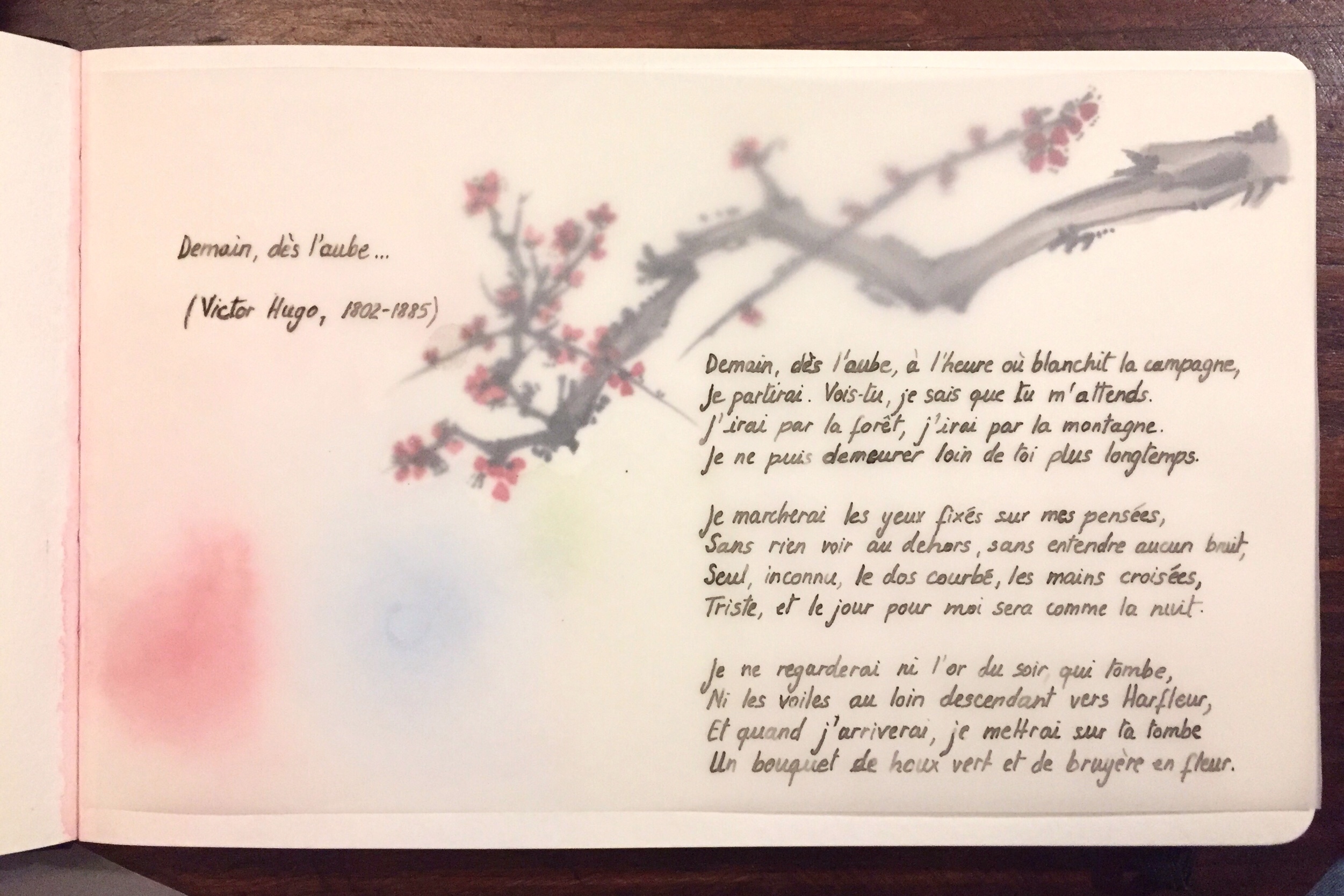
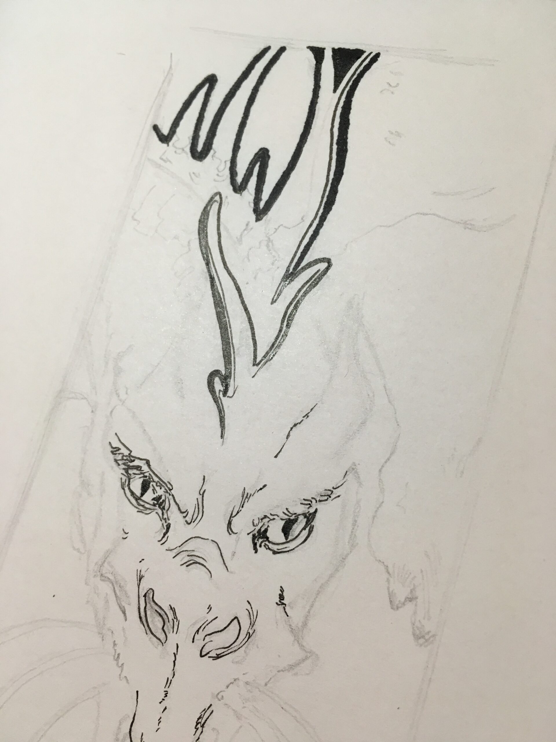
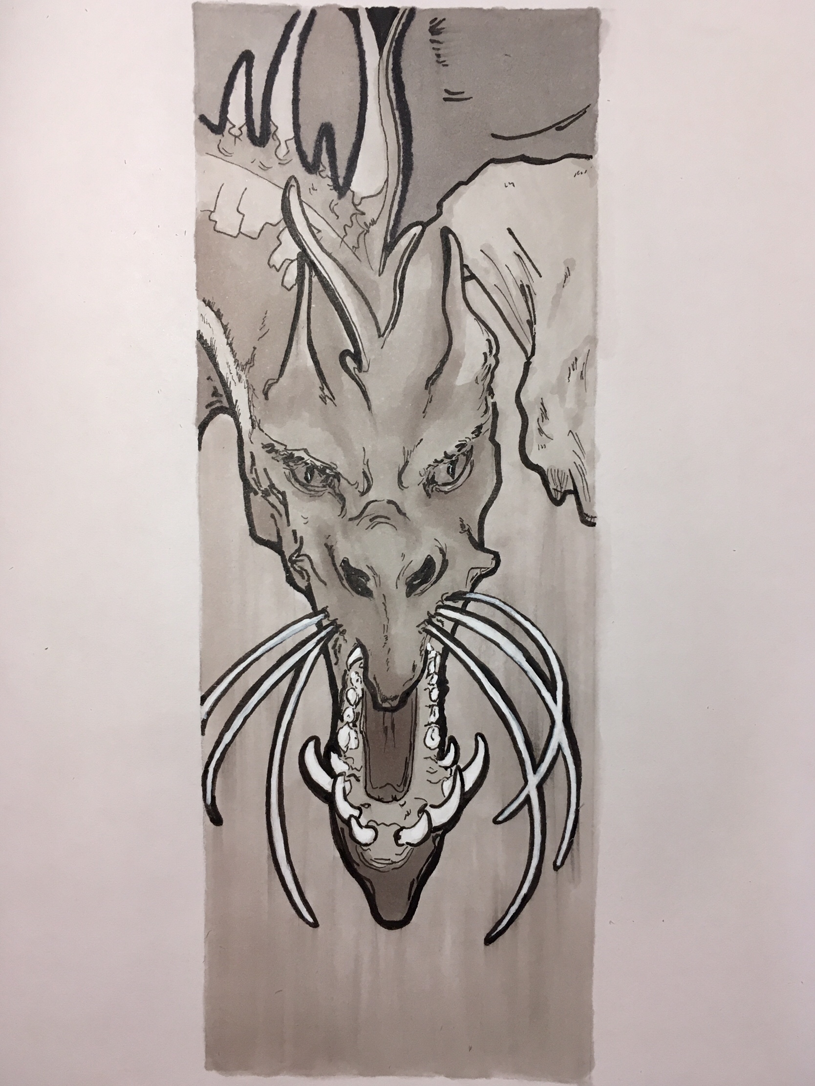
All of these were done in a Moleskin watercolor book (21×13 cm), and are safely away from view.


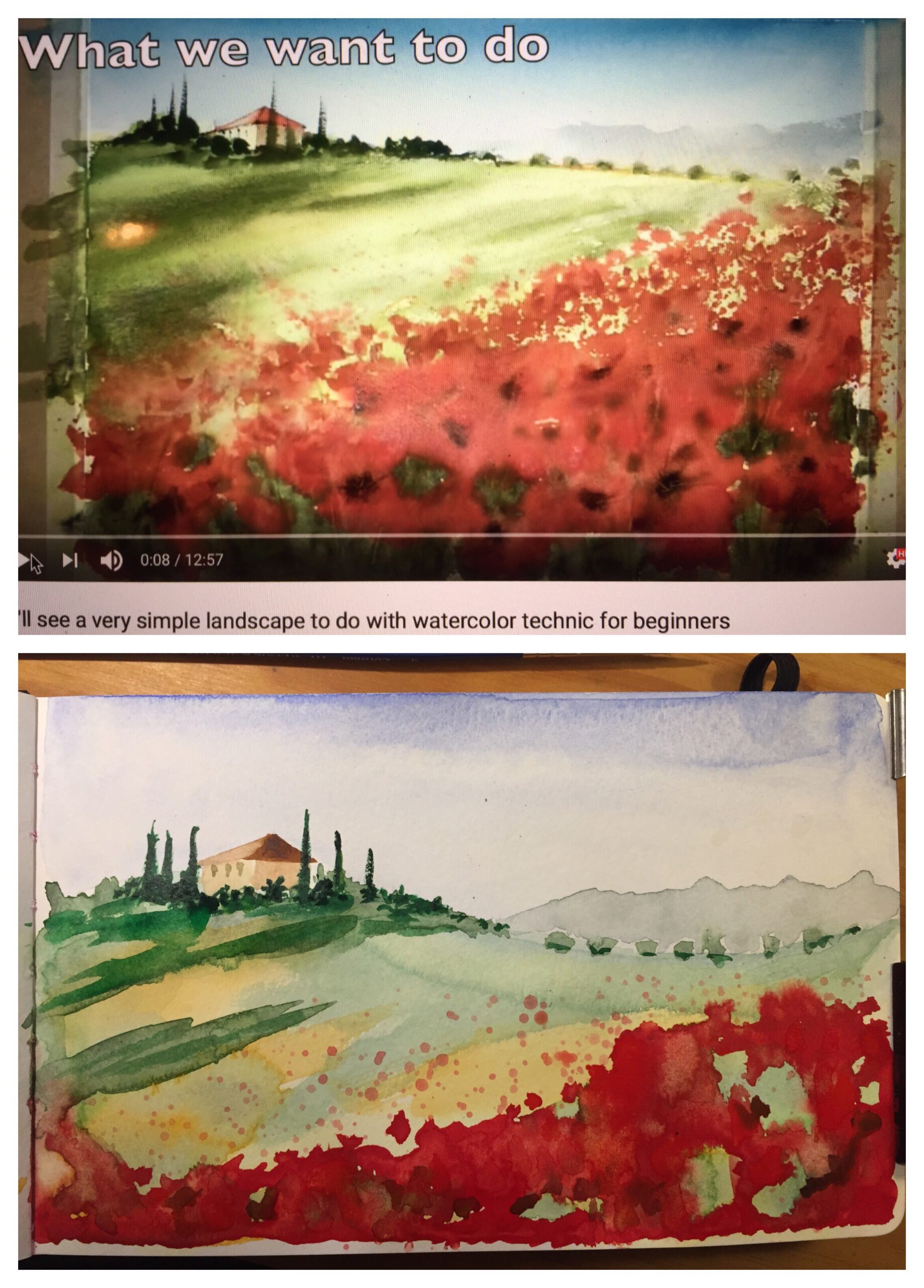
I chose a YouTube video featuring a lovely Tuscany landscape and advertising it was very simple and ideal for beginners. The result isn’t entirely bad but it’s far from being good:
Collage of two pictures: at the top the still photo of the video I watched advertising a very simple Tuscany landscape for watercolour beginners. At the bottom my interpretation with stains and overlapping colours.

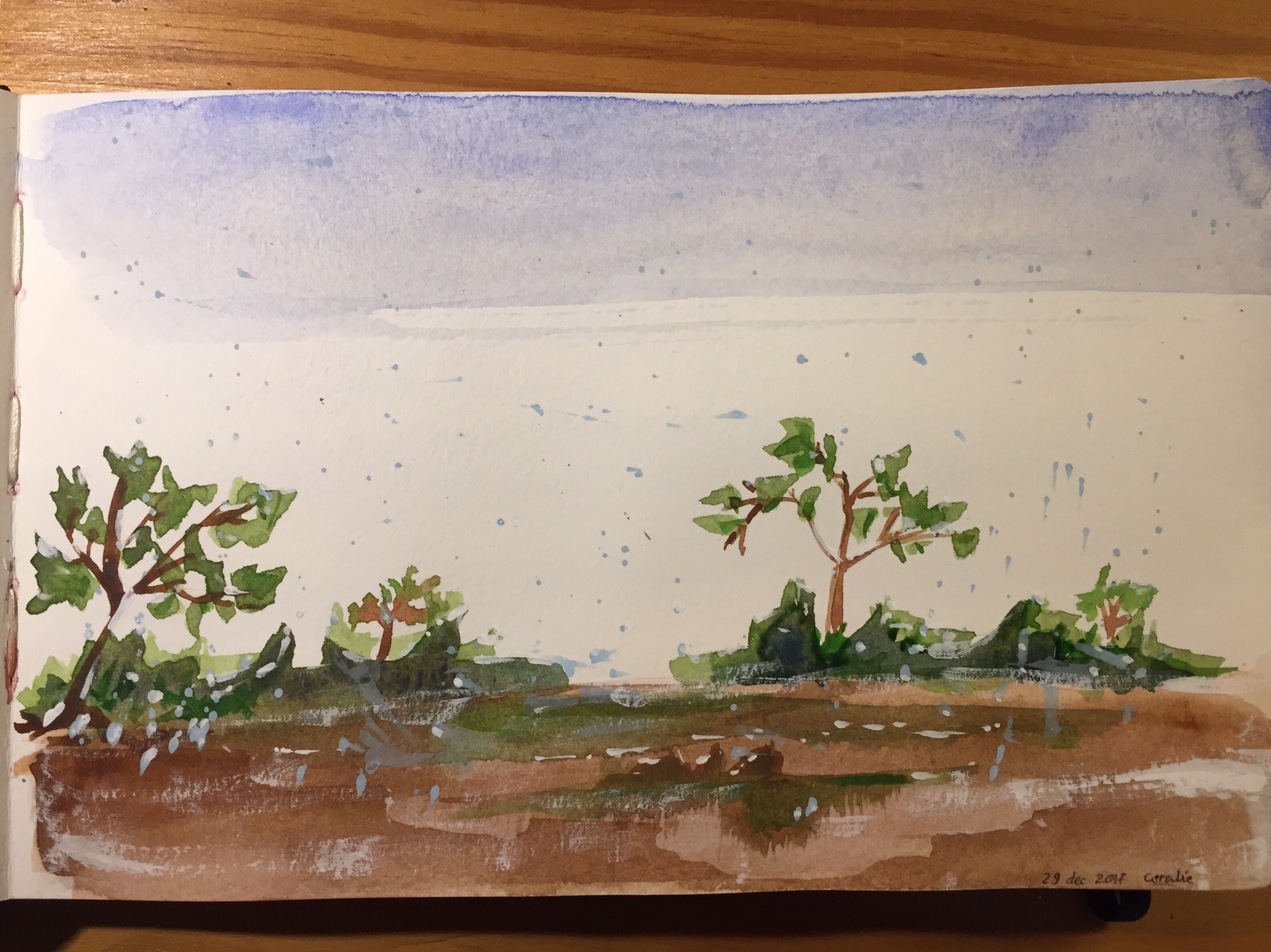
Following as best as I could the instructions in a “watercolor for beginners” manual, here is a winter field landscape, because I wanted to practice painting trees in particular and was intrigued by the splattering technique for the bluish snow (that you get by tapping your brush against your other hand close to where you want the projections to land):
winter field landscape with a few trees and bluish snow

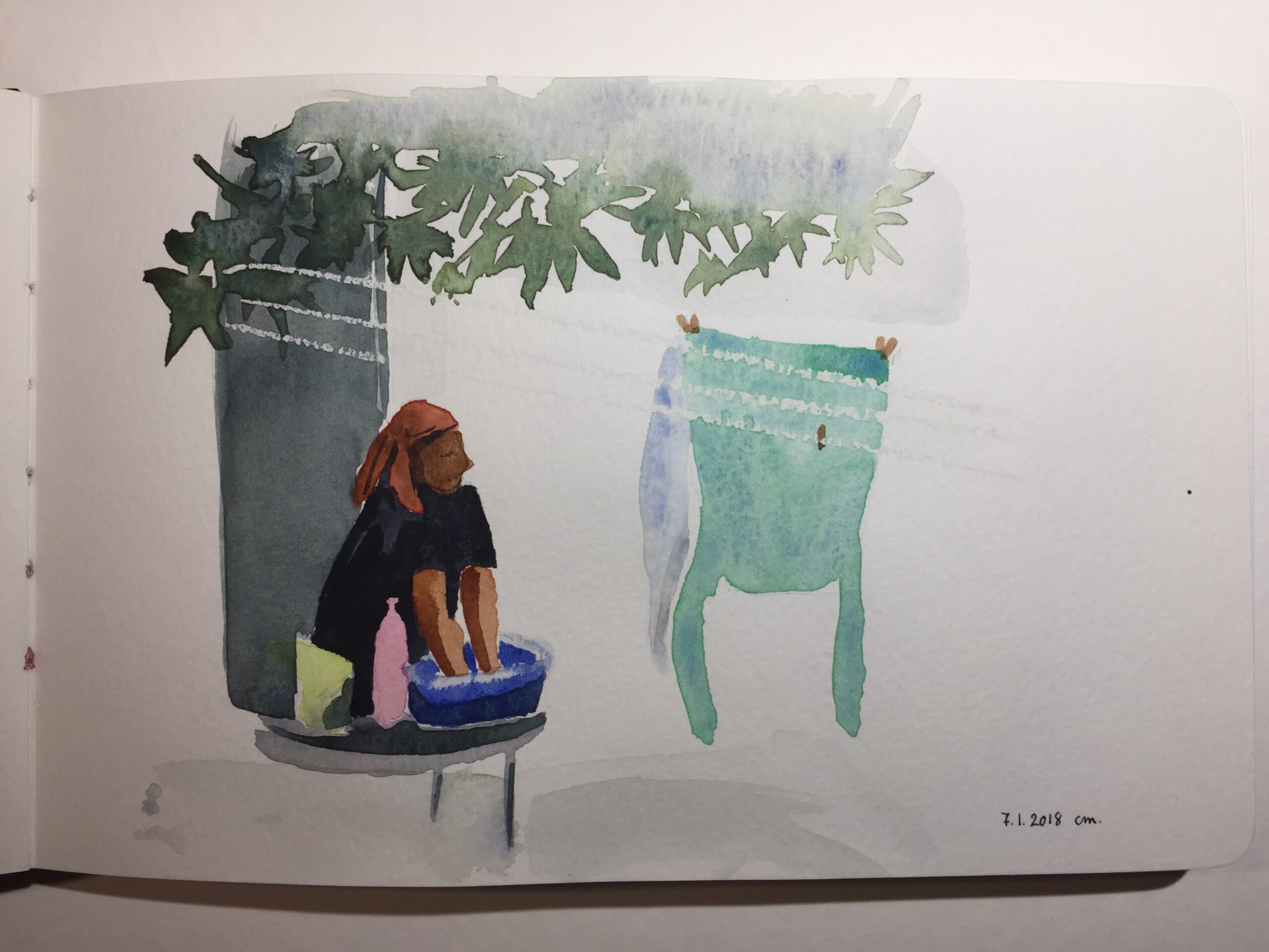
From the same “watercolor for beginners” manual, I tried my hand on a woman doing laundry in the shade, interested by the technique of using a white pastel stick to draw the clothes lines. The only part I like is the foliage however.
loose painting of a woman doing laundry in the shade

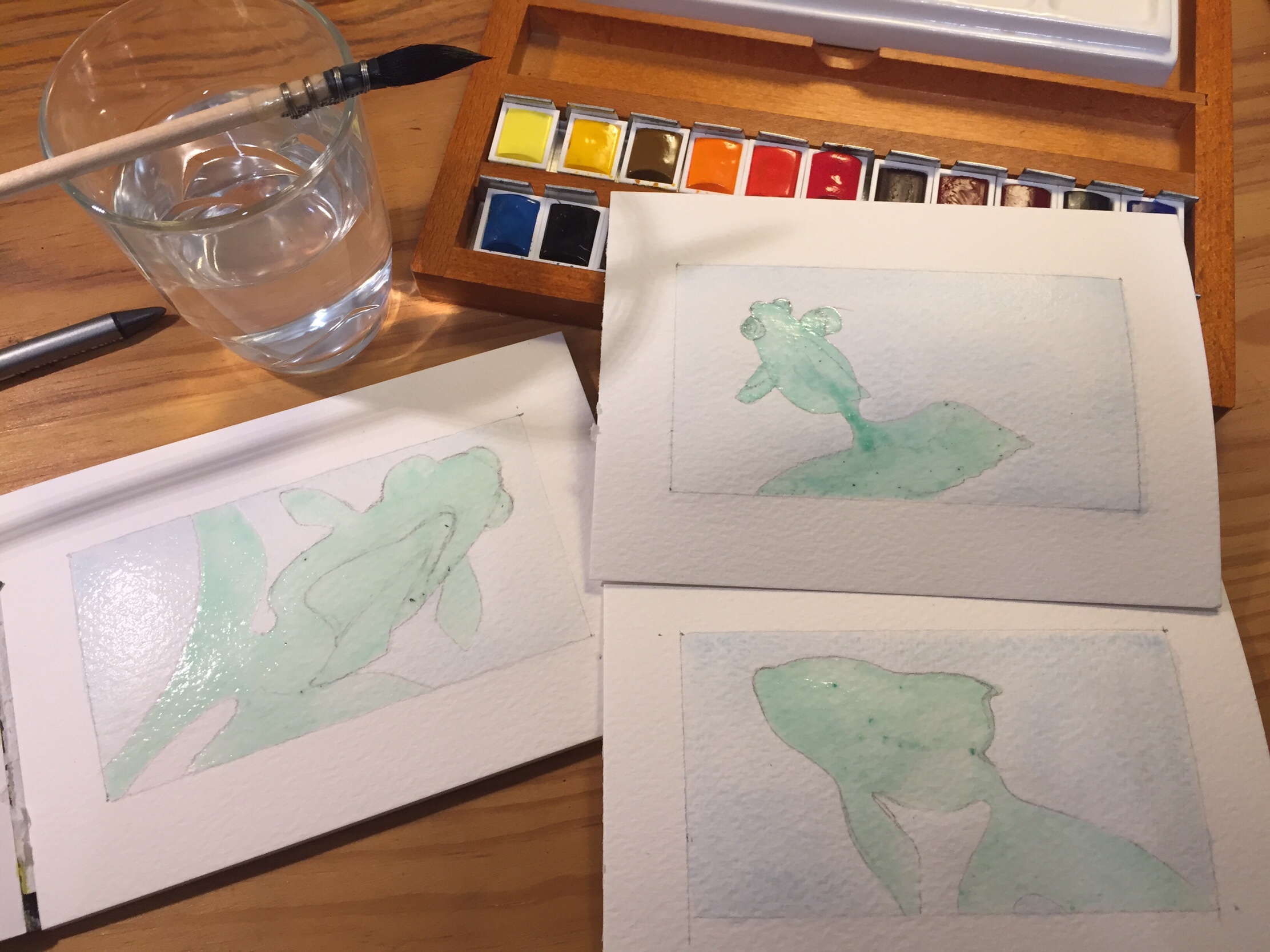
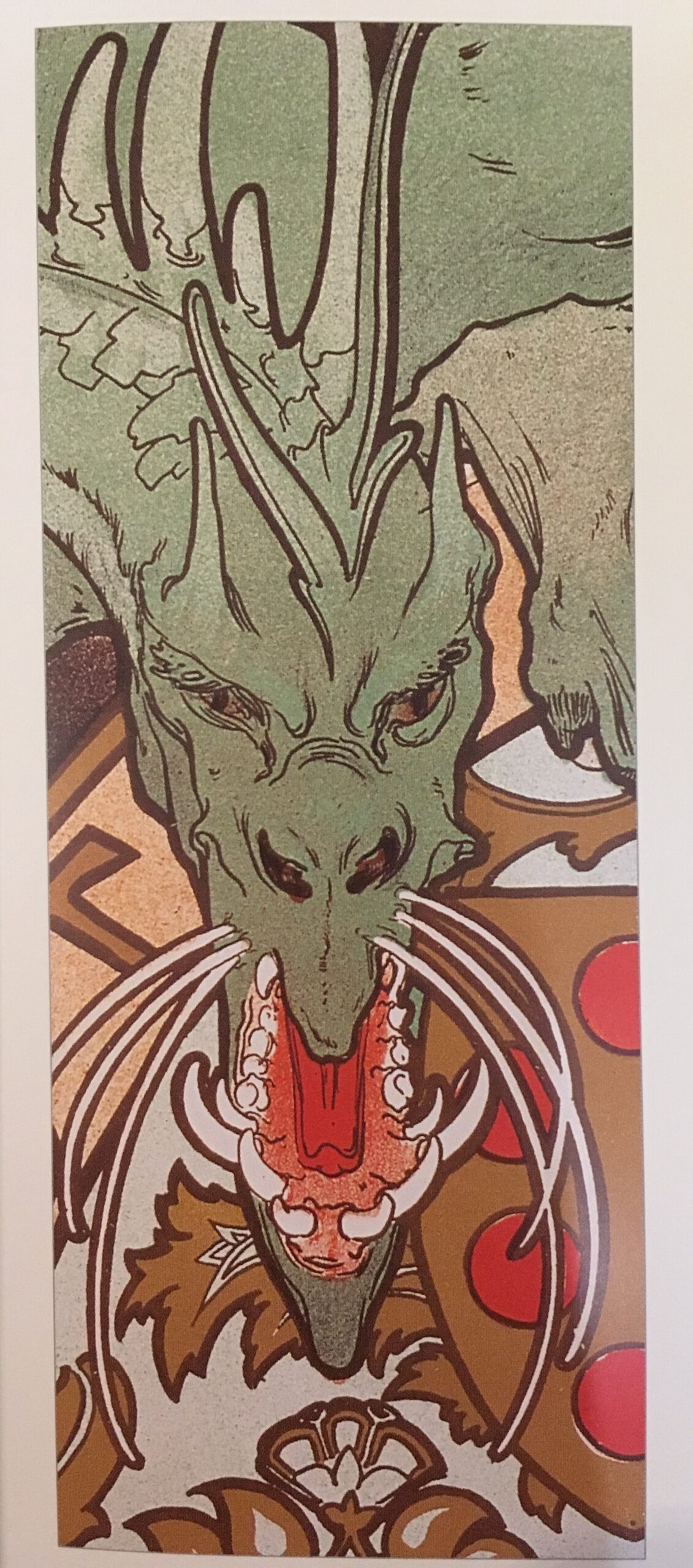
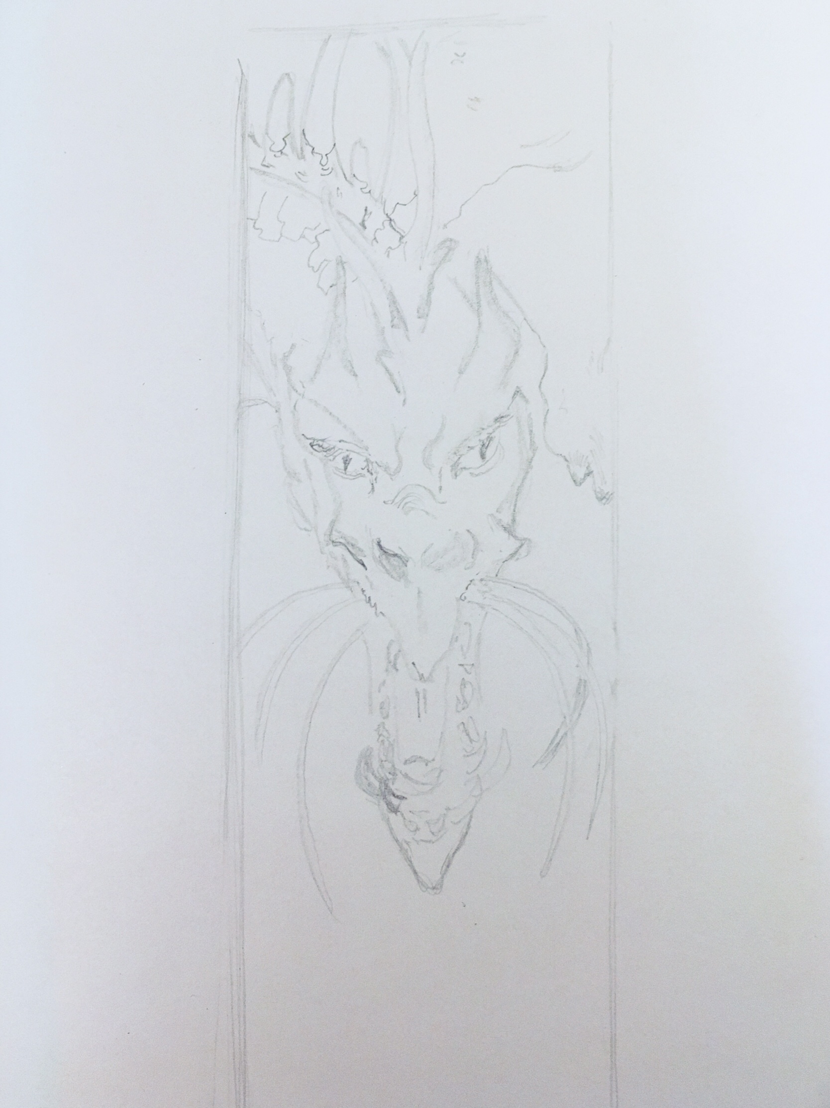
Here are a goldfish that looks part grumpy, part menacing, and a couple of delicate magnolia flowers:

And finally a lemon on a branch with leaves and their shadows:

Goldfish triptych

The exercise consisted in using masking fluid to paint the blue backgrounds and save the white for the goldfish:
Three postcard sized watercolour sheets where I drew the shapes of goldfish and painted the background in light blue. The watercolour pans, brush and water glass are visible.

The masking fluid was painstakingly slow to peel off, left some residue and I ended up scraping paper a bit in places:

Scrapped paper and residue of the green masking fluid that would not be removed

I filled the first goldfish with black ink from a Pentel Brushpen (which is awesome for very thin lines as well as large areas) after painting the fins, tail, eyes and mouth in bright orange watercolor:

The second and third goldfish were a mix of bright orange watercolor, black on some fins, eye and mouth, and to cover the masking fluid residue I applied a layer of white watercolor paint:

I framed those and painted the frame bright orange as well before adding a layer of varnish:

Demain dès l’aube

Branch of a blooming tree, done using grey Brushmarkers and alizarin crimson watercolor:
Branch of a blooming tree, done using grey Brushmarkers and alizarin crimson watercolor. The artwork is on a wide drawing book on a table, next to the pens and paint.

Adding details in black, using a Pentel Brushpen:
Branch of a blooming tree, to which I added a few black spots. The artwork is on a wide drawing book on a table, next to pens and paint.

To fill the (future) white space under the blossoms I adding soft patches of that same pink, pale blue and a bit of green. In retrospect, I wish I hadn’t.

Then I wrote a Victor Hugo poem on tracing paper using India ink and nib, and glued the side of it vertically at the left of my watercolor:
Wide drawing book where I wrote a peom in black on tracing paper underneath which are visible spots of pink, blue and green, and the branch and blossoms.


Here is the poem from 1856:

Demain dès l’aube

Demain, dès l’aube, à l’heure où blanchit la campagne,
Je partirai. Vois-tu, je sais que tu m’attends.
J’irai par la forêt, j’irai par la montagne.
Je ne puis demeurer loin de toi plus longtemps.

Je marcherai les yeux fixés sur mes pensées,
Sans rien voir au dehors, sans entendre aucun bruit,
Seul, inconnu, le dos courbé, les mains croisées,
Triste, et le jour pour moi sera comme la nuit.

Je ne regarderai ni l’or du soir qui tombe,
Ni les voiles au loin descendant vers Harfleur,
Et, quand j’arriverai, je mettrai sur ta tombe
Un bouquet de houx vert et de bruyère en fleur.

Dragon to test {Brush|Pro}markers (alcoholic ink markers)

As an early Christmas treat I got myself a series of Brushmarkers and Promarkers in cold and warm greys, and in colors. The pens come with a blender.

Wooden storage box with a handle full of thick pens

In theory the blender helps blend colors together by wetting the surface of paper. In practice, colors will blend in any case (except with black) but will do so more smoothly on a reasonably wet layer of color. I have probably not mastered it as I find it’s more of a smudger than it is a blender, giving edges fuzziness, even on non-bleed paper.

To test the grey series I went for a dragon that adorned an Alfons Mucha poster of 1896 for the Lorenzaccio play:

Tall narrow rectangle filled with a green dragon that adorns an Alfons Mucha poster of 1896 for the Lorenzaccio play. The dragon has its mouth open and is surrounded by geometric motifs.

I sketched the outline:

Rough pencil sketch of the dragon within a tall and narrow rectangle

I marked the outline using Uni-ball pin pens (0.05, 0.1, 0.2 and 0.5 mm):

Black ink outline of various width

Black ink outline of various width now covering the entire sketch. Pencil erased.

Then I applied layers of grey. I had to use a white ink Posca pen to cover some overlapping black lines in the moustache. Here is the finished version:

Layers of grey ink of various intensity

⚠️I learned that the alcohol ink smears pencil lines and even the Uni-ball pin pens ink, so it’s better to go easy on the outline and add those or add finishing lines afterwards.


I got a silver and black Decopatch sheet that I applied with glue/varnish to the square wooden frame and tada! The frame is now on a shelf in the room of my little boy who loves dragons.

The finished piece: the dragon occupies the left half of a square white sheet of paper. The square frame is adorned with silver and black metallic paper.