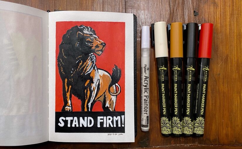
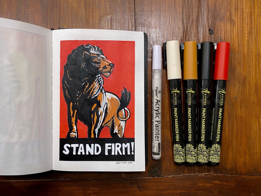
I’m really enjoying myself doing these poster art piece with acrylic paint markers!
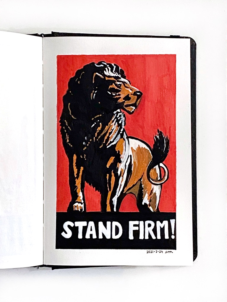
This is my interpretation of “Stand firm!”, a World War II propaganda poster during the UK war effort, 1939-1946, by Thomas Purvis.
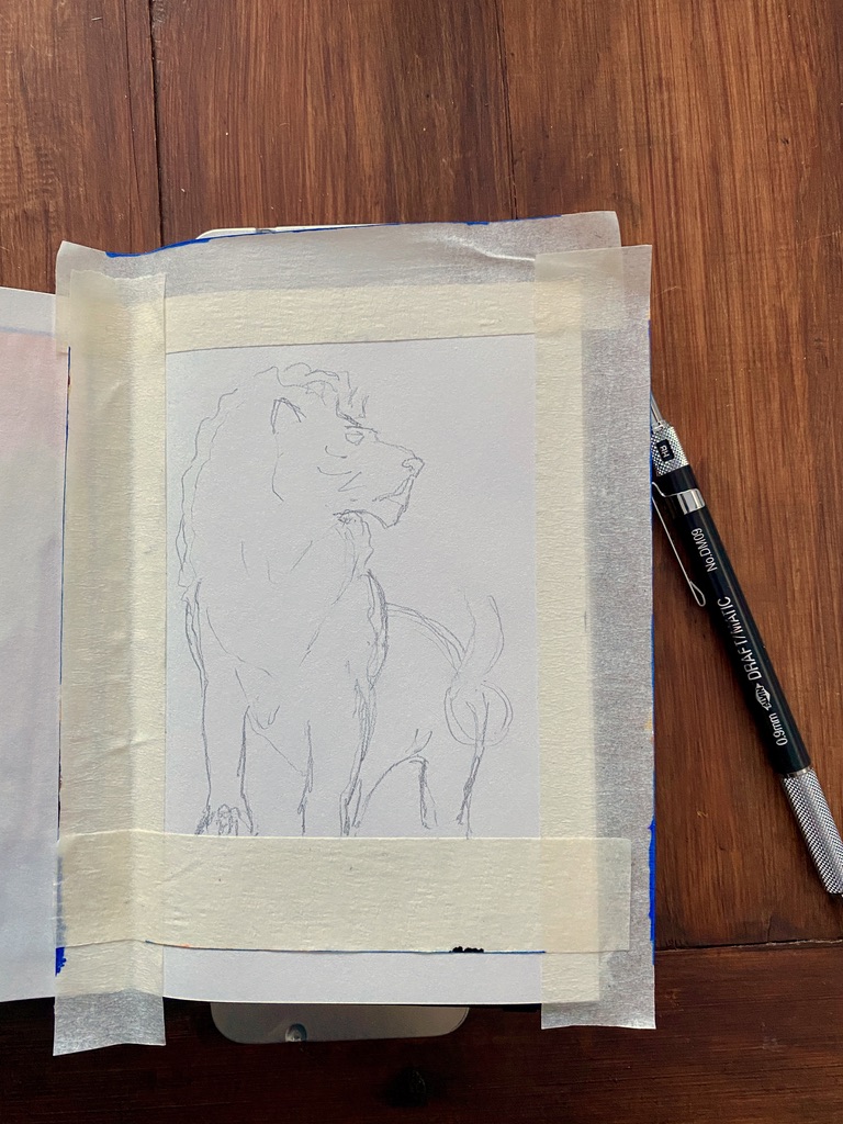
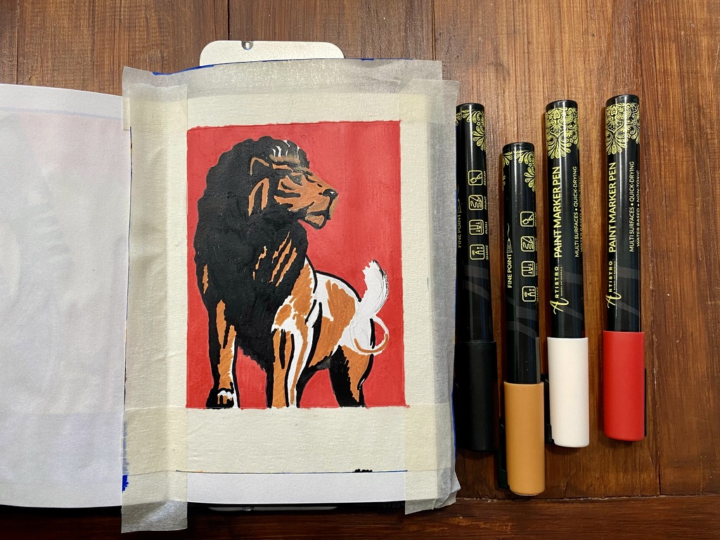
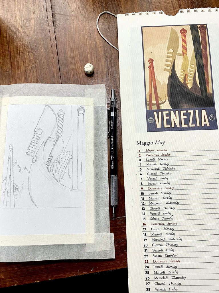
Masking tape and pencil sketch.
I will need four colours: orange-brown, black and red, and white.
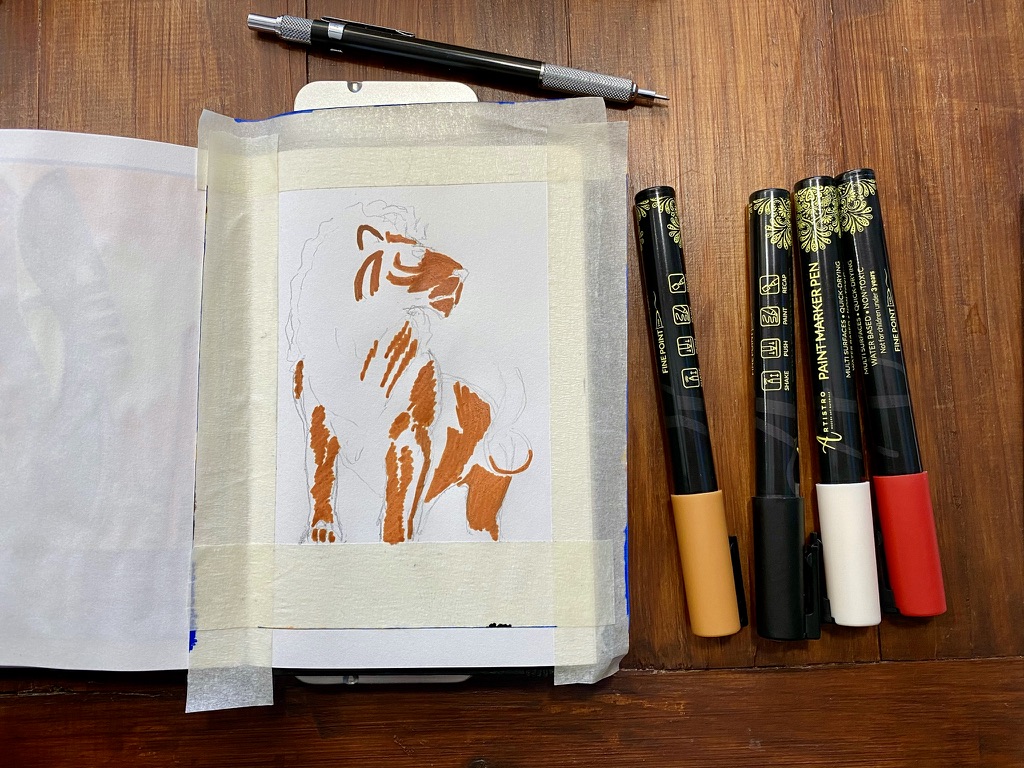
The lion is taking shape.
Red background done. I wished the tip were larger because with 1-millimeter, it took a lot of back and forth and the strokes are very visible on the paper.
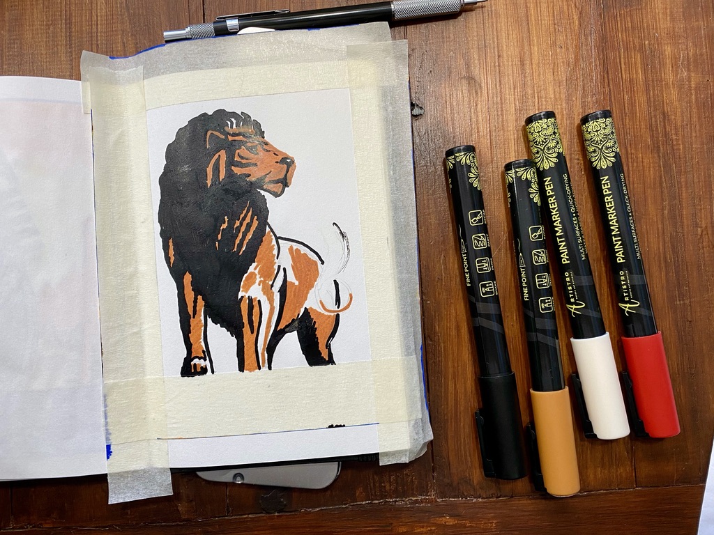
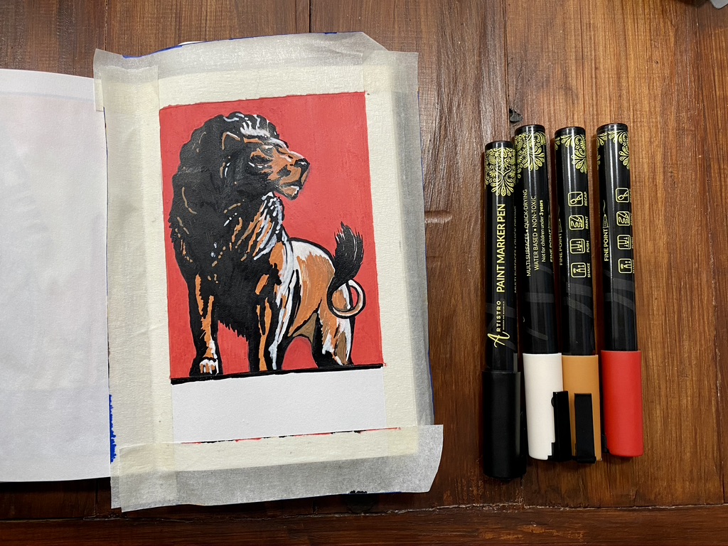
Now that the lion is finished, I added highlights.
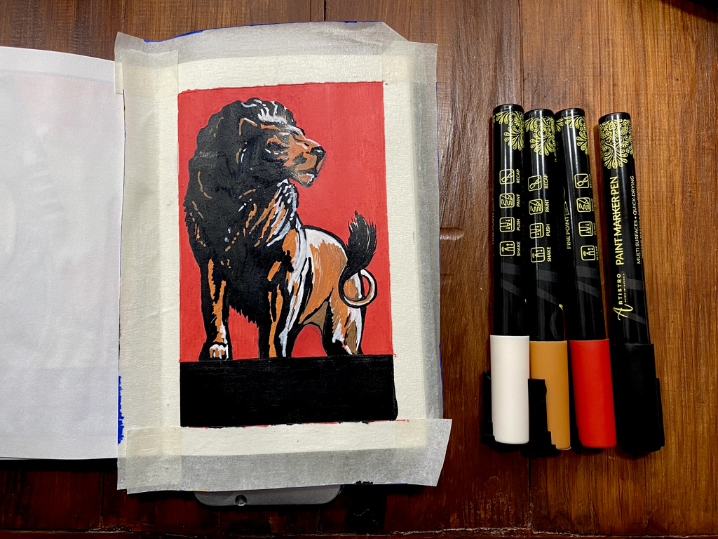
Black rectangle at the bottom.
I used a different white acrylic paint marker after all.
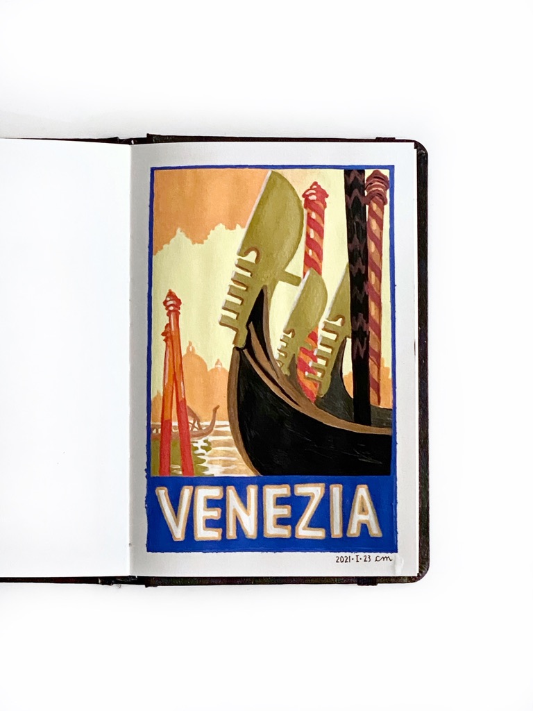
Finished work in the open artbook on a white table, dated and signed
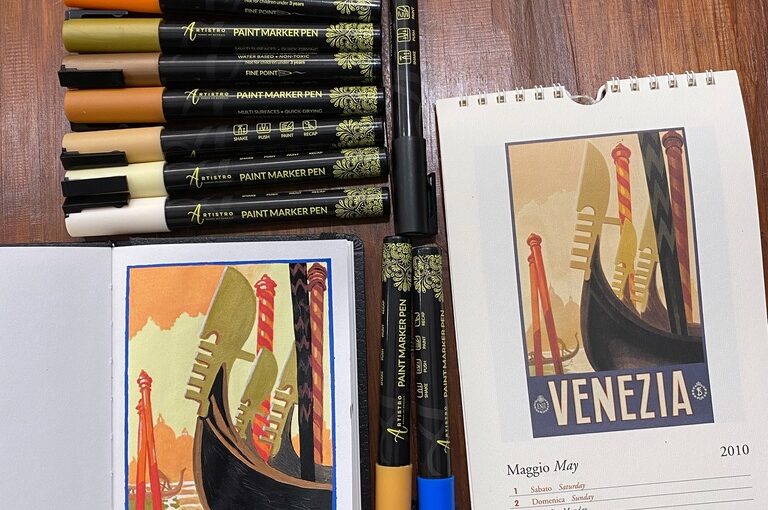
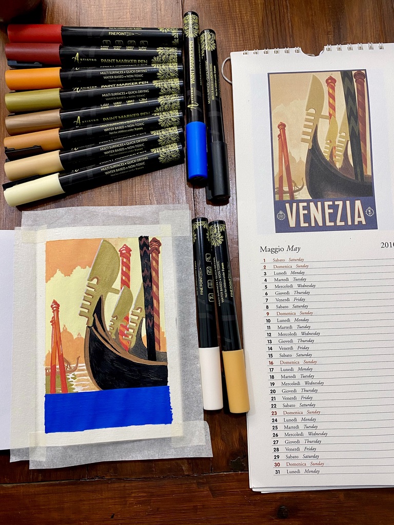
The subject is an advertisement poster for Venice that I found in the 2010 calendar I got in Venice in 2009, and which I kept because the illustrations are pretty.
Canson artbook, 10,2 x 15,2 cm (4 x 6 in), 96 g/m2 (65 lb). It took me 3 hours, although it felt much quicker.
The paper is almost too thin for this medium (the paper warped), and a bit too small for this level of detail. I’m using a set of 30 acrylic paint markers from Artistro that have a fine tip that is 1 millimeter wide. At this scale, one millimeter is pretty thick. I find that thinner lines can be achieved in swift strokes, but that is at the cost of precision (in my case).
Pencil sketch that will be covered by the acrylic paint.
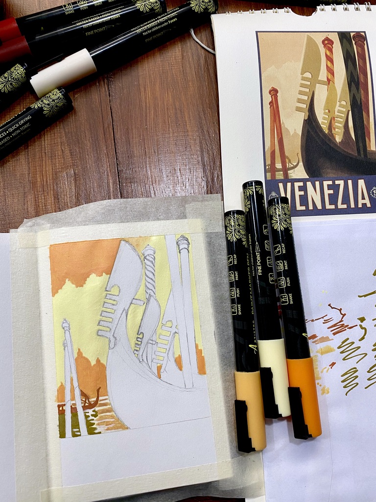
I do not have the exact same colours as the reference image. I’m trying out the pens I have on the back of an envelope.
I found colours that I think will work well together.
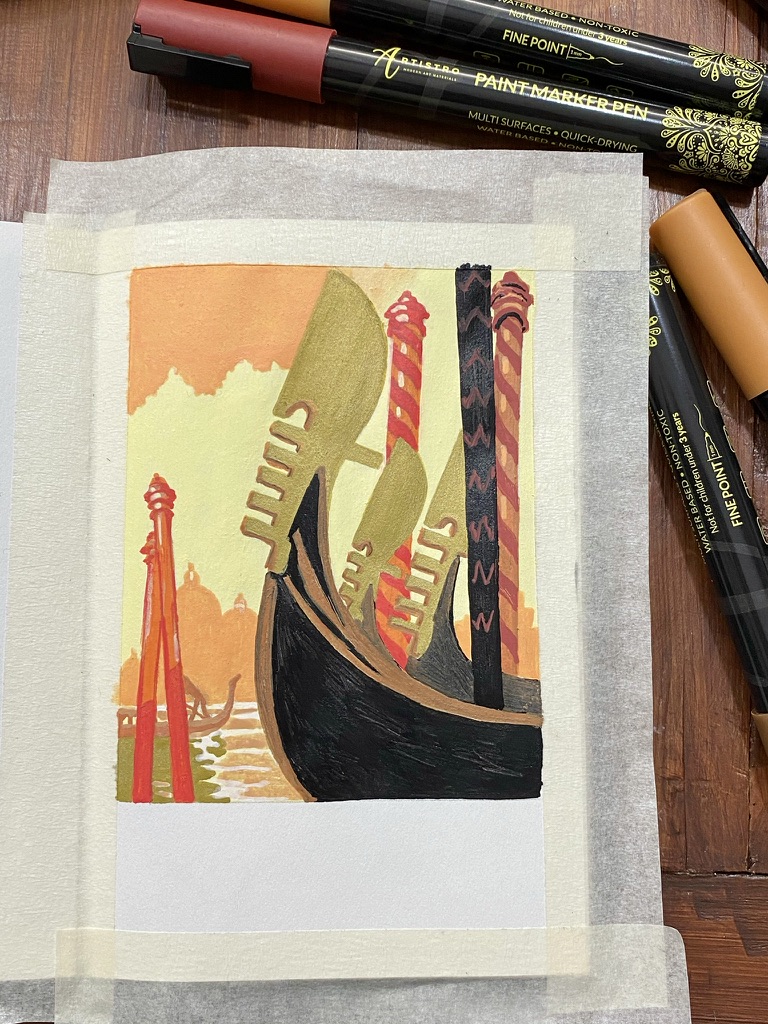
Close-up of the main drawing nearly done now that the gondolas and mooring posts are coloured.
Almost done! All I need to add is “Venezia” in block letters at the bottom, and remove the masking tape.
Finished work in the open artbook on a white table
I’m experimenting with two things: Art Deco which is a style I absolutely LOVE, and acrylic paint markers. The opaque and consistent colours they achieve lend themselves very well to this type of highly contrasted art.
This is after an Art Deco ad for Herkules Bier from the 1930s.
Pencil sketch.
It’s a very zen thing to apply patches of colours in various spots and try to achieve gradients. So far so good.
Finished! I used only four shades of yellow to orange, and black. All I need to do now is apply a pale blue layer as background.
I fixed several proportion problems that became obvious the next day 🙃
One shoulder was visibly smaller than the other, the neck was not in the center and the waistline was too thin (it is notable that in the reference image, the waistline was too thin and the neck wasn’t exactly centered either.) Here is the fixed version which I framed:
I was researching this particular ad to learn more about its history and who created it but I didn’t find a lot of hits. However I found a comical review someone wrote about it in an Art Deco book that features this image:
“On page 89 is an ad for Herkules Bier “aus dem Hasenbrau-Augsburg.” The sinister, leviathanic, muscle-bound, fist-clenched figure uses one of the hallmarks of Art Deco—deep shadow to enhance contrast—to convey a message as self-contradictory as it is threatening: Drink this and it won’t go to your belly, it will build the muscle of Germany. Rage is power, and watch out you fops of Versailles.”