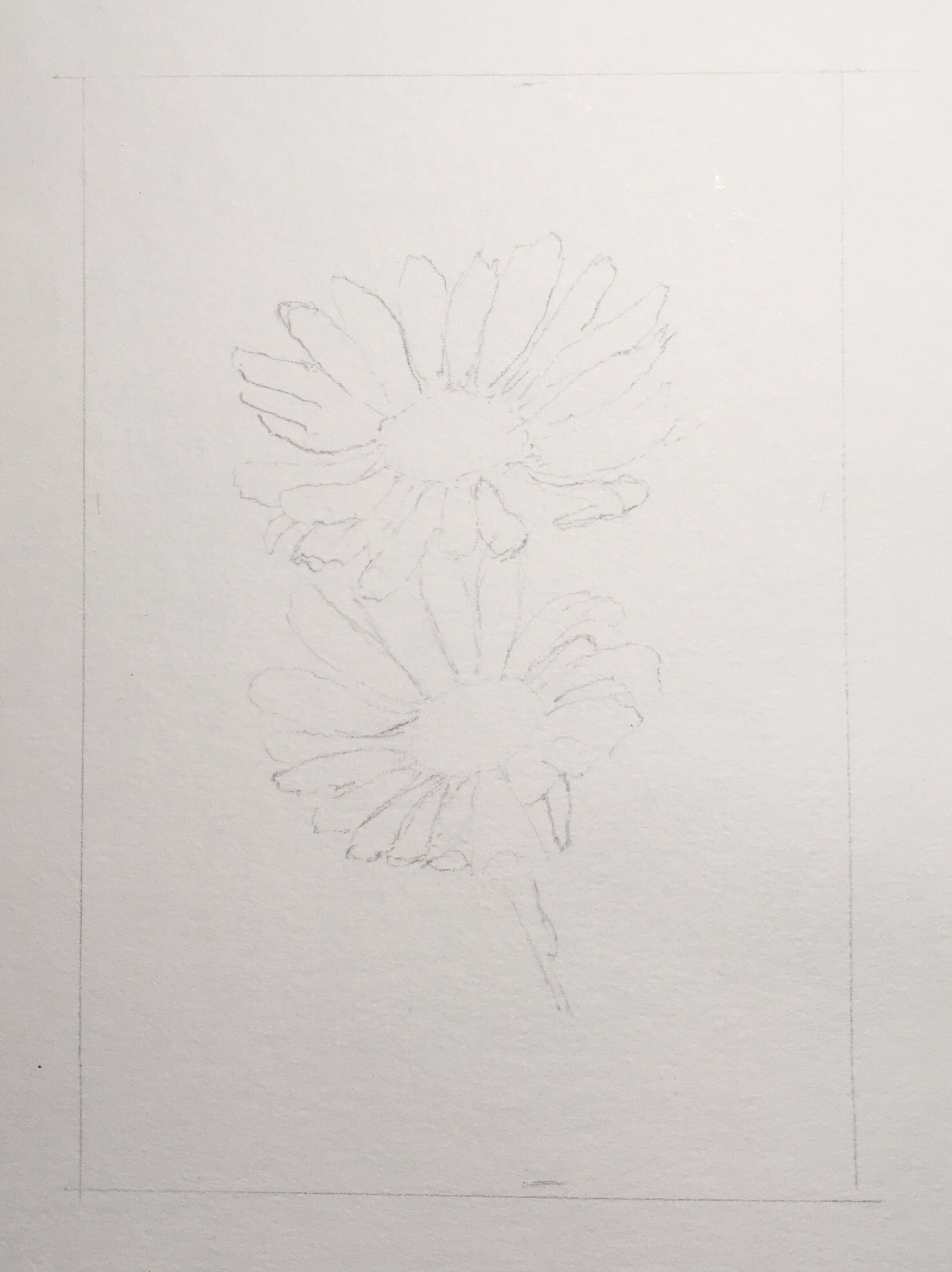
In trying to master how to use masking fluid, I painted daisies. Here’s the pencil sketch:
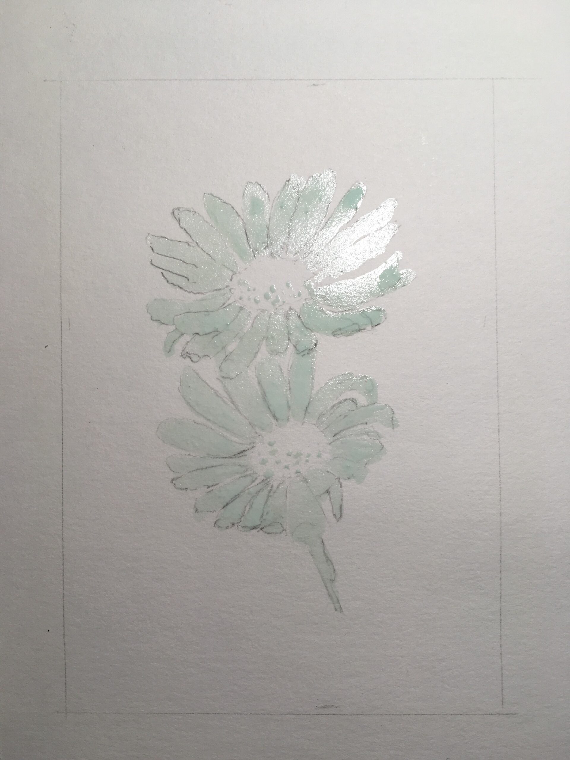
I poured masking fluid in a small container, added a bit of water and applied it on paper using an old brush:
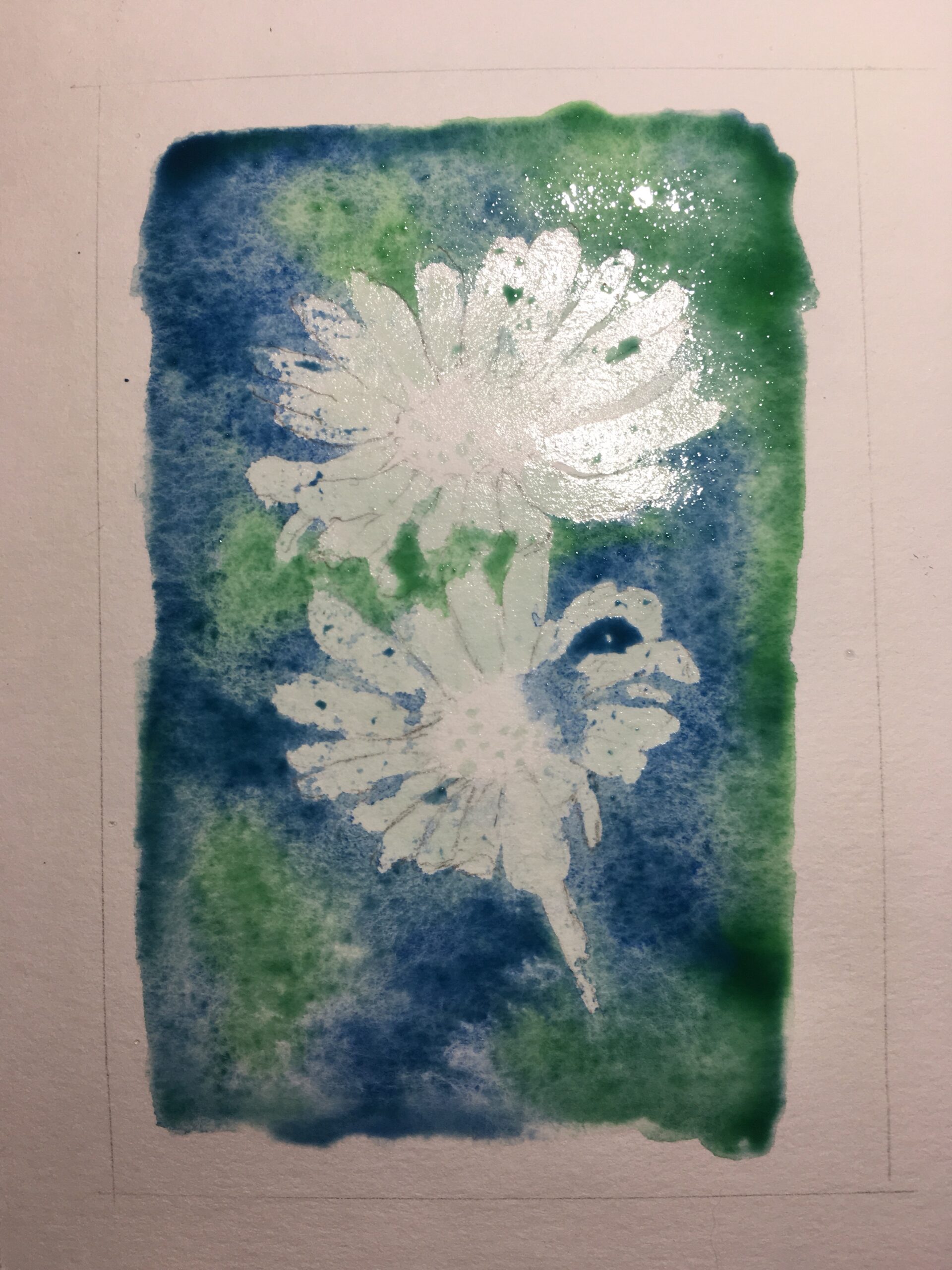
Once the fluid was dry, a used a wash of sap green and another of ultramarine, making sure to paint over the fluid but avoiding the center, so that areas between the petals that were not protected would be colored:
Once dried, I peel the fluid off the petals, leaving the dots at the center untouched. The dry fluid had turned into some rubber-like gum. Unfortunately, a fair amount of paper was torn in the process:

For the shadows on the petals I used light blue, thin violet, some of my ultramarine wash. I used yellow at the center:

To the yellow I added some burnt sienna and a bit of red, I painted the stem with two shades of green, and once the paper was dry, peeled off the remaining dots of gum at the center:

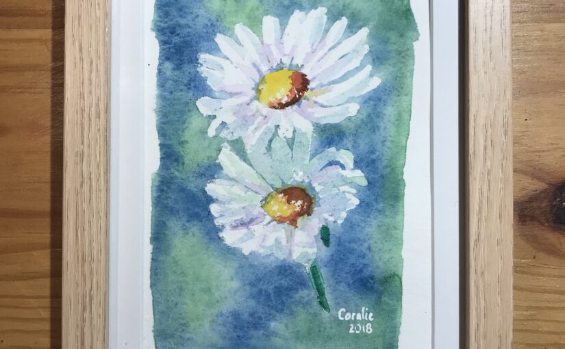
Here is the result (9×14 cm), framed (15×20.5 cm), and ready to be given to Caroline as a gift: