Making my own holiday cards is fun. Besides, I am keen on the notion of taking time to make something for someone I care about. I’ve hand-made my holiday cards every year for 5 or 6 years now. The time I spend making something for someone is time I spend thinking about them. The only thing missing is… well, them. But in most cases the people I make them for are far away. This year, with the COVID-19 pandemic and various states of lockdown or/and curfew, everyone was far away.
2020 was a rough year for so many people and I felt I could maybe share some love, that I tweeted that I was offering 20 hand-made cards to whoever wanted one. I had found a lovely pad of 20 thick smooth watercolor paper of roughly A5 size which once folded would make nice cards.

To my surprise, nobody responded.
I was puzzled. Perhaps the time wasn’t right? But Twitter shows the number of impressions (times in somebody’s timeline) and engagement (any interaction with the tweet) and after 4 days that tweet had been seen by over 200 persons, and interacted with by 20. Twenty. Exactly the number of sheets I could make cards with 😀

But then a friend of mine sent me a text message to “sign up”. Woohoo! Game on! That friend was surprised to be the first. That reinforced the idea that perhaps my first message wasn’t sent at the right time. Or perhaps people didn’t care. In any case, I added a tweet in response.
4 friends raised their hands. That’s it. 5 actually, as another friend raised hand three weeks later.
Oh well, I built a list of other people I wanted to send a card to, made and sent the cards to everyone! Most of them have made it already.
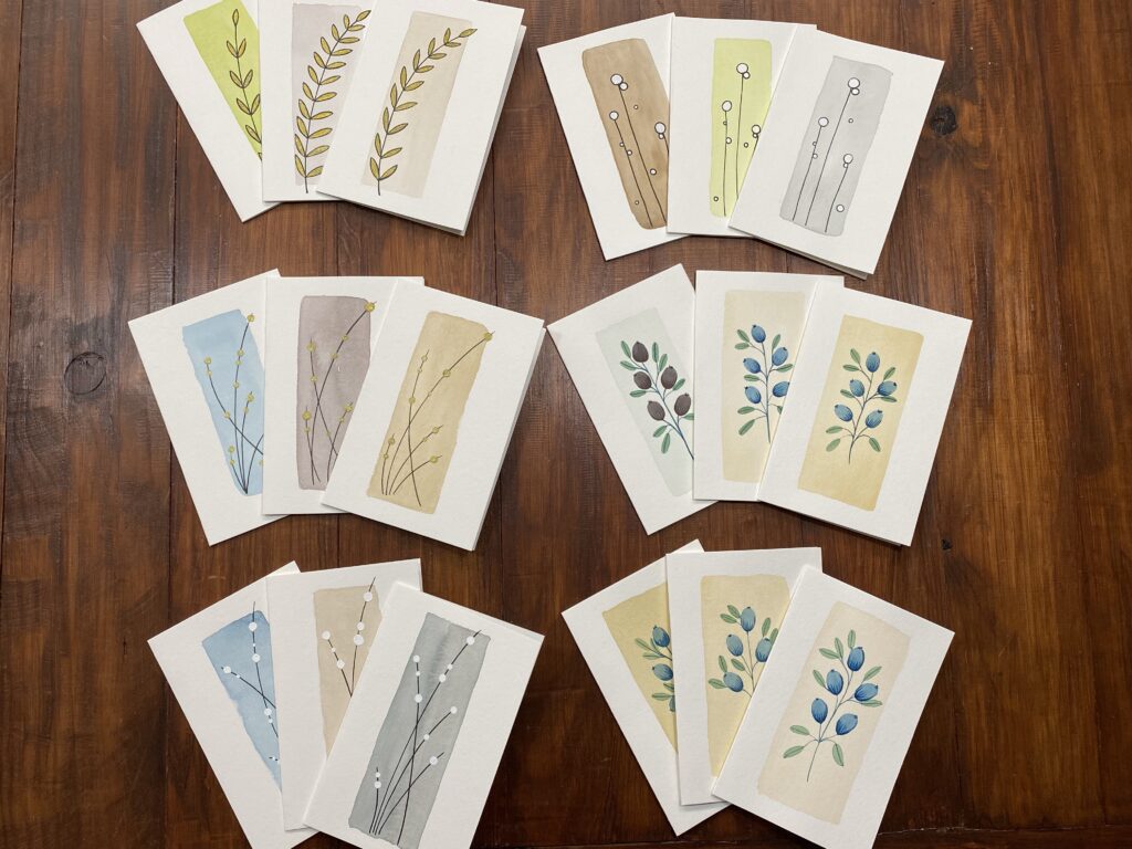
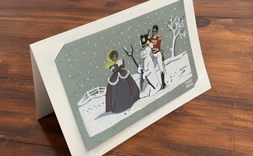
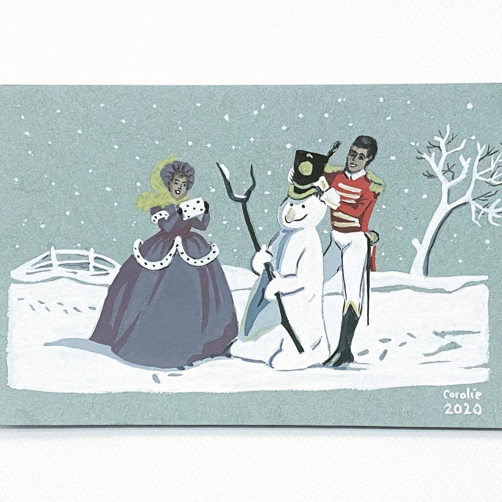
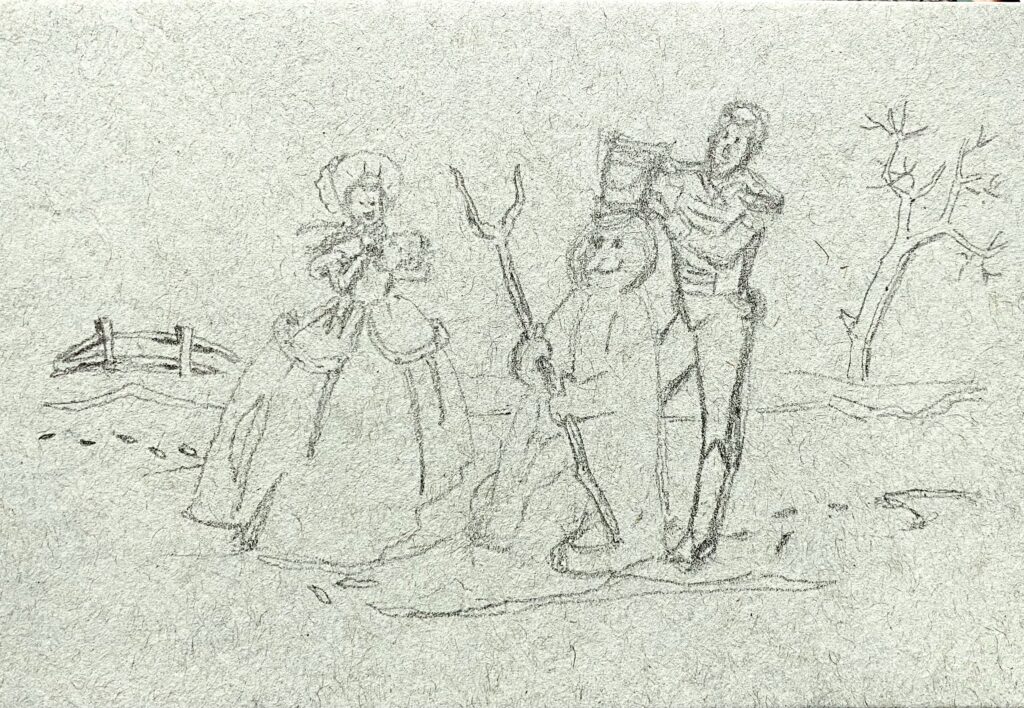
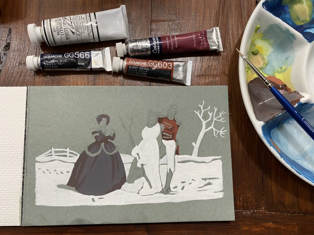
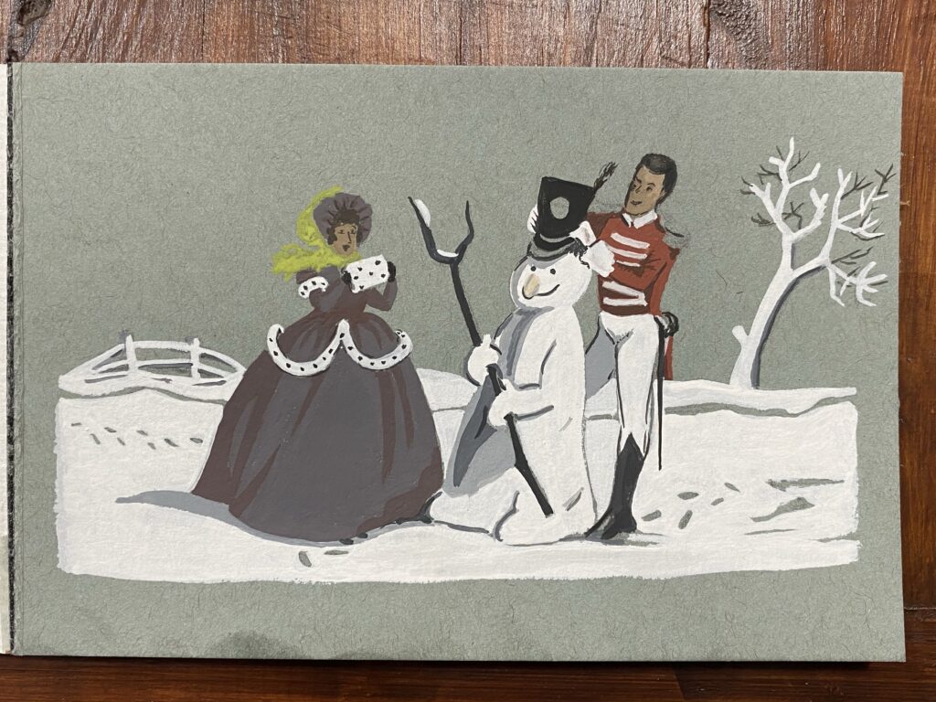
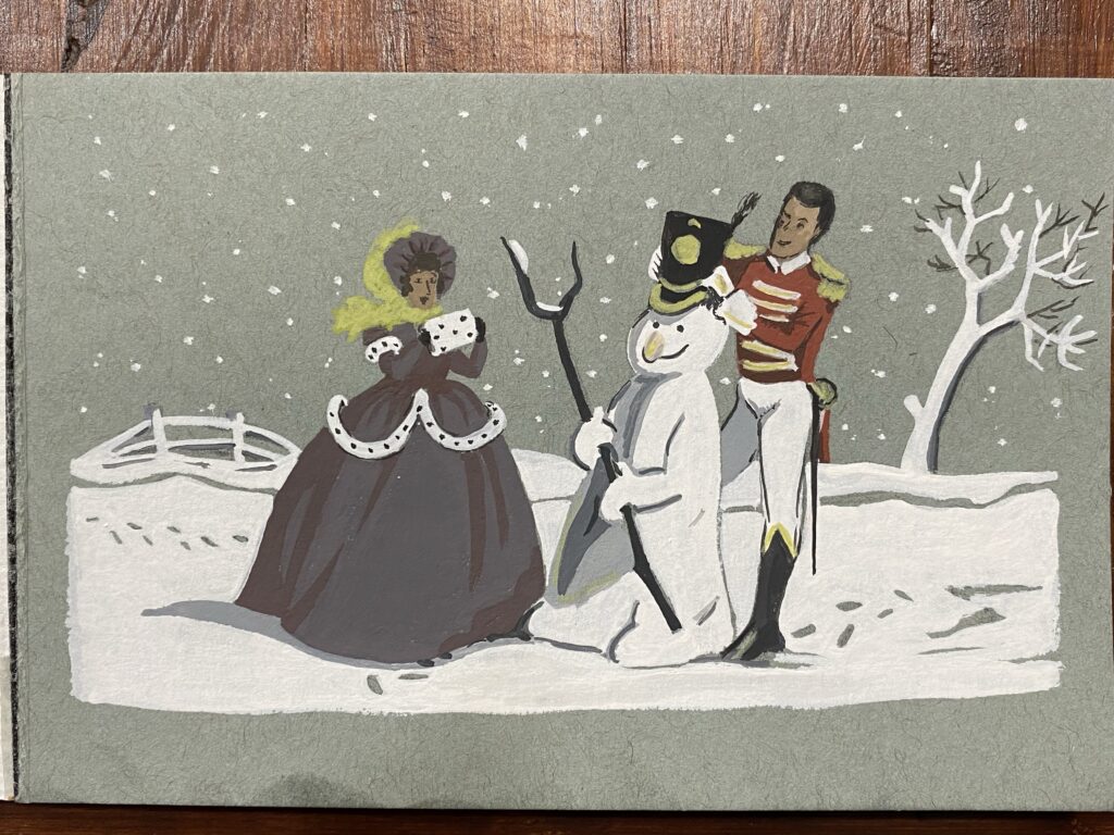
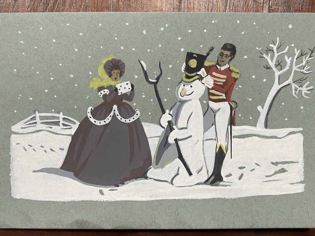
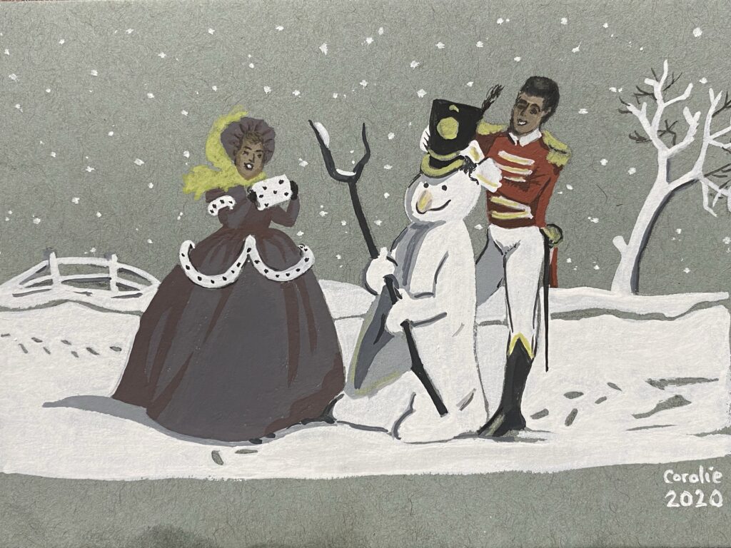
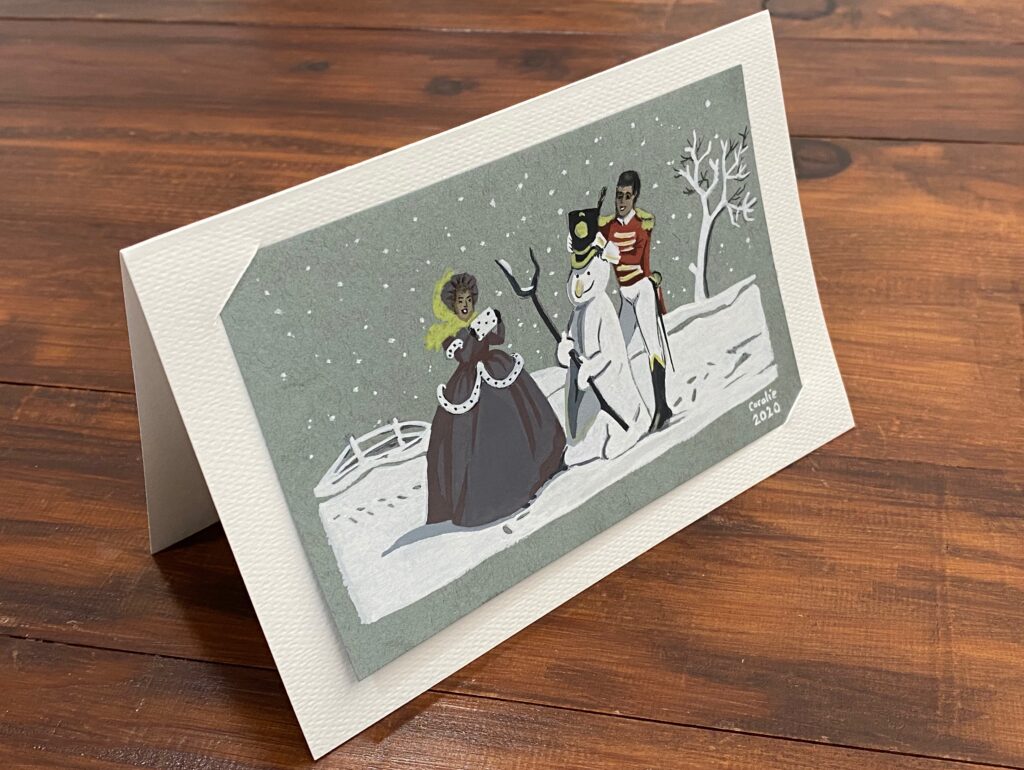
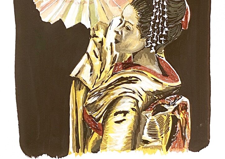
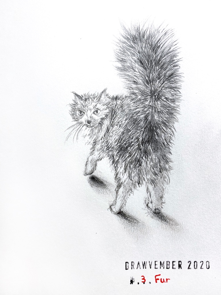
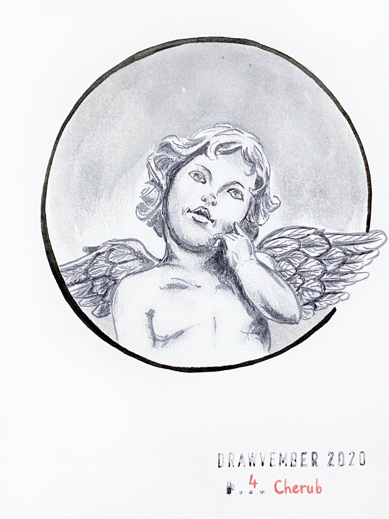
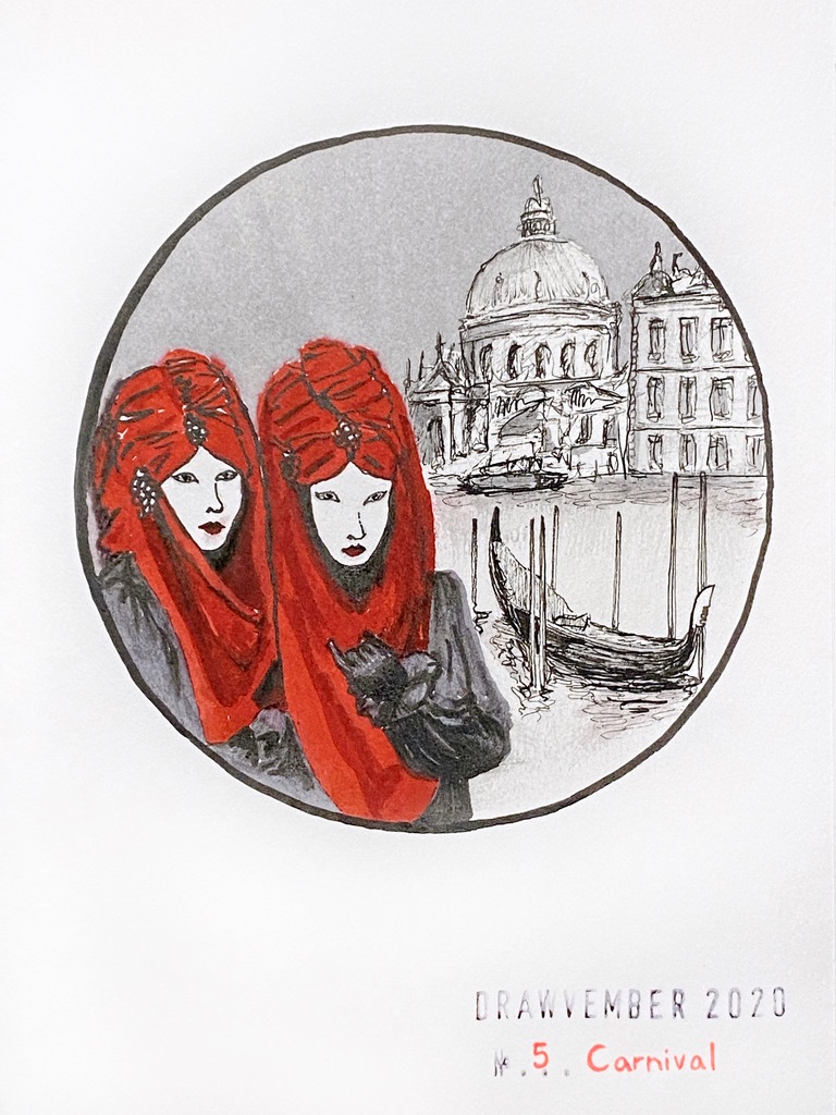
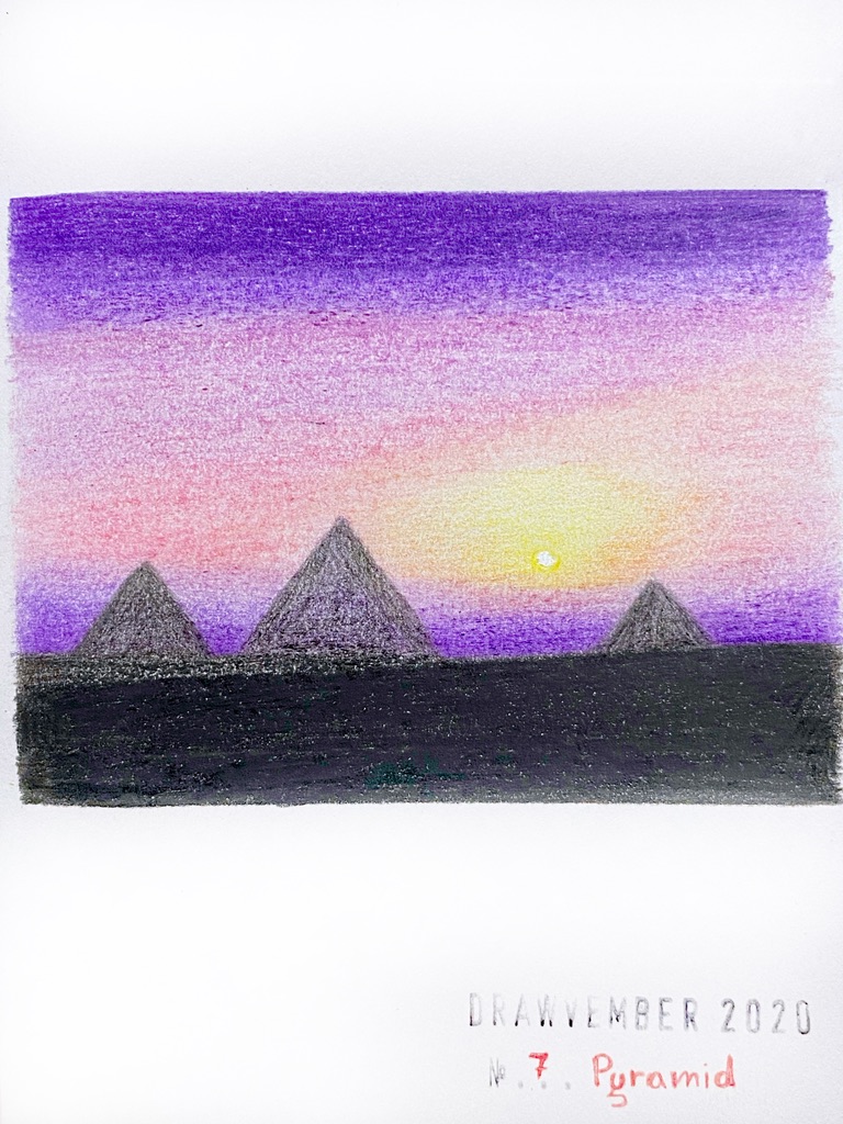
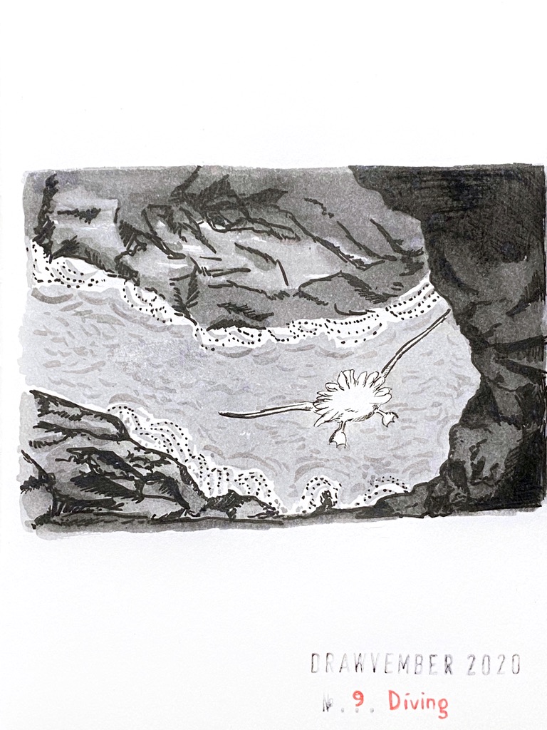
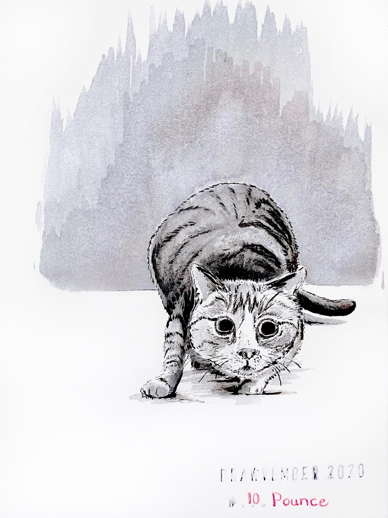
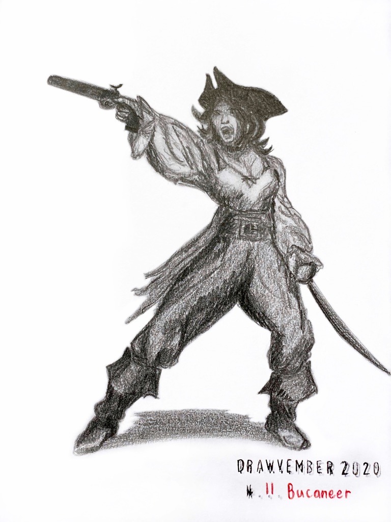
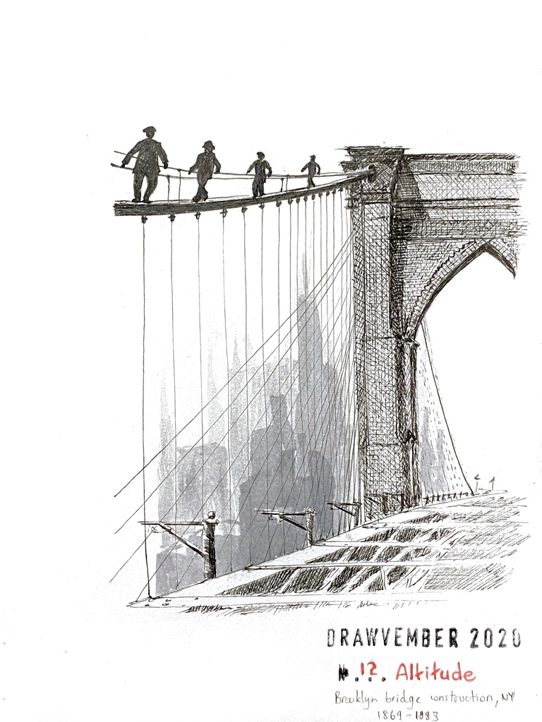
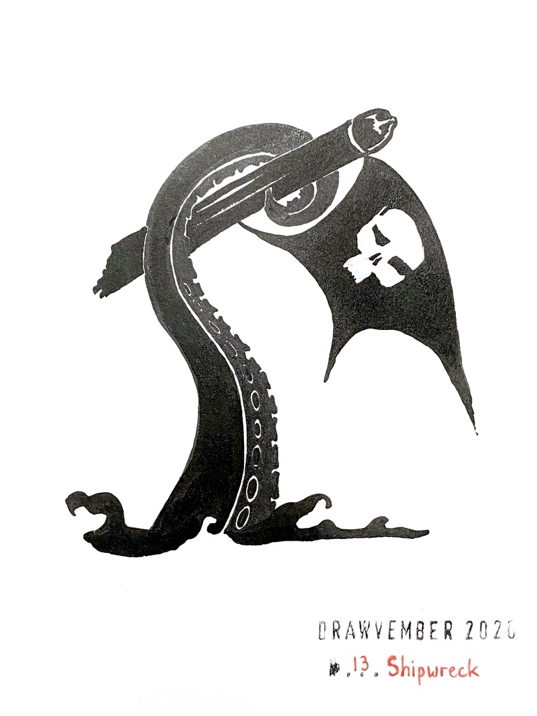
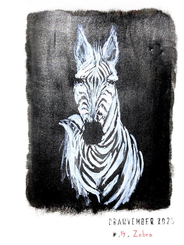
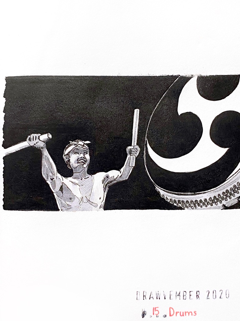
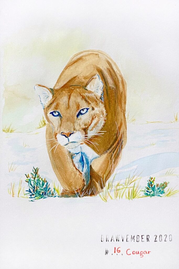
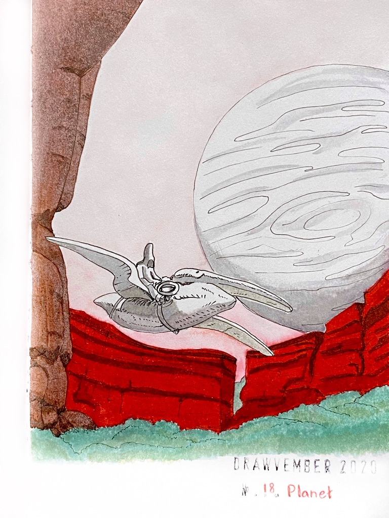
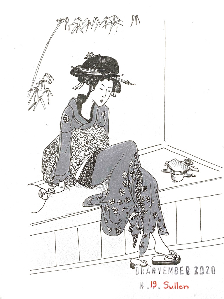
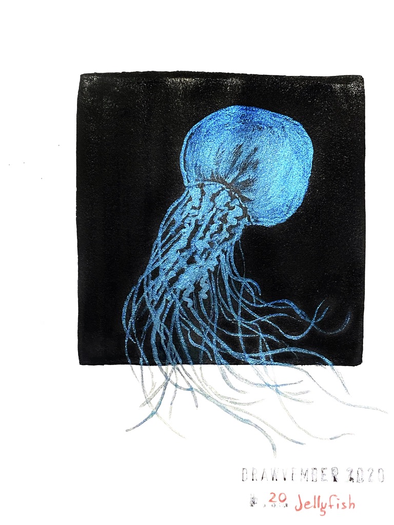
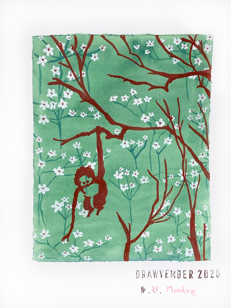
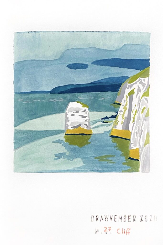
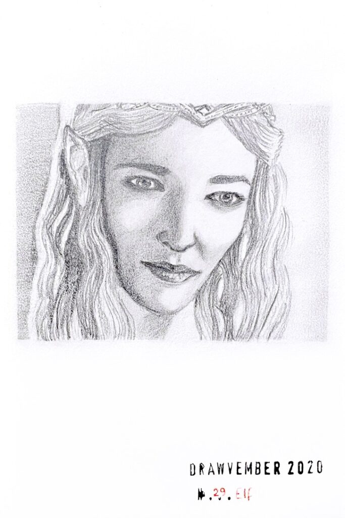
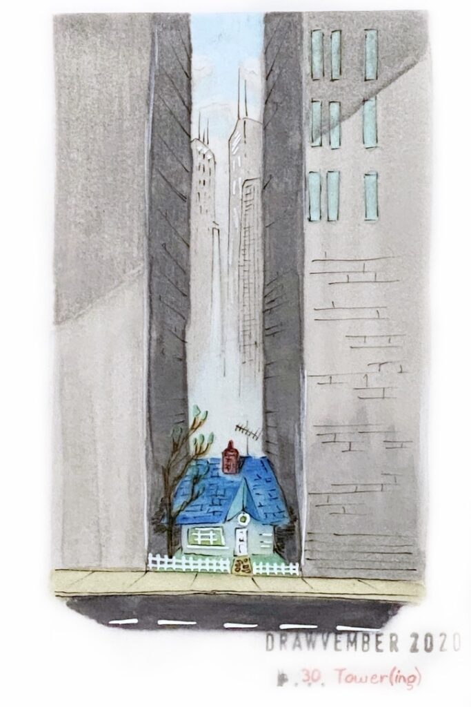
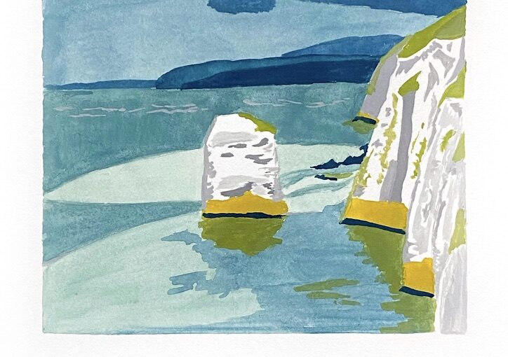
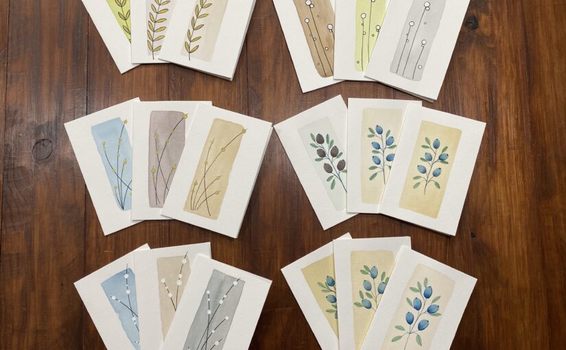
Here are 18 of them. I chose simple designs and a few colours: blue, sienna, grey, green that I mixed to obtain varying shades. I used gouache paint, a black pen, a white Posca pen, and a metallic gold pen. Inside I traced in pencil a couple lines in case people wanted to cut out the painting and use it as a bookmark. I wrote a personal holiday greeting in each of them.