Pranking

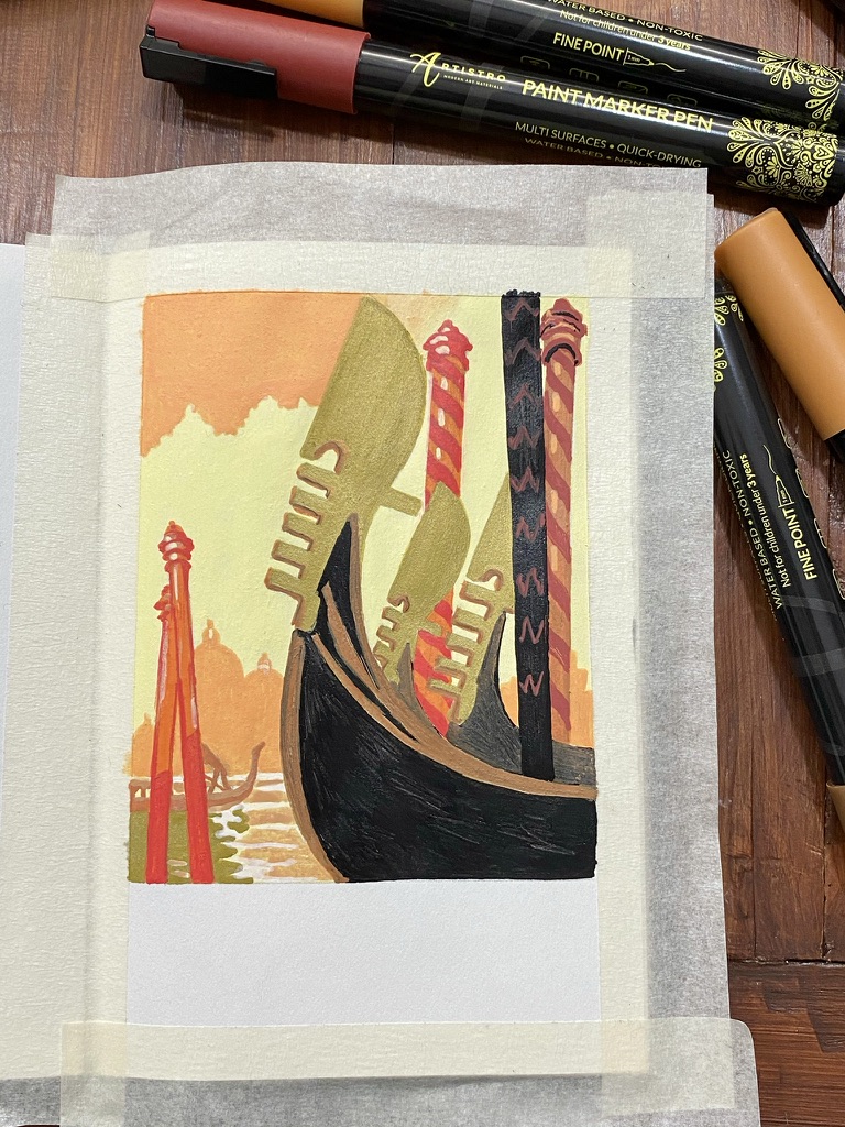
This week was a good week. I engineered a prank at work that brought much fun and entertainment, and made the week even better. A prank in 3 acts.

Act 1

We use Zoom for our meetings and when I noticed, just as I was leaving at the end of a meeting, that a colleague of mine wasn’t at his desk, I thought I just had missed an opportunity to take a screenshot of his room without him, and later use it as my own background image and see his face as he realized!

So I went back, found his room still empty and quickly took a screenshot. I was in the process of making my window bigger to take a better screenshot when he showed up. Uh oh! “Oh, you were waiting for me to return?,” he asked. I couldn’t quickly enough come up with a good excuse for the probably guilty look on my face, so I just fessed up. Good laugh was had. And see you next time, wink wink!

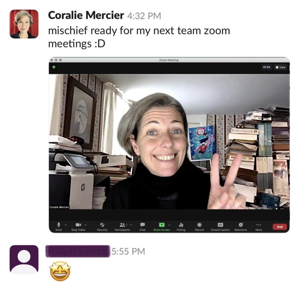
The next thing I did was to quickly edit out his name from the bottom left part of the screenshot. I saved the photo somewhere I could open it on my iPhone and used the “healing” tool of Snapseed (my favourite —and free— image edition software on smartphone), which basically redraws an area of your choice using its surrounding. Then I adjusted a bit the sharpness and reduced the noise to get the best out of that pretty small screenshot.

Then I tested it as my own Zoom virtual background 👌and gave him a preview.

Screenshot of an instant message conversation where I showed a picture of my zoom using as background the image I stole of a colleague's background. That colleague liked the result and gave a star-eyed emoji as response
a glimpse of what it looked like when I use this picture as my Zoom background

Act 2

I wrote to everyone-but-him in the team who usually attends our weekly all-hands meeting (which was the next day) and shared my “work” and the context, offering them to join me in escalating the prank, since I had been made.

And it turned out so so much better this way.

Response was high. But then, who isn’t in for a bit of harmless fun? Especially when it’s so easy to set up.

Someone had suggested some particular timing: our colleague usually gets to speak early in the meeting and that was going to be our cue to all switch to our virtual background of his soon-worldwide-office.

Act 3

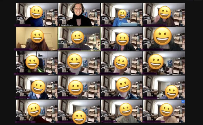
The meeting started as usual and people, who were a bit more numerous than habitual, kept a very straight face. Our colleague was called to speak and that’s when most of the tiles in the gallery instantly changed!

Screenshot of our zoom meeting where everyone (but one person) in the 4 x 5 grid of video feeds uses the same background image. Everyone's face but mine has been replaced by a smiley.
Screenshot of our zoom meeting where everyone (but one person) in the 4 x 5 grid of video feeds uses the same background image. Everyone’s face but mine has been replaced by a smiley.

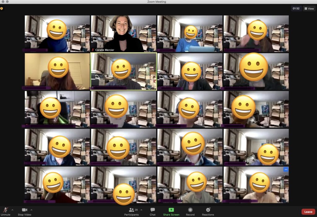
Everyone yielded to the smiles that had been suppressed and for a few moments none of us heard him. We were too focused on awaiting his reaction. And yet, he continued to talk, unaware, for a few seconds until wrapping up. At the exact moment he briefly paused, hesitated, apparently lost track of his thought and then finished his word, we knew he was finally looking at his screen and he was confused.

Mischief managed!

He was not expecting that, to our delight! Hearing his heartfelt laugh was such a reward. Another bonus was seeing live a number of colleagues who usually don’t share their video in meetings.

I enjoyed immensely seeing a whole room of smiling people.

Art: “Stand firm!” (step by step)

I’m really enjoying myself doing these poster art piece with acrylic paint markers!

This is my interpretation of “Stand firm!”, a World War II propaganda poster during the UK war effort, 1939-1946, by Thomas Purvis.

Masking tape applied to the artbook and pencil sketch of a lion

Masking tape and pencil sketch.

Orange-brown acrylic paint applied to the drawing. Next to the artbook are my mechanical pencil and the four acrylic paint markers I will use: orange, red, black and white.

I will need four colours: orange-brown, black and red, and white.

Black added to the line for the mane and the shadows.

The lion is taking shape.

Red background added.

Red background done. I wished the tip were larger because with 1-millimeter, it took a lot of back and forth and the strokes are very visible on the paper.

White highlights added to the face of the lion and several areas of its body. The tail is now painted black.

Now that the lion is finished, I added highlights.

Black rectangle painted at the bottom.

Black rectangle at the bottom.

Block lettering done to write "stand firm!" in white in the black rectangle.

I used a different white acrylic paint marker after all.

Finished work in the open artbook on a white table, dated and signed

Art: Venezia (step by step)

The subject is an advertisement poster for Venice that I found in the 2010 calendar I got in Venice in 2009, and which I kept because the illustrations are pretty.

Canson artbook, 10,2 x 15,2 cm (4 x 6 in), 96 g/m2 (65 lb). It took me 3 hours, although it felt much quicker.

The paper is almost too thin for this medium (the paper warped), and a bit too small for this level of detail. I’m using a set of 30 acrylic paint markers from Artistro that have a fine tip that is 1 millimeter wide. At this scale, one millimeter is pretty thick. I find that thinner lines can be achieved in swift strokes, but that is at the cost of precision (in my case).

Masking tape, pencil sketch of the front of gondolas, mooring posts and basic shapes for buildings, next to the reference image at the top of a tall narrow calendar.

Pencil sketch that will be covered by the acrylic paint.

Sky, city line, silhouette of gondola and water painted in shades of yellow, orange and gold. There is an envelope on the back of which I try out the colours.

I do not have the exact same colours as the reference image. I’m trying out the pens I have on the back of an envelope.

I found colours that I think will work well together.

More gold, a lot of black, some brown, red and orange for the big gondolas and the mooring posts.

Close-up of the main drawing nearly done now that the gondolas and mooring posts are coloured.

Photo showing the work in progress with now a large vivid blue rectangle at the bottom, the calendar at the right, and 12 acrylic paint markers I used.

Almost done! All I need to add is “Venezia” in block letters at the bottom, and remove the masking tape.

Finished work in the open artbook on a white table

Art: Fairey Fulmar taking off

Now that I’ve started doing pieces of Art Deco, I naturally and happily venture into propaganda poster art!

This is a Fairey Fulmar taking off from an armored flight deck (apparently a feature of British carriers) during World War II.

My kid liked it, so I put it in large frame and it now hangs on his wall.

Mixing blue and white gouache paint in a ceramic pan with a toothpick

Mixing blue and white. This is going to be the main colour.

Mixing black and white gouache paint in a ceramic pan

Mixing black and white. Grey is going to be the colour of the visual components.

Overview of the finished 21x15 cm painting on a cutting mat next to the ceramic pans of the mixes I used: grey, white and blue.

I painted this on the back of a cereal cardboard box (21×15 cm).

I love how it turned out!

The finished 21x15 cm painting, signed and dated, glued to a back sheet and put in a large frame with a white mounting card.
The finished 21×15 cm painting, signed and dated, glued to a back sheet and put in a large frame with a white mounting card.