Art: Art Deco ad for Herkules Bier (step by step)

I’m experimenting with two things: Art Deco which is a style I absolutely LOVE, and acrylic paint markers. The opaque and consistent colours they achieve lend themselves very well to this type of highly contrasted art.

This is after an Art Deco ad for Herkules Bier from the 1930s.
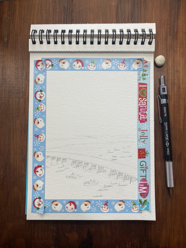
Masking tape on a small pad of watercolour sheets (the size of a large postcard), pencil sketch of a muscular man flexing his biceps. My mechanical pencil and rubber are on the cutting mat next to the drawing.

Pencil sketch.

I started painted the head, neck, shoulder and part of the left arm. The markers I used are on the cutting board: black, bright orange, pale orange, pink-orange and pale yellow.

It’s a very zen thing to apply patches of colours in various spots and try to achieve gradients. So far so good.

All colours and shadows are done, with the same markers.

Finished! I used only four shades of yellow to orange, and black. All I need to do now is apply a pale blue layer as background.

I fixed several proportion problems that became obvious the next day 🙃

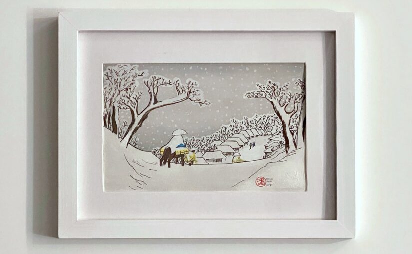
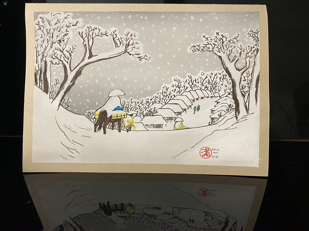
One shoulder was visibly smaller than the other, the neck was not in the center and the waistline was too thin (it is notable that in the reference image, the waistline was too thin and the neck wasn’t exactly centered either.) Here is the fixed version which I framed:

Finished version with a light blue background, which I signed and dated, and framed in black wood.

I was researching this particular ad to learn more about its history and who created it but I didn’t find a lot of hits. However I found a comical review someone wrote about it in an Art Deco book that features this image:

“On page 89 is an ad for Herkules Bier “aus dem Hasenbrau-Augsburg.” The sinister, leviathanic, muscle-bound, fist-clenched figure uses one of the hallmarks of Art Deco—deep shadow to enhance contrast—to convey a message as self-contradictory as it is threatening: Drink this and it won’t go to your belly, it will build the muscle of Germany. Rage is power, and watch out you fops of Versailles.”

Art: Fujiwara, 38th station of the Tōkaidō (Kyoka edition)

Fujiwara, 38th station of the Kyoka edition of 53 stations of the Tōkaidō, by Hiroshige.

Final painting propped up against my black piano. The painting shows a caped person from behind, on a horse loaded with crates at its sides. At the foot of the raised area they are is a village and a few people. There is snow everywhere and people wear large hats and capes.

I messed up my stamp and then couldn’t paint over it with gouache as the red stamp ink I use kept seeping through! I had to cover it with acrylic white paint which is like plastic, but also is shinier than gouache, so it shows.


Here is a photo of my work area just as I was done:

Messy work table where we see the finished painting taped to a large cutting board in front of the propped up book I used as reference. The tools I used are scattered around: paint tubes, white acrylic paint marker, black and grey ink pen, brushes.

I did a second version of it the following week.

Art: Ryōgoku Hanabi (Fireworks at Ryogoku), Hiroshige (step by step)

My first painting of the year 2021! It seems appropriate as a new year’s first painting to be one of fireworks.

I set out to paint Ryōgoku Hanabi (Fireworks at Ryogoku) by favourite artist Hiroshige (1858). Here’s a step by step progression.

Masking tape on a watercolour sheet with pencil sketch of a large bridge and many boats on the river. My mechanical pencil and tiny rubber are visible on the table.

Masking tape in place, pencil sketch done.

Top and bottom painted with a gradient of deep prussian blue. The gouache paint tube is visible next to the pad on the table.

Gradient of prussian blue for the night sky and the bottom part of the river.

Bridge, boats, village, tree line and vegetation added, as well a many tiny people on the bridge. I used yellow ochre gouache paint mixed with ivory black to get the brown and darker brown tones. The tubes are visible on the table.

Bridge, boats, village, tree line, people.

Finished version, signed and dated at the bottom right, against a black backdrop.

Fireworks added in white. Tape removed. Signature and date added.

Finished version framed: the painting is glued on some light taupe paper and the frame is taupe wood.