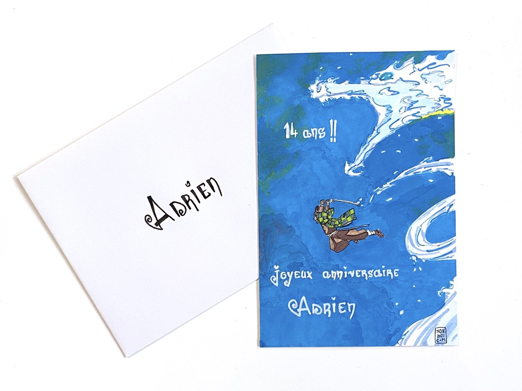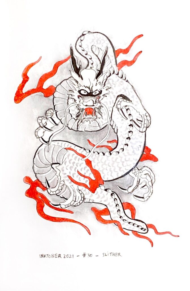
A couple of days ago, I drew a card and did some lettering for my son at the occasion of his 14th birthday today. (He loved it)
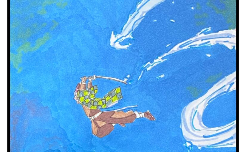
This is some fan art of Demon Slayer, a manga/anime he’s a fan of. This is Kamado Tanjiro and his water dragon.
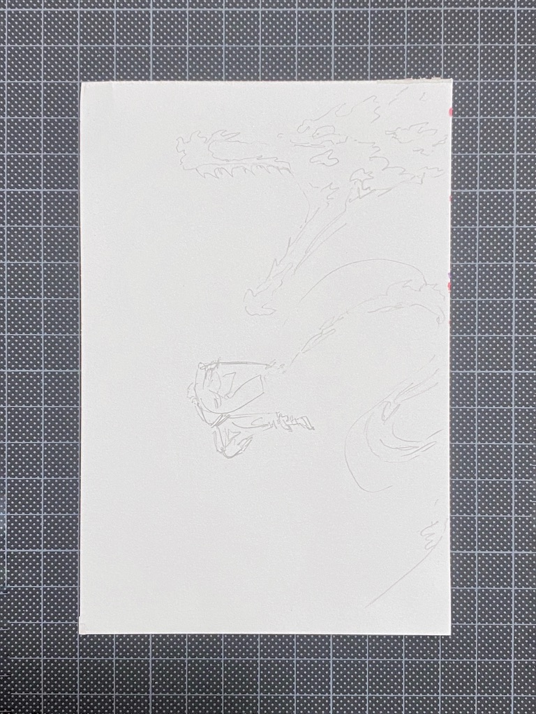
Rough pencil sketch on a Bristol paper card.
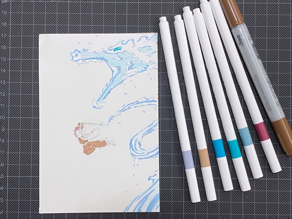
I’m using alcohol ink markers. I don’t have many and I don’t have the right colours.
At this scale I had a bit of a hard time filling the small areas in brown.
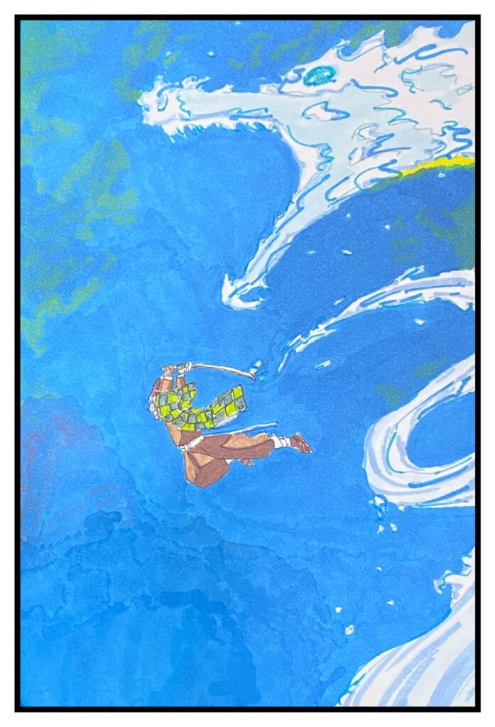
The paper did something weird with the medium which did not blend as it does normally. I don’t mind the texture, but it wasn’t intended.
I managed to get some contrast on the character’s outfit.
I realised belatedly that the dragon’s contrast was insufficient, however.
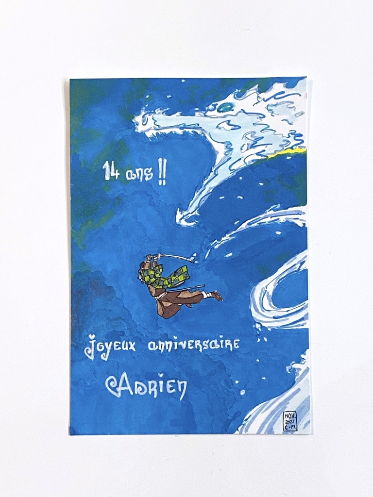
I have been using the same sort of lettering for a few years now, more of less. It’s always the same letters 🙂
I used a white acrylic paint marker.