Making my own holiday cards is fun. Besides, I am keen on the notion of taking time to make something for someone I care about. I’ve hand-made my holiday cards every year for 5 or 6 years now. The time I spend making something for someone is time I spend thinking about them. The only thing missing is… well, them. But in most cases the people I make them for are far away. This year, with the COVID-19 pandemic and various states of lockdown or/and curfew, everyone was far away.
2020 was a rough year for so many people and I felt I could maybe share some love, that I tweeted that I was offering 20 hand-made cards to whoever wanted one. I had found a lovely pad of 20 thick smooth watercolor paper of roughly A5 size which once folded would make nice cards.
To my surprise, nobody responded.
I was puzzled. Perhaps the time wasn’t right? But Twitter shows the number of impressions (times in somebody’s timeline) and engagement (any interaction with the tweet) and after 4 days that tweet had been seen by over 200 persons, and interacted with by 20. Twenty. Exactly the number of sheets I could make cards with 😀
But then a friend of mine sent me a text message to “sign up”. Woohoo! Game on! That friend was surprised to be the first. That reinforced the idea that perhaps my first message wasn’t sent at the right time. Or perhaps people didn’t care. In any case, I added a tweet in response.
4 friends raised their hands. That’s it. 5 actually, as another friend raised hand three weeks later.
Oh well, I built a list of other people I wanted to send a card to, made and sent the cards to everyone! Most of them have made it already.
Here are 18 of them. I chose simple designs and a few colours: blue, sienna, grey, green that I mixed to obtain varying shades. I used gouache paint, a black pen, a white Posca pen, and a metallic gold pen. Inside I traced in pencil a couple lines in case people wanted to cut out the painting and use it as a bookmark. I wrote a personal holiday greeting in each of them.
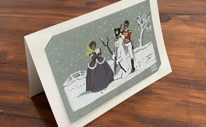
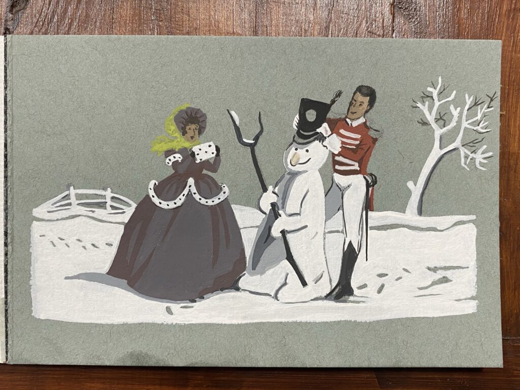
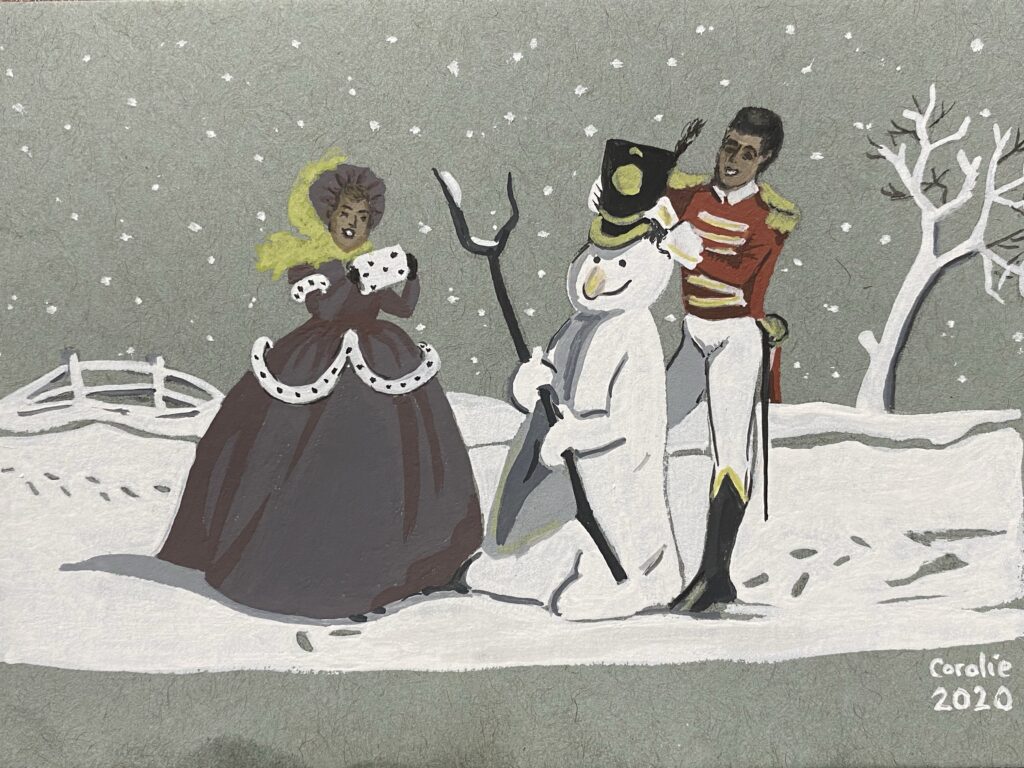
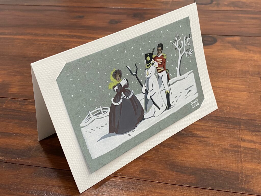
I will be mailing my parents their Christmas presents this year. And since my mum was so happy last year with my drawing of the Mackintosh’s Quality Street characters Soldier and Lady, I painted her a Christmas card with them making a snowman.
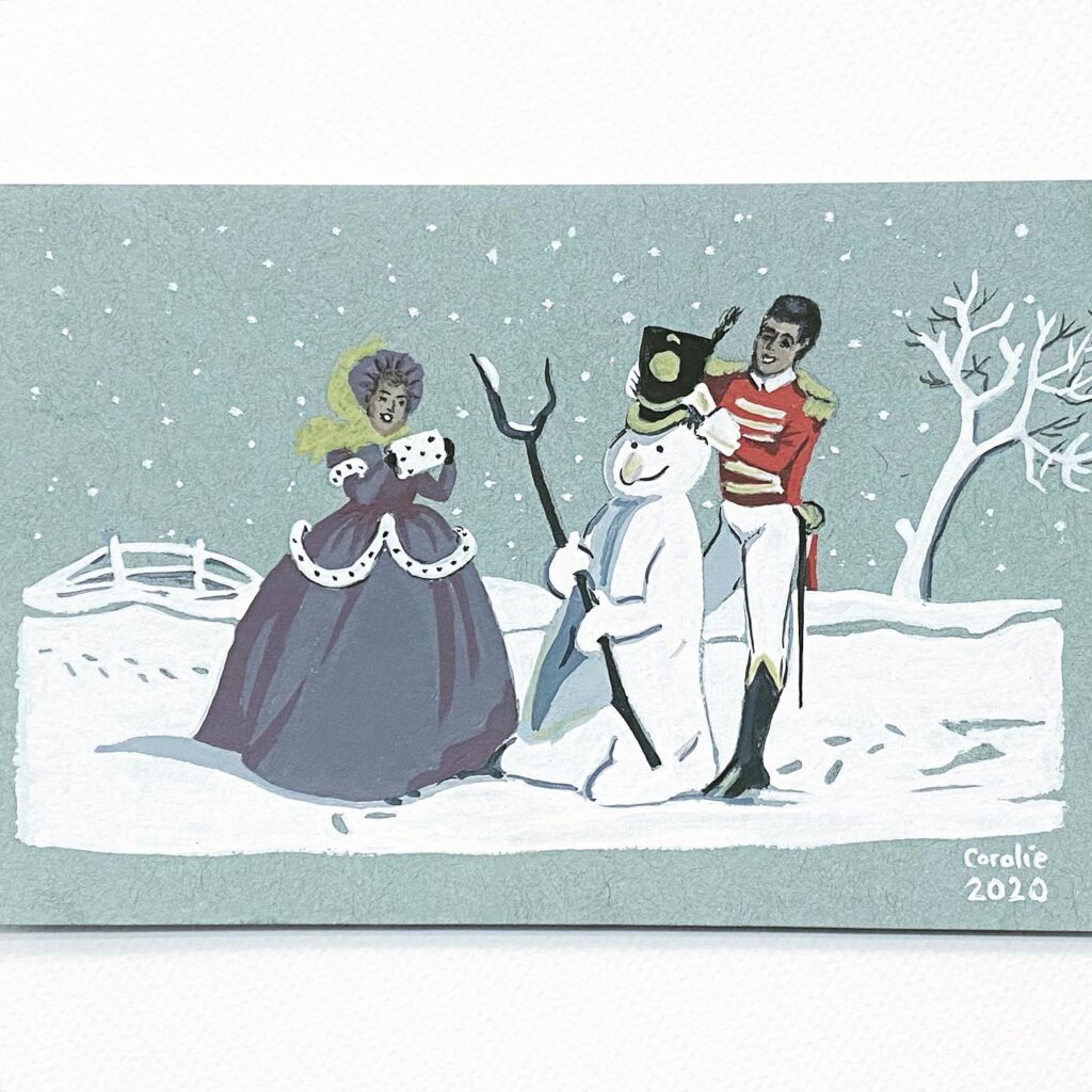
Finished version of the “Soldier & Lady making a snowman” postcard painted with gouache
This is one of their design from the 1960s, I think. From the side of a tin box.
Step by step
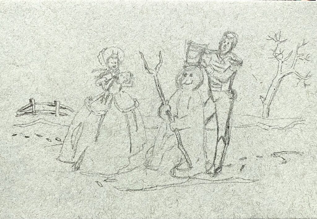
Pencil sketch. The background being grey, I chose a toned paper so that I would only have to add colours and white on top of it. It’s from a Toned Blue Mixed Media vellum surface pad from Strathmore. The blue looks more like a grey. It’s 4 in. X 6 in. (10.2 x 15.2 cm), 184 lb. (300 g/m2)
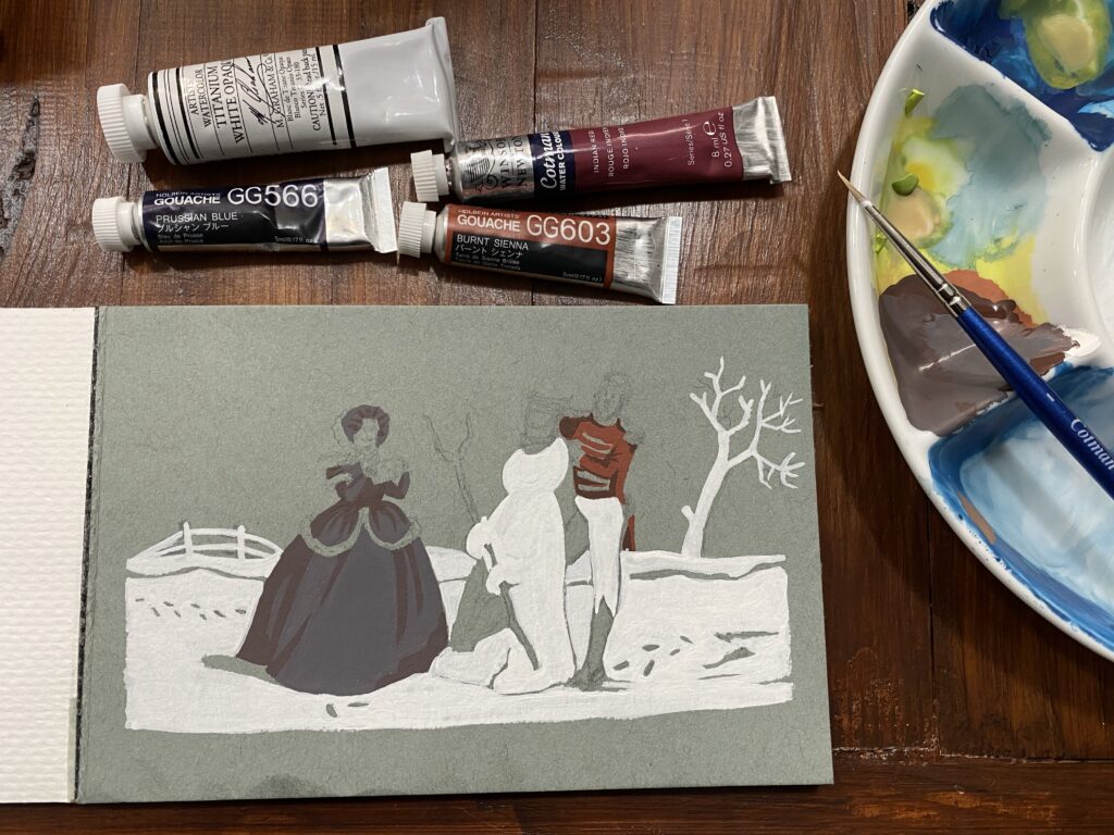
I have only a few tubes of gouache paint and watercolour to mix colours. I knew the painting colours would not be faithful to the original, in particular the Lady’s dress which is supposed to be pink and fuchsia. For the Soldier’s red jacket, I mixed burnt sienna gouache with titanium white opaque watercolor and ended it with a pinkish orange, to which I added Indian red watercolour and was satisfied. For the dress, I added white and a little bit of Prussian blue to my orange/red mix. The resulting colour was plum, and this was fine. I added more of the red mix and used that for the darker parts of the dress. Then I used titanium white watercolour to paint the snow, leaving untouched the areas of the footprints and shadows.
I needed a few shades of grey for shadows on the snowman, under the dress, and on the soldier’s leg behind the snowman. For the faces I applied white and brown. Then I used some ivory black to decorate the dress’ fur, paint the hat, boots, Soldier’s hair, the snowman’s stick and eyes, and the shadows of the tree. The Lady’s scarf was supposed to be blue and dark green, but with a dark plum dress I thought leaf green was going to be better.
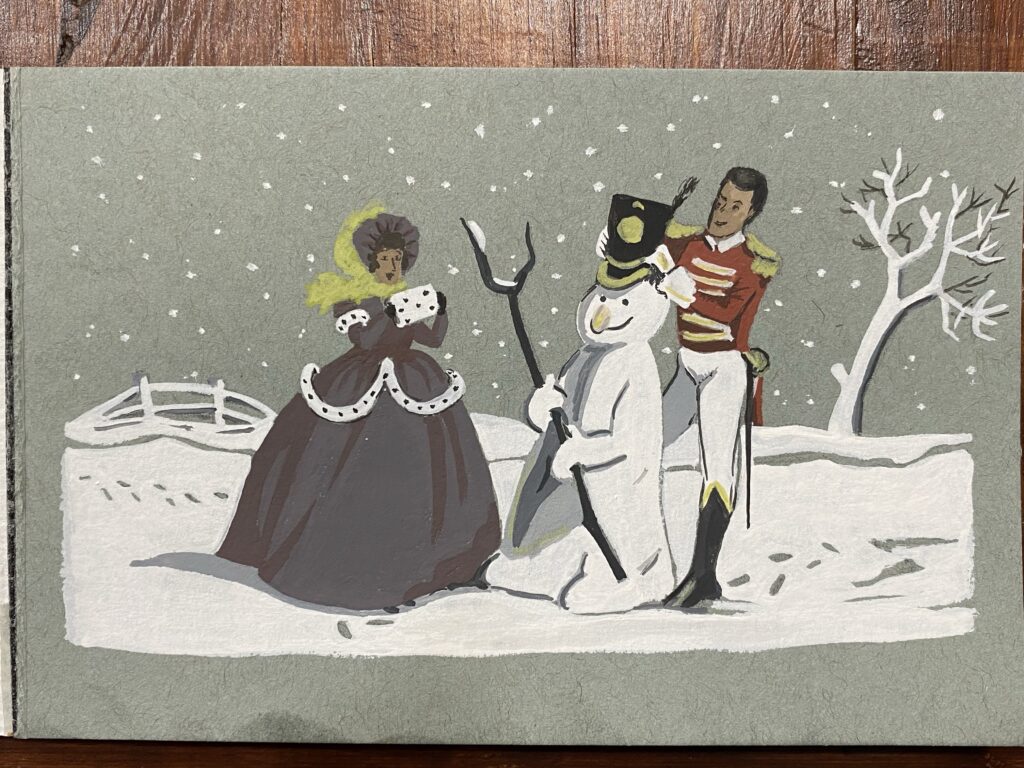
Snowflakes! I used a white Posca pen to add dots that I immediately tapped with my finger to spread the ink unevenly. Then I added yellow ochre to my green to obtain something that passes for gold so I could finish the Soldier’s hat, the top of his boots, the decorations on his shoulders and the handle of his sword.
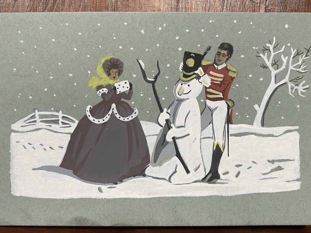
I wasn’t happy with their faces so I attempted to make them better. In retrospect, the faces were fine as they were!
I fiddled some more with their faces and as soon as I had managed to make them look a bit less weird, I stopped. I made them look happier in the process, so it’s all good. I added a touch of white for the teeth, which aren’t visible in the original, but since their faces were so dark, I thought it would be a good alteration.
I didn’t want to write on the painting in case my mum wants to frame it. So I folded a white sheet from my cheap watercolour paper block, cut a couple slits and inserted the painting. I will write inside and will mail everything tomorrow!
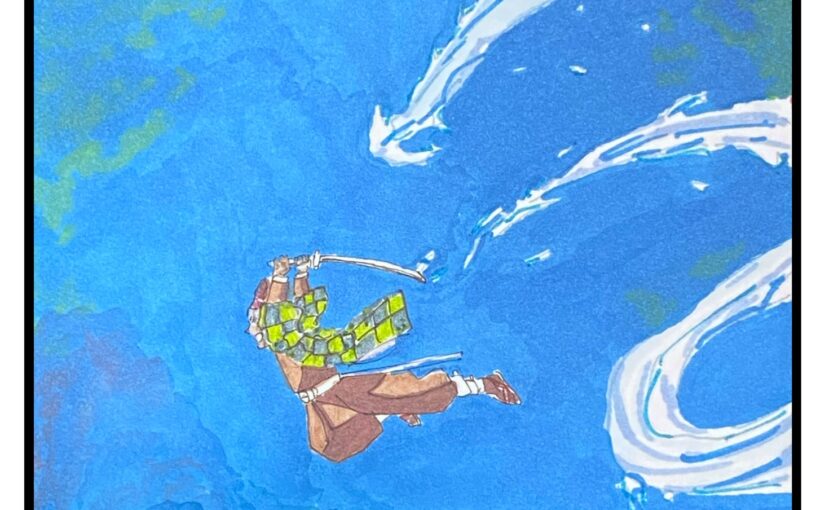
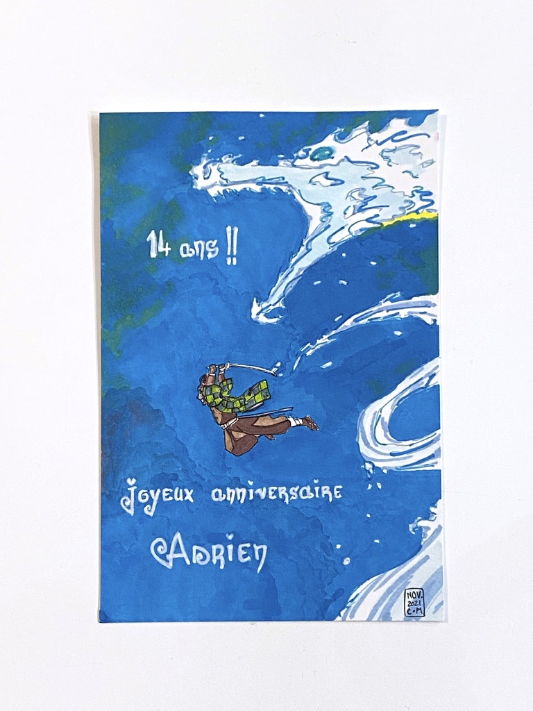
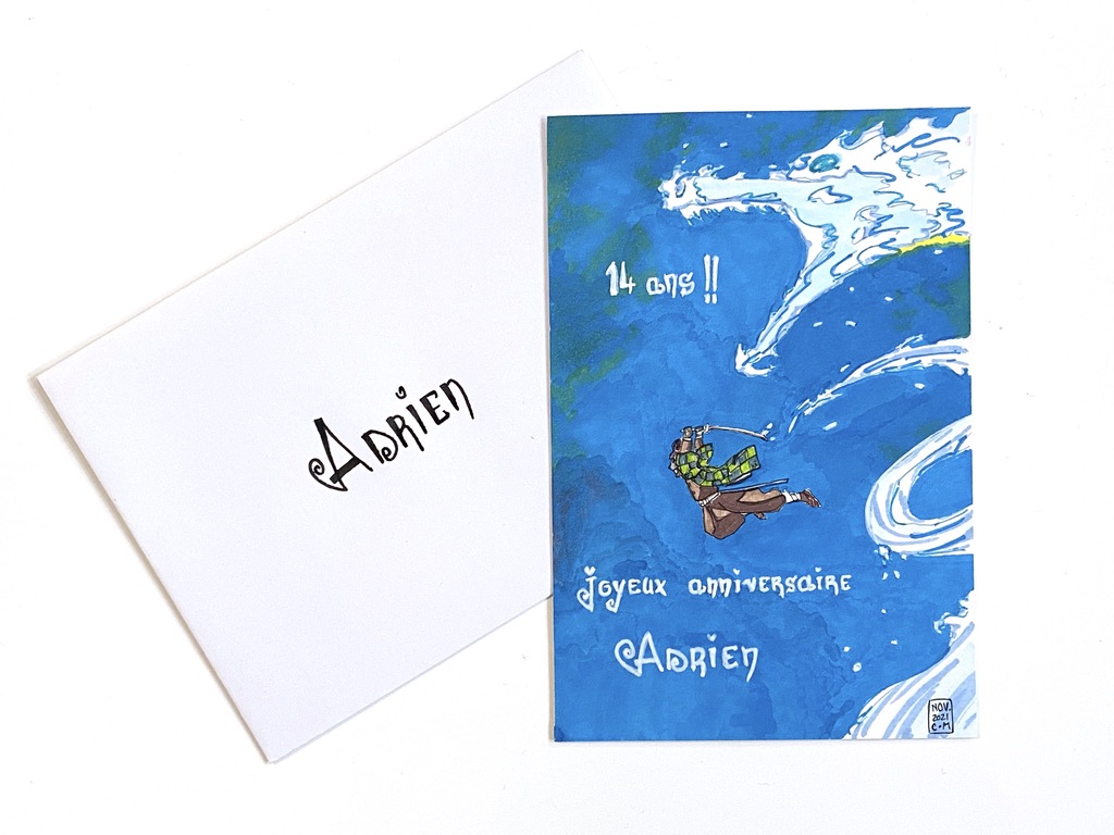
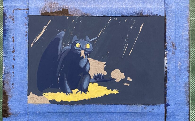
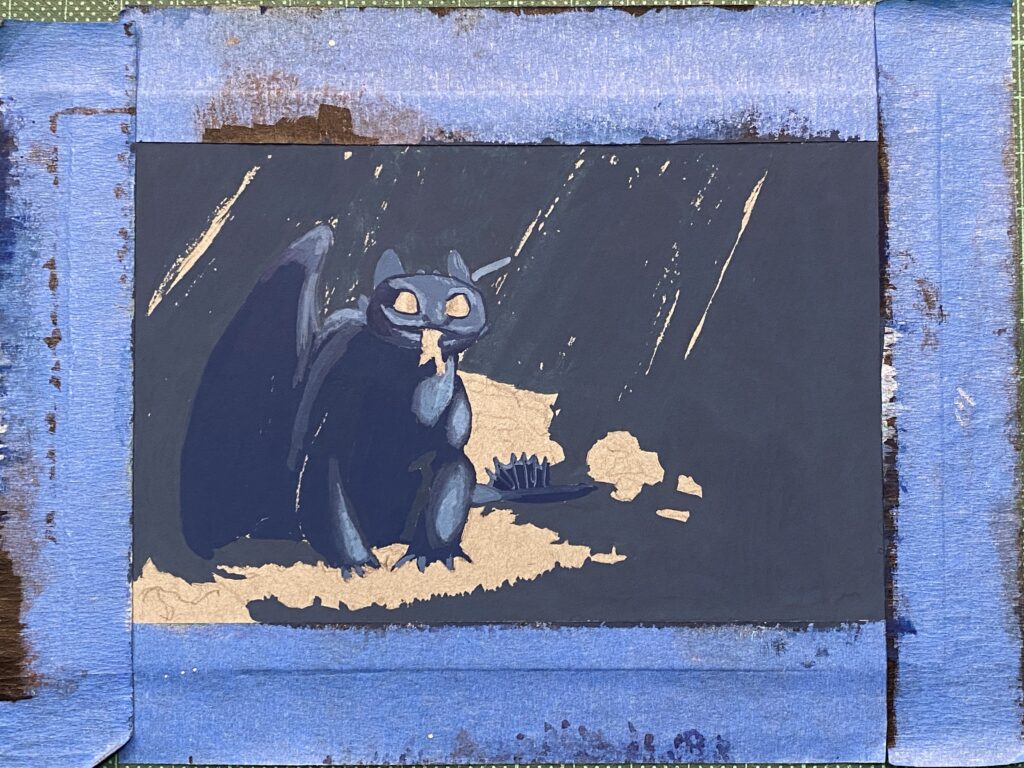
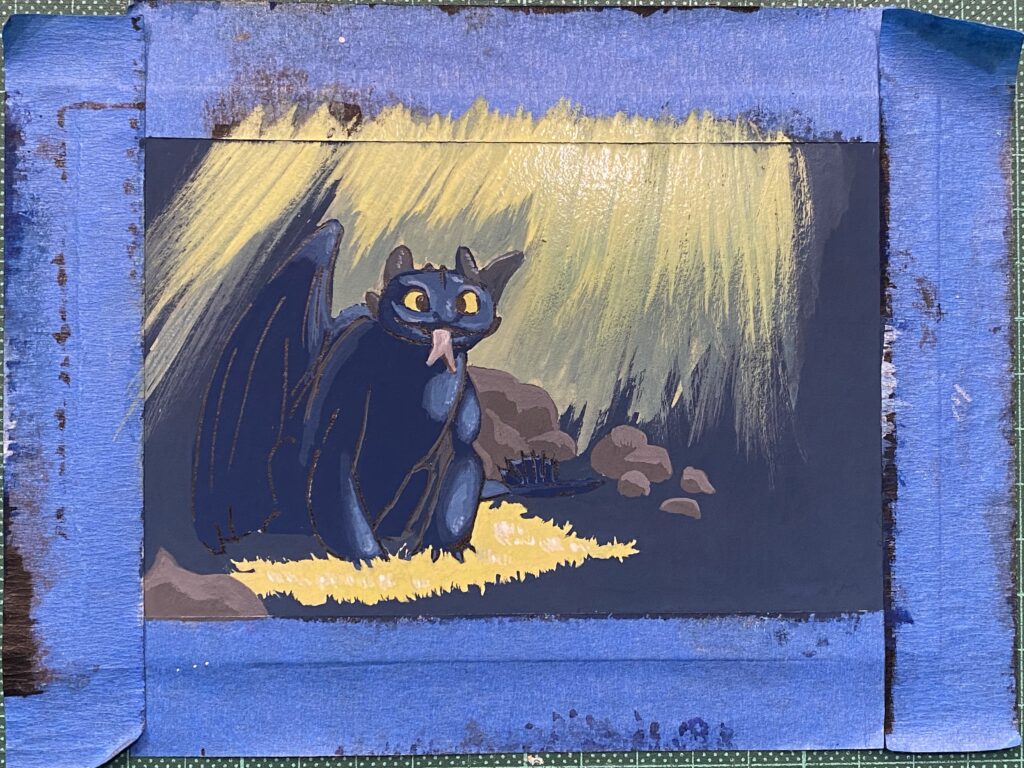
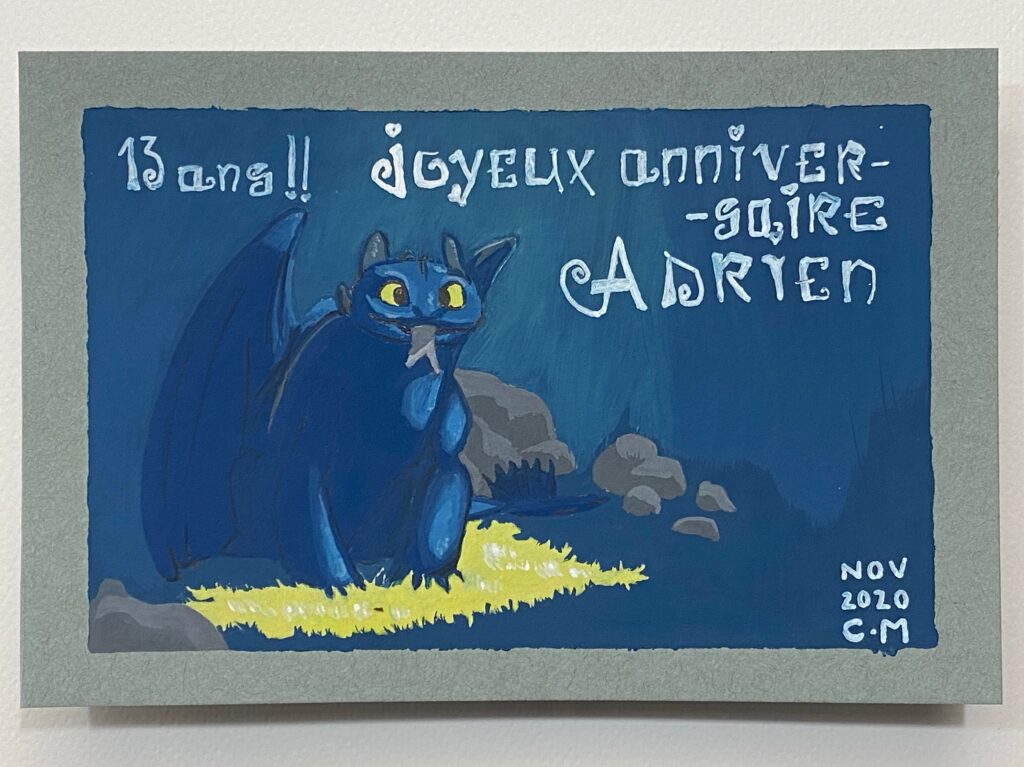
I made a habit these last few years to hand-make my son’s birthday cards. This year I did something new: asking HIM what theme he wanted me to explore. Toothless, from the movie “How to train your dragon”, he said. Ok! I love this character: he’s in fact a cat. With scales and wings.
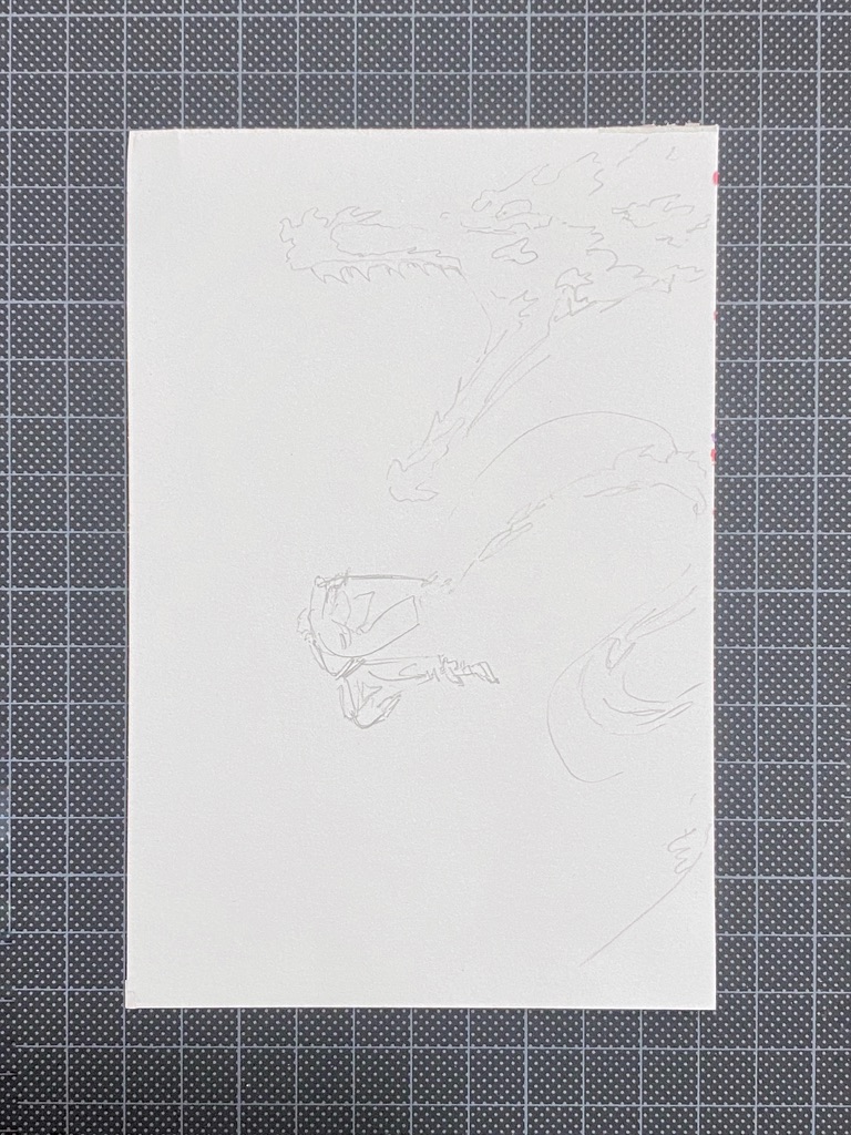
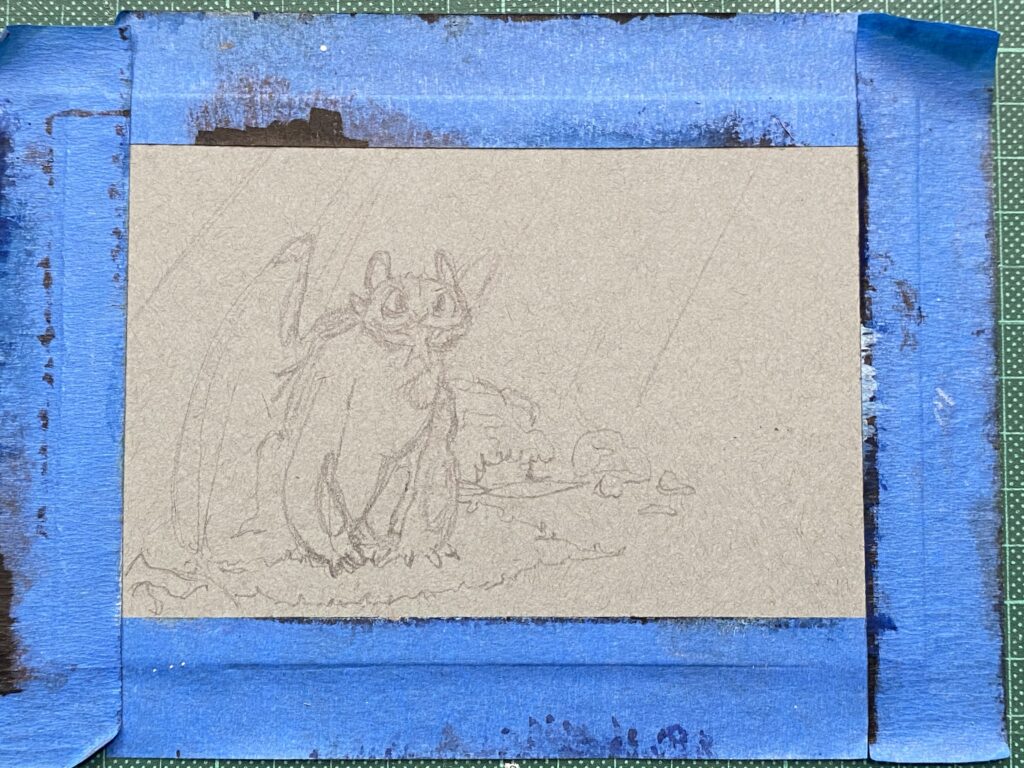
I started with a pencil outline on toned thick paper, the size of a postcard.
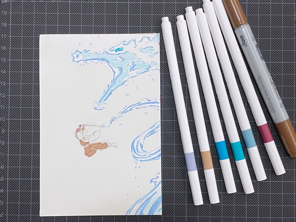
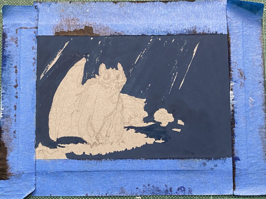
Then I mixed my Holbein Artists gouache paint: Prussian blue and ivory black and added titanium white (just a teeny bit), which I laid on the paper. I made sure to be as precise as I could
I mixed further my blue mix: more blue and black for the areas of the dragon that were in the shadow, and more white for the parts of the dragon that were illuminated.
Then I used leaf green mixed with with to paint the grass underneath and his eyes.
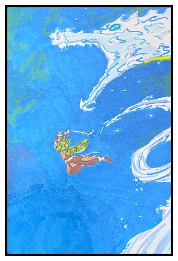
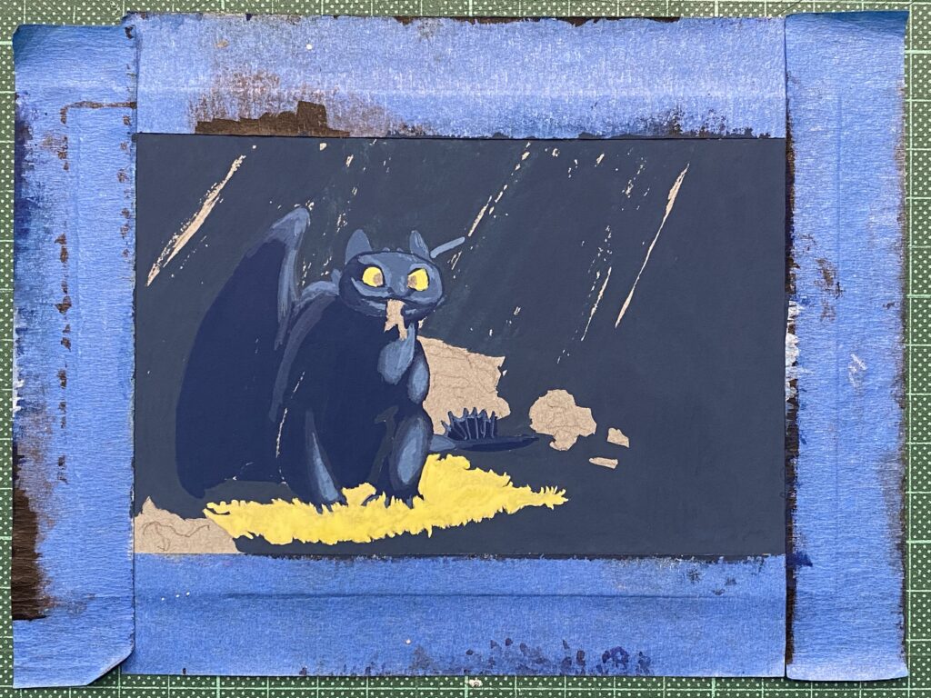
Here, I had a very precise idea of what I wanted to achieve and it turned out I just could not! I wanted rays of golden light falling in the background. I mixed some yellow watercolor paint (I don’t have yellow gouache) and white. And there was no way I was able to get the yellow to play well with the blue background. I had thought that once the background was dry the new layer was never going to be change by it: big mistake.
So I ignored the yellow rays mess, mixed a bit of black and white and painted the dark parts of the rocks. Then added more white to the mix and painted the light areas of the rocks. I used some of those mixed on the ears. I added details using black for the pupils, white to accentuate the illuminated areas.
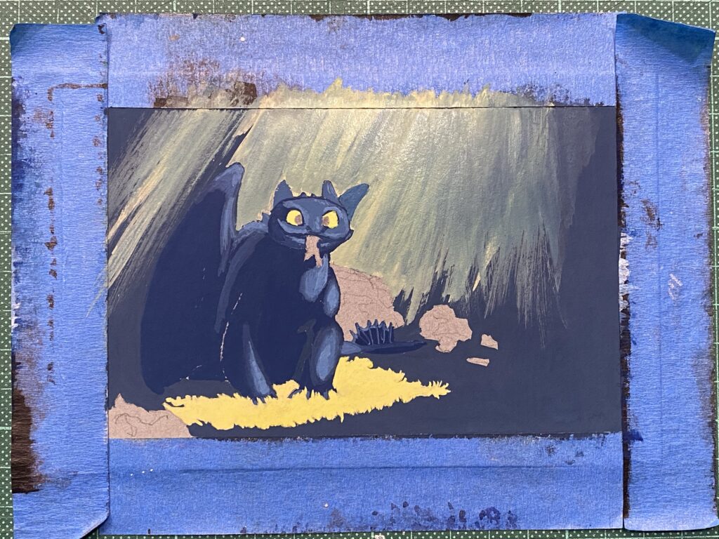
At this point, I had wasted both time and yellow paint 🙂 None of the strokes would produce the gradient I wanted because either the moisture of the paint turned the layers to green, or the new layer was unblended and it was going to look bad.
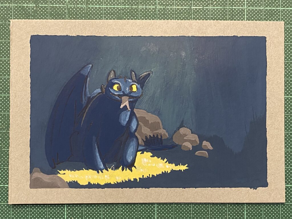
So, I returned to my early mix of blue, black and white and covered as much of the yellow rays as I could. It gave some texture to the background. I painted the bit of the fish that sticks out of the dragon’s mouth.
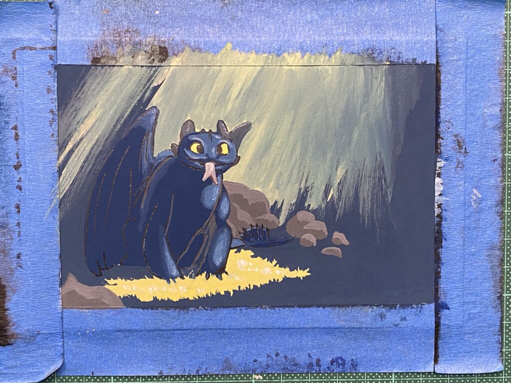
Final result with lettering done with a white Posca pen. I hope he likes it! His birthday is next Monday.