It’s the 8th year in a row I’m participating in Inktober. The rules are simple: A different prompt every day. Use ink. Enjoy. Learn new techniques, or not.
Some choose to not use the prompt list, or create their own, or follow a different list. I prefer to stick to those proposed by Inktober creator Jake Parker, because I find it easier, even though some prompts are less inspiring than others!
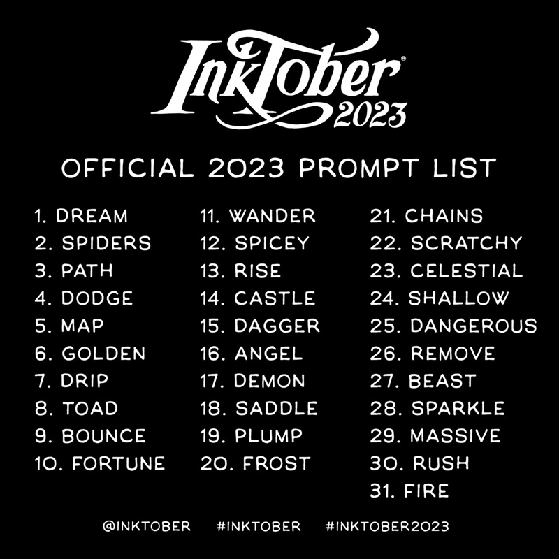
Day 8: “toad”
This is after a photo I took. The medium-sized toad is one of the two that I am aware live in my garden. I used a light grey Kuretake BrushWriter, a Sakura micron 003 black pen and Pentel black ink Brushpen.
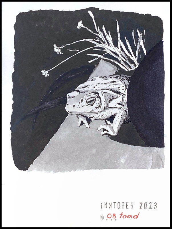
Day 9: “bounce”
Young girl playing basketball. I used only the Sakura Micron 003 black fineliner and the Kuretake light grey BrushWriter.
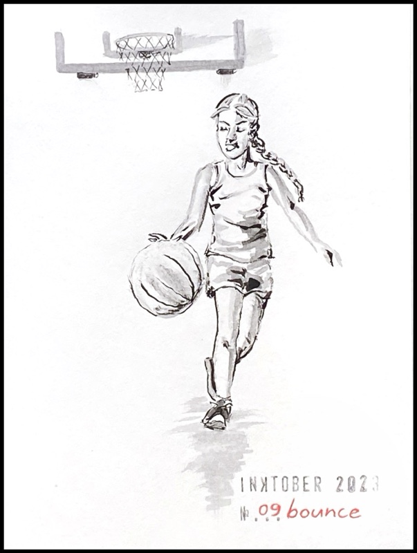
Day 10: “fortune”
This is after a photo I took in a restaurant in California. The fortune promises that I’ll make a name for myself in the field of entertainment. It hasn’t come true but I haven’t tried very hard. I used the black micron 003 fineliner for the text, and for the rest the Kuretake BrushWriter in light grey ink, and the black Pentel Brushpen.
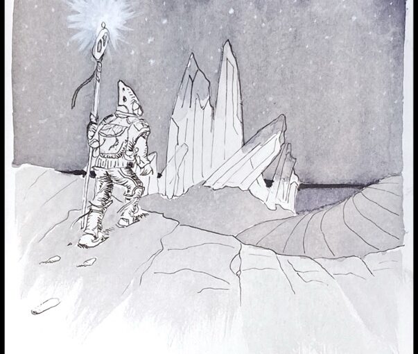
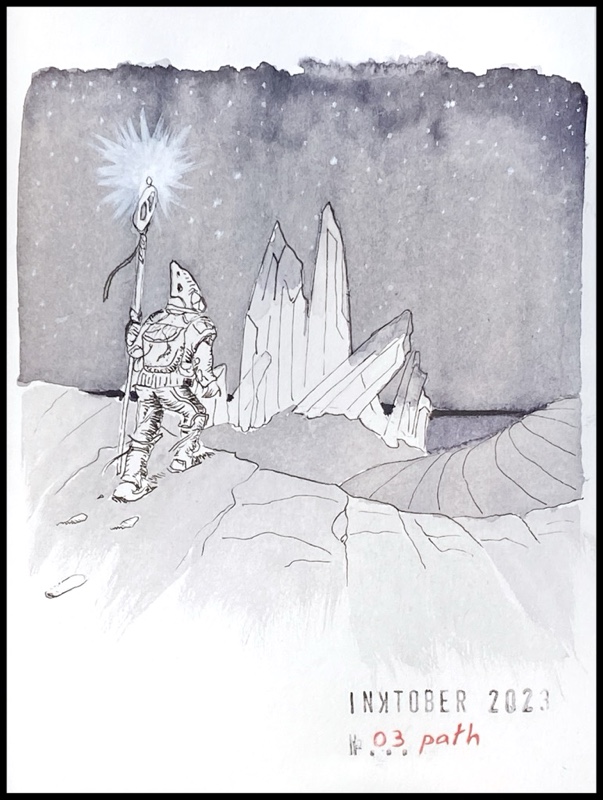
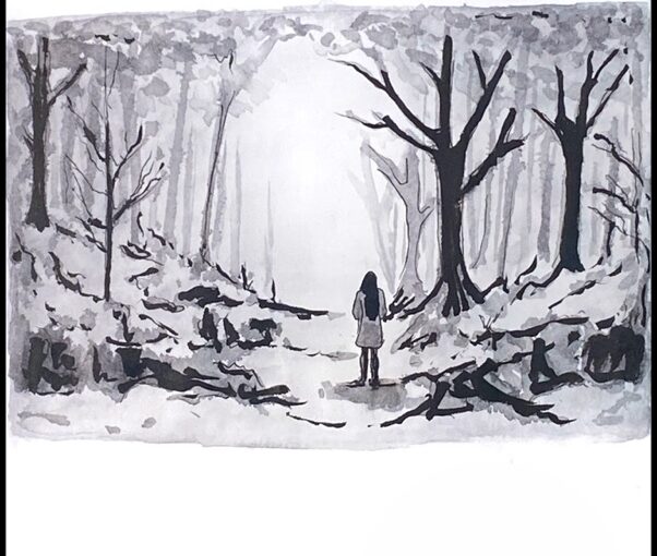
Day 11: “wander”
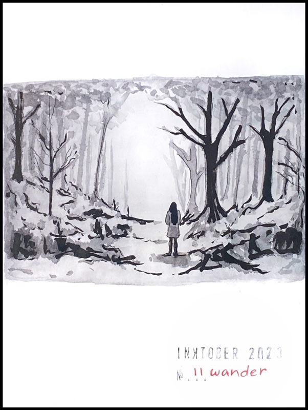
Gloomy forest scene where a young woman stands on a path, looking at a lighter hazy spot on the horizon. Again I used the micron 003 black fineliner, Kuretake light grey BrushWriter, and black Pentel Brushpen.
Day 12: “spicy”
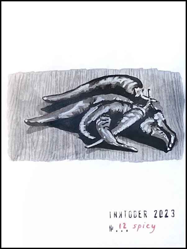
Hot peppers on a wooden table. I used once more the same light grey Kuretake BrushWriter, a Sakura micron 003 black pen and Pentel black ink Brushpen. For the highlights I used a white acrylic paint marker.
Day 13: “rise”
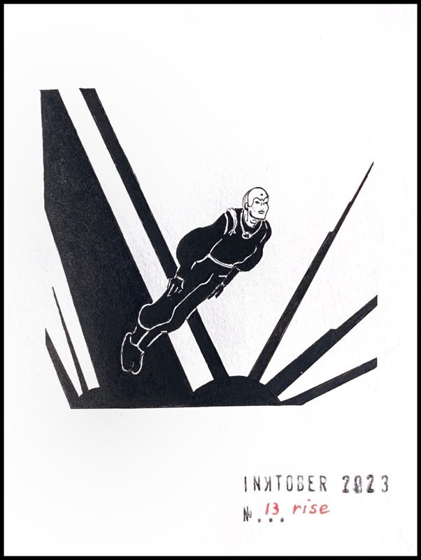
Tribute to Moebius. I used the Sakura Micron 003 black fineliner and black ink Pentel Brushpen.
Day 14: “castle”
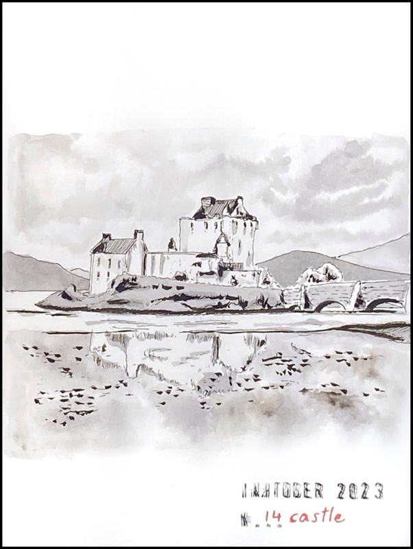
Eilean Donan Castle in the Scottish Highlands. My favourite castle on earth. I discovered it when I lived in Scotland as a student. I used the Sakura Micron 003 black fineliner, Kuretake light grey BrushWriter, and black Pentel Brushpen. Ah and a water brush as well, to get lighter and more diffuse light grey.