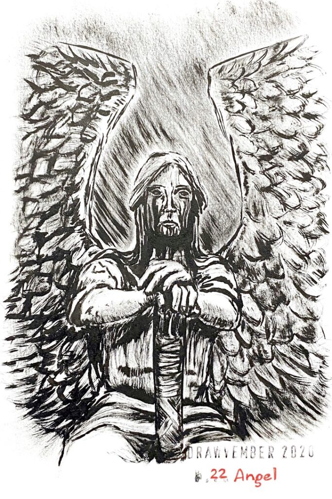
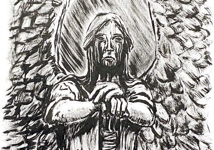
Drawvember 2020 days 21-25

This year for Drawvember, I compiled my own list of prompts, to ensure that I wasn’t going to use “not inspired” as an excuse for skipping days. Drawing actually brings me joy and satisfaction, and as it’s in rather short supply at this time of year for me, I have much at stake.

I picked words that appealed to me, rather randomly, without any clear idea how I was going to develop each prompt. So far, I’m having fun.

Day 21: “Monkey”

Gouache painting of a monkey dangling from a branch, against a floral background

My friend Amy shared with me a collage she created in Photoshop in her wonderful Wallpaper series, featuring a monkey silhouette. I found it beautiful and set out to interpret it.

I used exclusively gouache paint, from the few Holbein Artists tubes that I received in one of the Sketchboxes. I mixed Prussian blue, leaf green and titanium white to get the green background, darkened with more blue for the flower stems, titanium white for the flowers, and burnt sienna for the flowers centre, the tree and the monkey silhouette.

Day 22: “Angel”

Black ink drawing of a life-size angel with black tears that pour out of his eyes and drain down his neck, which appeared over time as an effect of aging bronze. His hands are resting on a post or sword in front of him between his thighs.

This is the Haserot Angel, a bronze sculpture of a life-size angel guarding the grave of Francis Haserot at Lake View Cemetery, Cleveland, Ohio, created in 1924 by sculptor Herman Matzen, who called it “The Angel of Death Victorious”.

The black tears that pour out of his eyes and drain down his neck appeared over time as the bronze aged. Definitely not the common angel! At first I was afraid by the pictures of it, then I was fascinated.

I chose to paint it with a flat brush and black Sumi ink. The bristles are unfortunately worn out and the lines aren’t so sharp and thin anymore.

(Watch the 58-second time-lapse)

Day 23: “Vanquish”

Gouache painting of an Aston Martin Vanquish speeding in a curve

I chose the prompts somewhat arbitrarily and I had no idea how to illustrate today’s prompt, so I am very glad Aston Martin created a model called Vanquish — did they name it this way to encourage James Bond to use it? It’s a beautiful car. I never drew a car before, let alone painted one!

Gouache paint is clearly becoming a favourite medium! I used Prussian blue and green leaf with a cheap medium soft flat brush with synthetic bristles that I once got at a Flying Tiger Copenhagen shop, and a bit of titanium white watercolor in tube for the highlights.

Day 24: “Depth”

Black ink drawing of a roof-topping view with perspective on the roofs of other buildings, the streets below, and the body, legs and feet of the person viewing this

Perhaps I chose “depth” as a counterpart for the earlier prompt “altitude”? I struggled a bit for inspiration. Since I am not very good with perspectives, I thought it would be challenging to draw a rooftopping point of view (it was).

I used for the first time a black Copic Drawing Pen that I received in a Sketchbox. The ink doesn’t flow very well. That’s why I haven’t used it before. I don’t know if it’s on purpose. The ink turns to some dark sepia as it dries, it’s interesting. Another interesting aspect is that the line is thick when the nib is used the right way, but it is extra thin when used upside down. I don’t really like this drawing but I don’t detest it either.

Day 25: “Villain”

Black grey and blue ink and gouache painting of the joker holding the Batman playing card in front of his face.

Black, grey, and blue ink, and gouache painting of the joker holding the Batman playing card in front of his face.

I got so carried away layering grey ink mixed with blue gouache that I misplaced the eye! Oh well, I still like it very much. It’s very bold compared to much of the stuff I usually draw.

I learned that the grey ink in the Brush Writer from Kuretake does not mix too well with the Holbein Artists gouache. And the black ink from the Pentel Brushpen does weird things with the grey ink when that brushpen is too wet.

Art: Toothless gulping fish (step by step)

I made a habit these last few years to hand-make my son’s birthday cards. This year I did something new: asking HIM what theme he wanted me to explore. Toothless, from the movie “How to train your dragon”, he said. Ok! I love this character: he’s in fact a cat. With scales and wings.

Grey toned paper taped with masking tape and the pencil sketch of a sitting dragon with a fish in his mouth

I started with a pencil outline on toned thick paper, the size of a postcard.

Dark blue gouache paint applied in the background

Then I mixed my Holbein Artists gouache paint: Prussian blue and ivory black and added titanium white (just a teeny bit), which I laid on the paper. I made sure to be as precise as I could

Darker blue and lighter blue applied on the dragon and where there is light on him

I mixed further my blue mix: more blue and black for the areas of the dragon that were in the shadow, and more white for the parts of the dragon that were illuminated.

Yellow paint in his eyes and on the ground around his feet

Then I used leaf green mixed with with to paint the grass underneath and his eyes.

Thinner yellow in the background to represent light rays

Here, I had a very precise idea of what I wanted to achieve and it turned out I just could not! I wanted rays of golden light falling in the background. I mixed some yellow watercolor paint (I don’t have yellow gouache) and white. And there was no way I was able to get the yellow to play well with the blue background. I had thought that once the background was dry the new layer was never going to be change by it: big mistake.

Brown and light brown added to the rocks

So I ignored the yellow rays mess, mixed a bit of black and white and painted the dark parts of the rocks. Then added more white to the mix and painted the light areas of the rocks. I used some of those mixed on the ears. I added details using black for the pupils, white to accentuate the illuminated areas.

More yellow added to darken the light rays

At this point, I had wasted both time and yellow paint 🙂 None of the strokes would produce the gradient I wanted because either the moisture of the paint turned the layers to green, or the new layer was unblended and it was going to look bad.

I covered the yellow rays after all and now the background is shades of blue

So, I returned to my early mix of blue, black and white and covered as much of the yellow rays as I could. It gave some texture to the background. I painted the bit of the fish that sticks out of the dragon’s mouth.

Masking tape removed, white lettering added to wish my son a happy 13th birthday, dated in signed.

Final result with lettering done with a white Posca pen. I hope he likes it! His birthday is next Monday.

Drawvember 2020 days 16-20

This year for Drawvember, I compiled my own list of prompts, to ensure that I wasn’t going to use “not inspired” as an excuse for skipping days. Drawing actually brings me joy and satisfaction, and as it’s in rather short supply at this time of year for me, I have much at stake.

I picked words that appealed to me, rather randomly, without any clear idea how I was going to develop each prompt. So far, I’m having fun.

Day 16: “Cougar”

Gouache painting of a cougar walking on snow

My favourite so far!

I was really pleased with the pencil sketch and found myself in a double-bind: it was perfect to me and I could consider it finished but, I wanted to add colour but was afraid to mess it up.

I am glad I tried, because I find the final result stunning!

I used only four of the five tubes of Holbein Artists’s gouache I received in a Sketchbox: yellow ochre, burnt sienna, leaf green and Prussian blue (the fifth one is ivory black, which I chose not to use, using blue instead, given that blue is ideal when there is snow.)

Day 17: “Boat”

Gouache painting of a cruise ship at night

A stylised oversized cruise ship sailing at night. I used gouache again, honouring my desire to experiment outside the black and grey ink brush pens that I love so much.

I used the tubes of Holbein Artists’s gouache I received in a Sketchbox: Prussian blue, burnt sienna, and ivory black. I used some titanium white watercolor from a tube to get the shades of blue and the grey. I wasn’t happy with the blue background. This has to do with the paper of my artbook which does not play well when too wet (96g/m2, 65 lb per sq. m.)

Day 18: “Planet”

Ink drawing of a man mounting an oversized pelican flying over a forest in a canyon, under a giant Jupiter.

This is an ink brush pens drawing of a man mounting an oversized pelican flying over a forest in a canyon, under a giant Jupiter. This is inspired from work by Moebius.

I used some of the November 2020 Sketchbox materials that I received just today: sepia ink Brush Writer from Kuretake, blue and green Twin Brushes from Monami. I also used a light grey ink and geranium red ink Brush Writer from Kuretake (the latter I found way too dark), and a pale rose water colour marker from Winsor and Newton.

Day 19: “Sullen”

Grey ink drawing of a woman in kimono sitting and holding a fan.

This is my interpretation of “Woman Sitting on Edge of Veranda”, a work of Kitagawa Utamaro from 1798.

I used a black ink 0.05 mm line maker from Derwent and a light grey Brush Writer by Kuretake.

I drew it before, four years ago and I looked up that page in my artbook at the time: wow, unbelievable how much I have progressed since then! Everything is so much better in this version: proportions, line work, hues.

Day 20: “Jellyfish”

Metallic paint depicting a large jelly fish against a black square

I went into Drawvember thinking I should experiment with new techniques or medium I don’t use often. Today’s prompt lended itself well to that. There is a shiny quality to jellyfish that I wanted to try to render using metallic paint. I have just one pan of such paint and it is blue. I also used black sumi ink in a rectangle background so that it would bring out the blue. It does achieve that, although I am not enamoured with the result. Perhaps had I used a bit of white paint for highlights and a bit of non metallic blue to bring out the shine I might have liked it more.

Drawvember 2020 days 11-15

This year for Drawvember, I compiled my own list of prompts, to ensure that I wasn’t going to use “not inspired” as an excuse for skipping days. Drawing actually brings me joy and satisfaction, and as it’s in rather short supply at this time of year for me, I have much at stake.

I picked words that appealed to me, rather randomly, without any clear idea how I was going to develop each prompt. So far, I’m having fun.

Day 11: “Buccaneer”

Pencil drawing of a fierce-looking woman pirate aiming a pistol and carrying a sword in the other hand.

Pencil work for this fierce lady pirate aiming a pistol and holding a sword.

Day 12: “Altitude”

Black and grey ink drawing of the Brooklyn Bridge under construction with silhouettes of men walking on top of a high cable. The city is suggested in the background as grey shapes of buildings.

According to my research, these men were interviewing to work as painters on the construction of the Brooklyn Bridge, and their test was being able to walk on the top cable.

I used a black ink fine liner and light grey ink Brush Writer by Kuretake. I didn’t use a ruler.

Day 13: “Shipwreck”

Black ink drawing of a tentacle emerging from water, at the end of which is the remnant of a pirate ship flag and broken pole.

This theme was much harder than I anticipated. I didn’t know what I wanted to draw and had very little inspiration. Eventually I settled for something graphic and evocative of a shipwreck: a Kraken tentacle holding the mast and pirate flag of a ship.

I used black ink.

Day 14: “Zebra”

Dark black shiny rectangle with fuzzy border on which I drew a zebra in white ink

I painted the background using acrylic graphite ink and then used a fine brush and white calligraphy ink to paint the white parts of the zebra.

Day 15: “Drums”

Black and grey ink drawing of a Japanese man playing kodo, a really big drum, with two thick round sticks. He looks very happy.

Former colleague Mauro once made me listen and watch something called Kodo, the Japanese drums. I loved it.

I used a black ink fine liner, black ink Brushpen by Pentel and Light Grey Brush Writer by Kuretake.