Art: Toothless gulping fish (step by step)

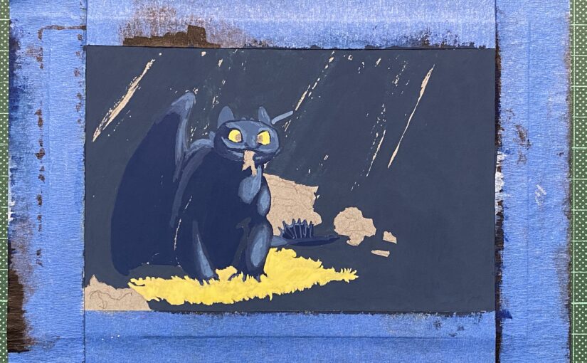
I made a habit these last few years to hand-make my son’s birthday cards. This year I did something new: asking HIM what theme he wanted me to explore. Toothless, from the movie “How to train your dragon”, he said. Ok! I love this character: he’s in fact a cat. With scales and wings.

Grey toned paper taped with masking tape and the pencil sketch of a sitting dragon with a fish in his mouth

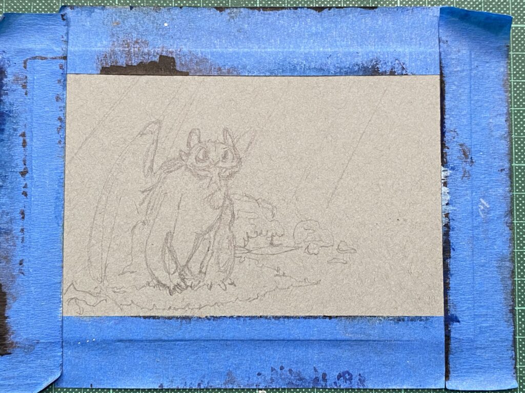
I started with a pencil outline on toned thick paper, the size of a postcard.

Dark blue gouache paint applied in the background

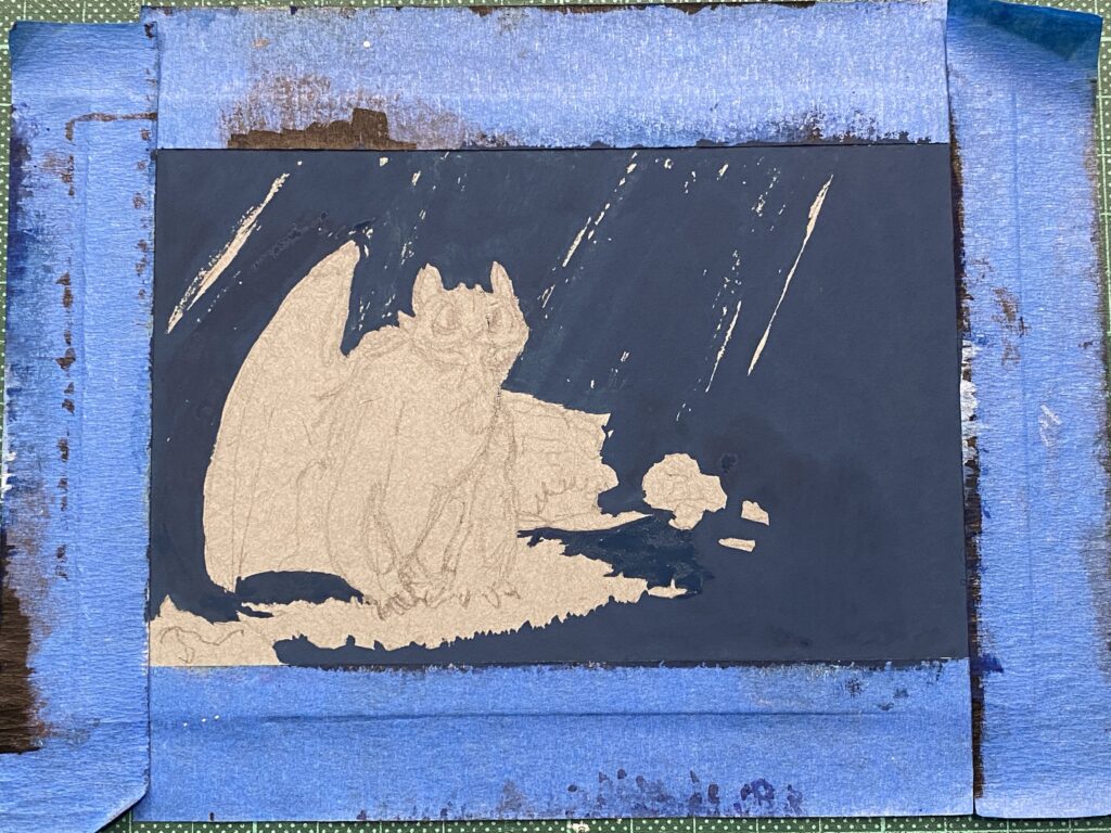
Then I mixed my Holbein Artists gouache paint: Prussian blue and ivory black and added titanium white (just a teeny bit), which I laid on the paper. I made sure to be as precise as I could

Darker blue and lighter blue applied on the dragon and where there is light on him

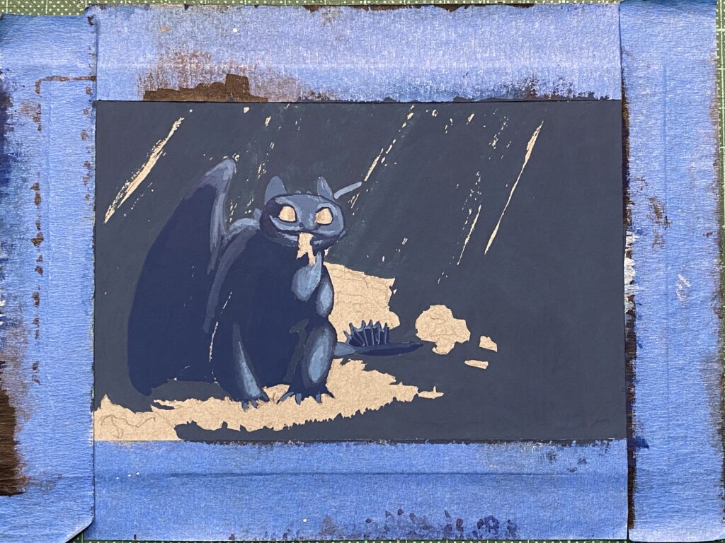
I mixed further my blue mix: more blue and black for the areas of the dragon that were in the shadow, and more white for the parts of the dragon that were illuminated.

Yellow paint in his eyes and on the ground around his feet

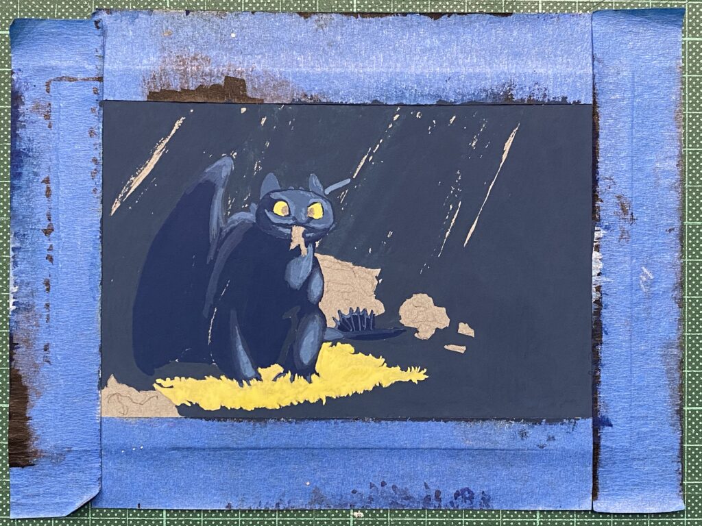
Then I used leaf green mixed with with to paint the grass underneath and his eyes.

Thinner yellow in the background to represent light rays

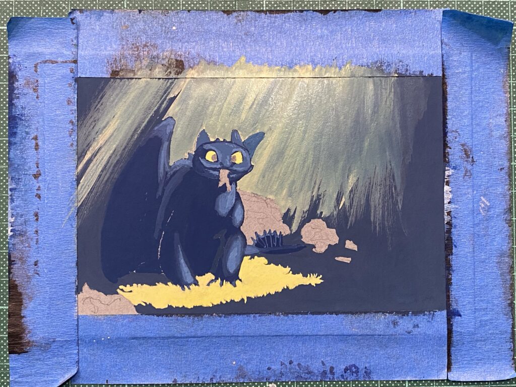
Here, I had a very precise idea of what I wanted to achieve and it turned out I just could not! I wanted rays of golden light falling in the background. I mixed some yellow watercolor paint (I don’t have yellow gouache) and white. And there was no way I was able to get the yellow to play well with the blue background. I had thought that once the background was dry the new layer was never going to be change by it: big mistake.

Brown and light brown added to the rocks

So I ignored the yellow rays mess, mixed a bit of black and white and painted the dark parts of the rocks. Then added more white to the mix and painted the light areas of the rocks. I used some of those mixed on the ears. I added details using black for the pupils, white to accentuate the illuminated areas.

More yellow added to darken the light rays

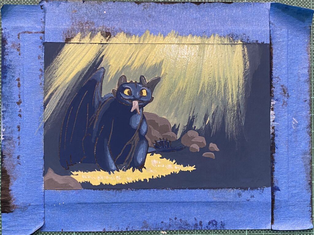
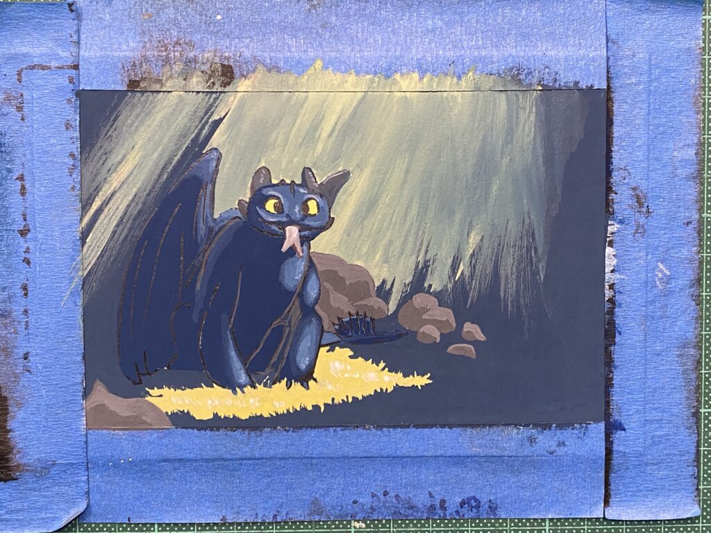
At this point, I had wasted both time and yellow paint 🙂 None of the strokes would produce the gradient I wanted because either the moisture of the paint turned the layers to green, or the new layer was unblended and it was going to look bad.

I covered the yellow rays after all and now the background is shades of blue

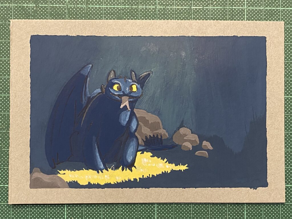
So, I returned to my early mix of blue, black and white and covered as much of the yellow rays as I could. It gave some texture to the background. I painted the bit of the fish that sticks out of the dragon’s mouth.

Masking tape removed, white lettering added to wish my son a happy 13th birthday, dated in signed.

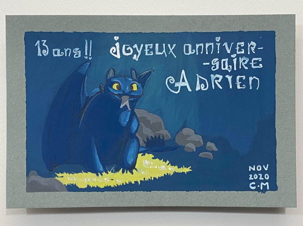
Final result with lettering done with a white Posca pen. I hope he likes it! His birthday is next Monday.

Drawvember 2020 days 16-20

This year for Drawvember, I compiled my own list of prompts, to ensure that I wasn’t going to use “not inspired” as an excuse for skipping days. Drawing actually brings me joy and satisfaction, and as it’s in rather short supply at this time of year for me, I have much at stake.

I picked words that appealed to me, rather randomly, without any clear idea how I was going to develop each prompt. So far, I’m having fun.

Day 16: “Cougar”

Gouache painting of a cougar walking on snow

My favourite so far!

I was really pleased with the pencil sketch and found myself in a double-bind: it was perfect to me and I could consider it finished but, I wanted to add colour but was afraid to mess it up.

I am glad I tried, because I find the final result stunning!

I used only four of the five tubes of Holbein Artists’s gouache I received in a Sketchbox: yellow ochre, burnt sienna, leaf green and Prussian blue (the fifth one is ivory black, which I chose not to use, using blue instead, given that blue is ideal when there is snow.)

Day 17: “Boat”

Gouache painting of a cruise ship at night

A stylised oversized cruise ship sailing at night. I used gouache again, honouring my desire to experiment outside the black and grey ink brush pens that I love so much.

I used the tubes of Holbein Artists’s gouache I received in a Sketchbox: Prussian blue, burnt sienna, and ivory black. I used some titanium white watercolor from a tube to get the shades of blue and the grey. I wasn’t happy with the blue background. This has to do with the paper of my artbook which does not play well when too wet (96g/m2, 65 lb per sq. m.)

Day 18: “Planet”

Ink drawing of a man mounting an oversized pelican flying over a forest in a canyon, under a giant Jupiter.

This is an ink brush pens drawing of a man mounting an oversized pelican flying over a forest in a canyon, under a giant Jupiter. This is inspired from work by Moebius.

I used some of the November 2020 Sketchbox materials that I received just today: sepia ink Brush Writer from Kuretake, blue and green Twin Brushes from Monami. I also used a light grey ink and geranium red ink Brush Writer from Kuretake (the latter I found way too dark), and a pale rose water colour marker from Winsor and Newton.

Day 19: “Sullen”

Grey ink drawing of a woman in kimono sitting and holding a fan.

This is my interpretation of “Woman Sitting on Edge of Veranda”, a work of Kitagawa Utamaro from 1798.

I used a black ink 0.05 mm line maker from Derwent and a light grey Brush Writer by Kuretake.

I drew it before, four years ago and I looked up that page in my artbook at the time: wow, unbelievable how much I have progressed since then! Everything is so much better in this version: proportions, line work, hues.

Day 20: “Jellyfish”

Metallic paint depicting a large jelly fish against a black square

I went into Drawvember thinking I should experiment with new techniques or medium I don’t use often. Today’s prompt lended itself well to that. There is a shiny quality to jellyfish that I wanted to try to render using metallic paint. I have just one pan of such paint and it is blue. I also used black sumi ink in a rectangle background so that it would bring out the blue. It does achieve that, although I am not enamoured with the result. Perhaps had I used a bit of white paint for highlights and a bit of non metallic blue to bring out the shine I might have liked it more.