Art: Japanese river scene (step by step)

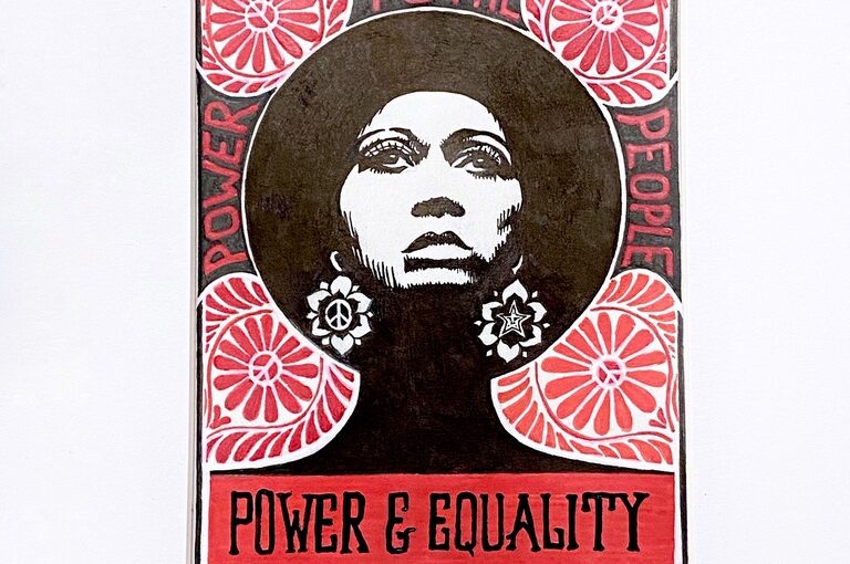
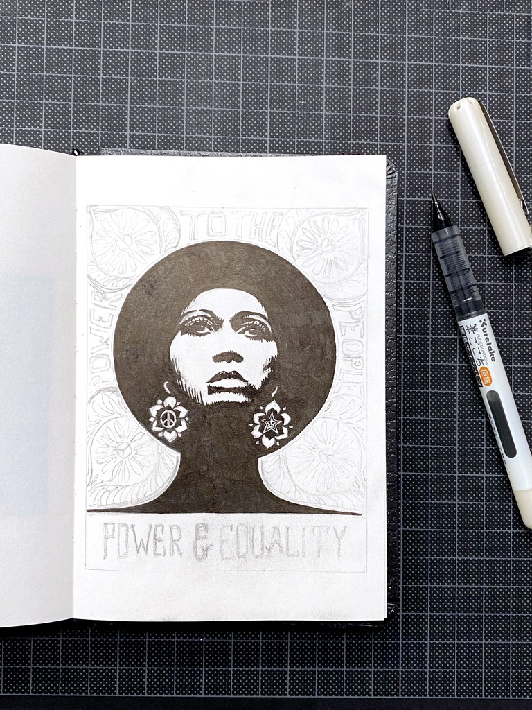
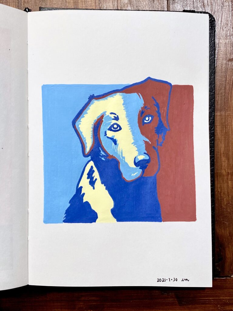
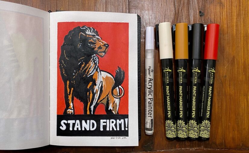
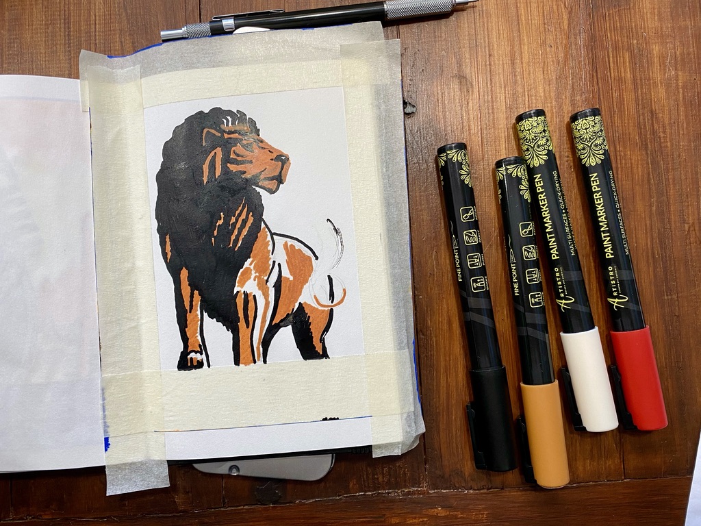
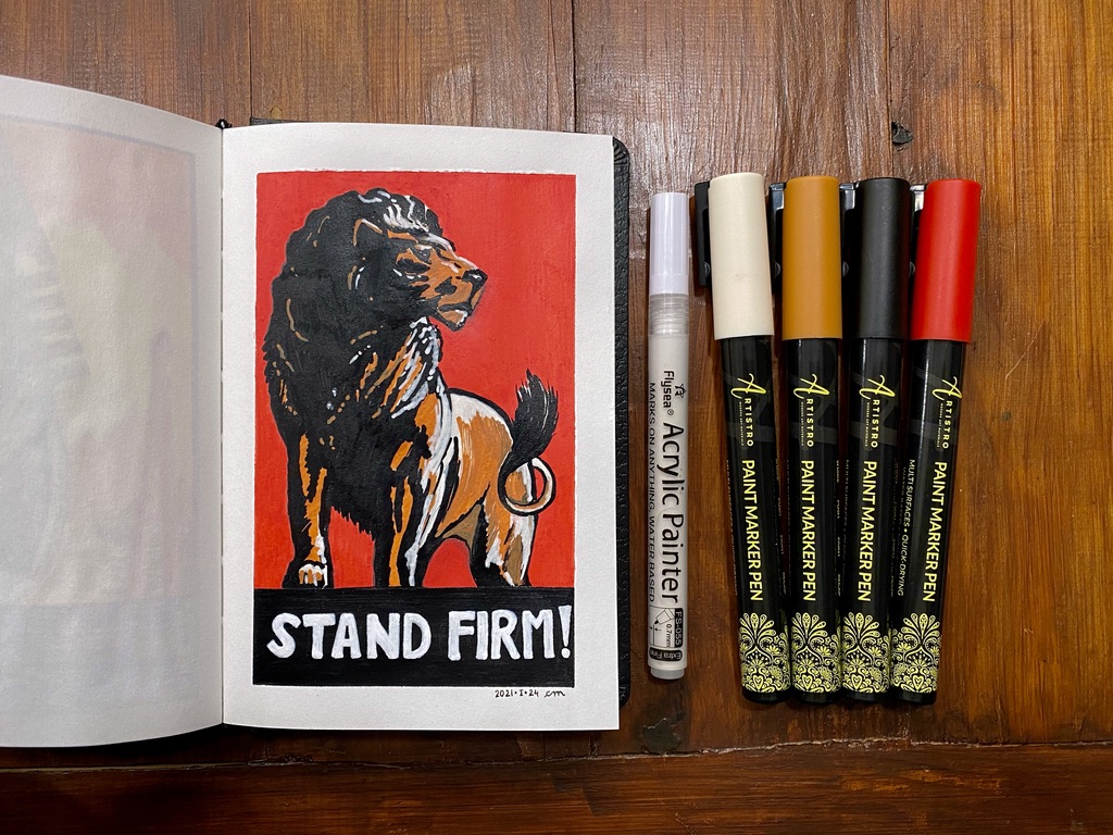
I tested acrylic gouache. They are similar to regular gouache, and even watercolour, except that they dry much quicker and once they’re dry they can’t mix anymore.

It’s both an advantage and a challenge! An advantage because you can layer other colours without any smearing. A challenge because the error margin is much narrower: if you don’t get it right the first time your mistake has to be worked around.

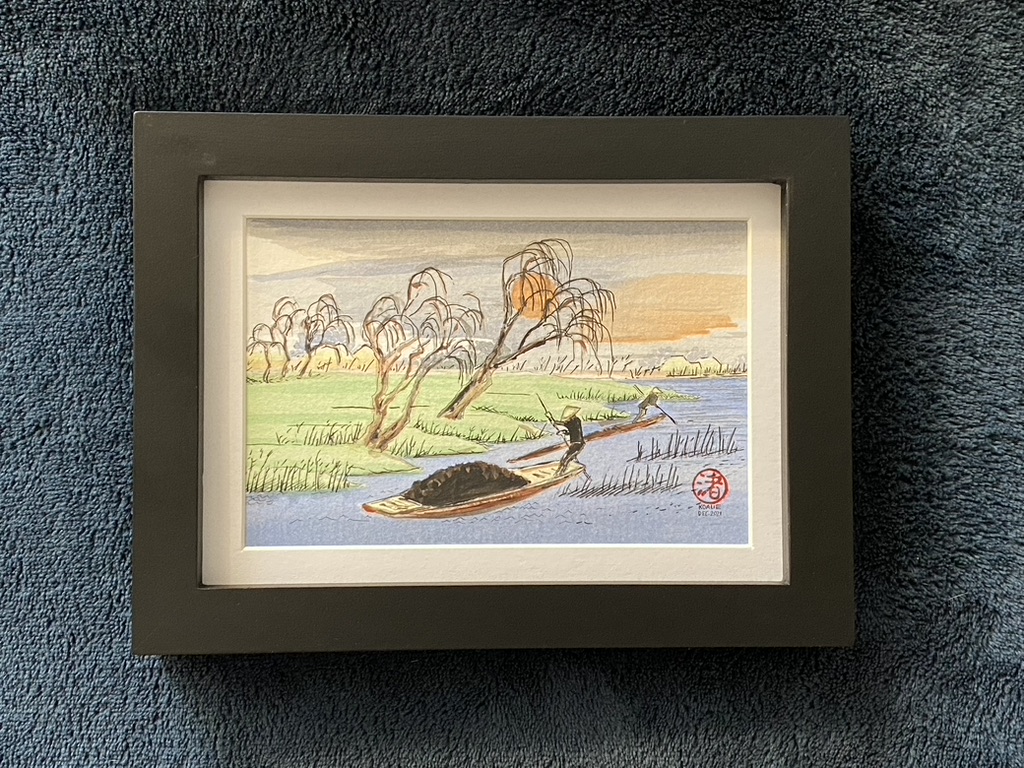
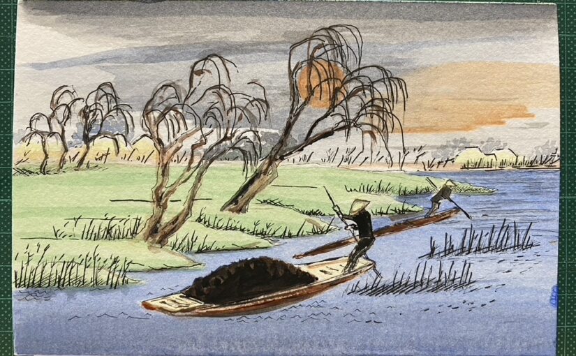
This is a river scene with two persons using long poles to maneuver their boats, and passing next to patches of grass where trees like willows are growing. It must be the start of autumn because the trees are bare but there is still grass. A few huts are visible on the horizon. There is a big orange setting sun, and grey and orange clouds.

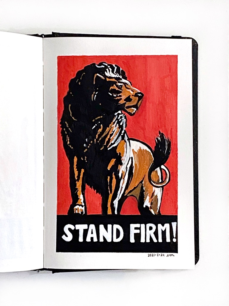
Framed in black, 10×15 cm (4×6 in.) [and since then sent to my friend Isabelle for whom I painted it.]
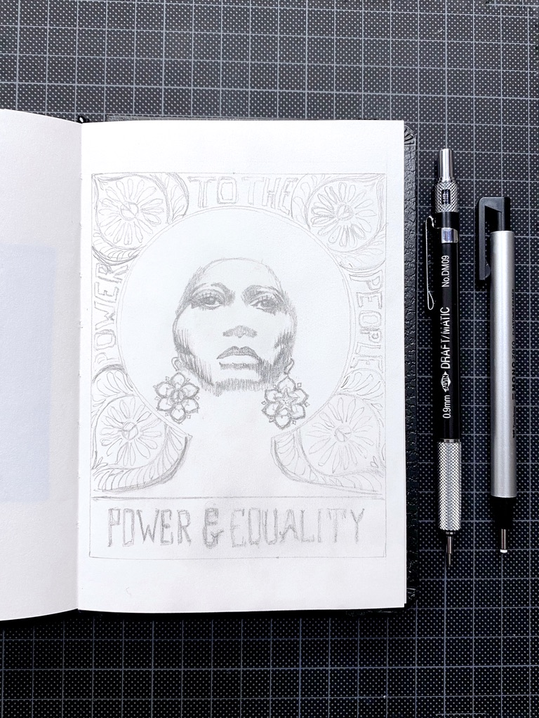
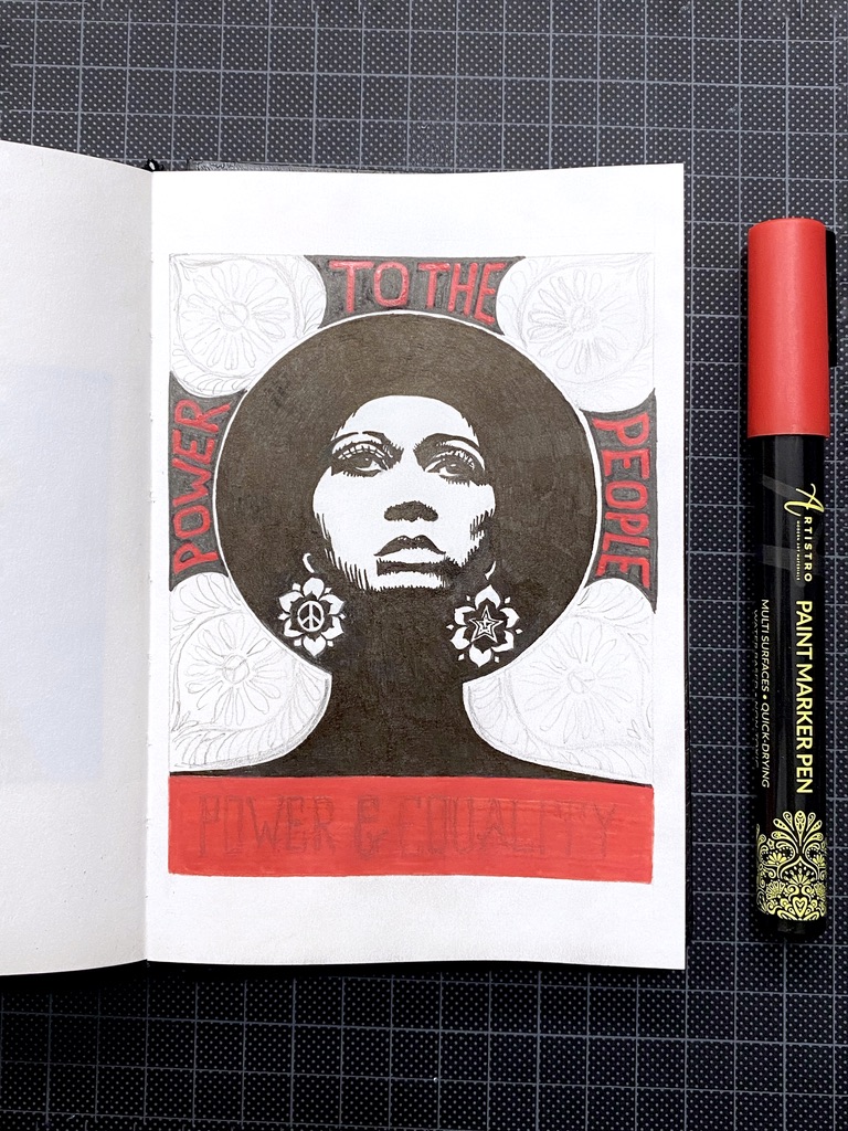
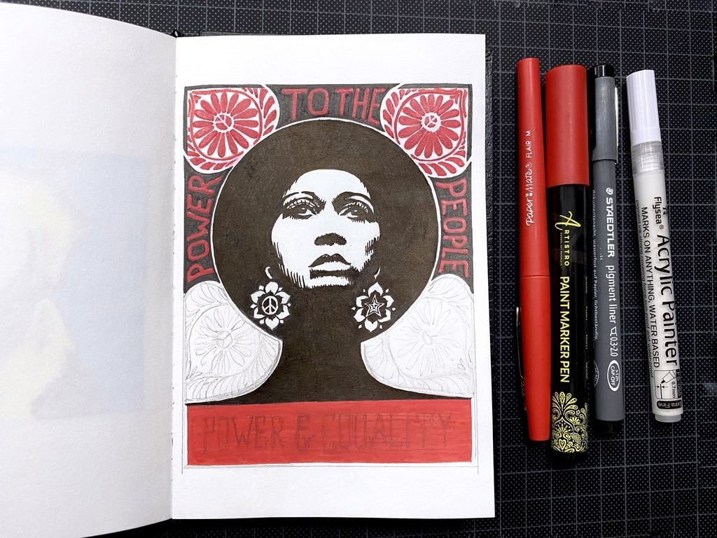
Rough pencil sketch

Grey, blue and orange in the sky, including dark orange for the sun; and blue for the river

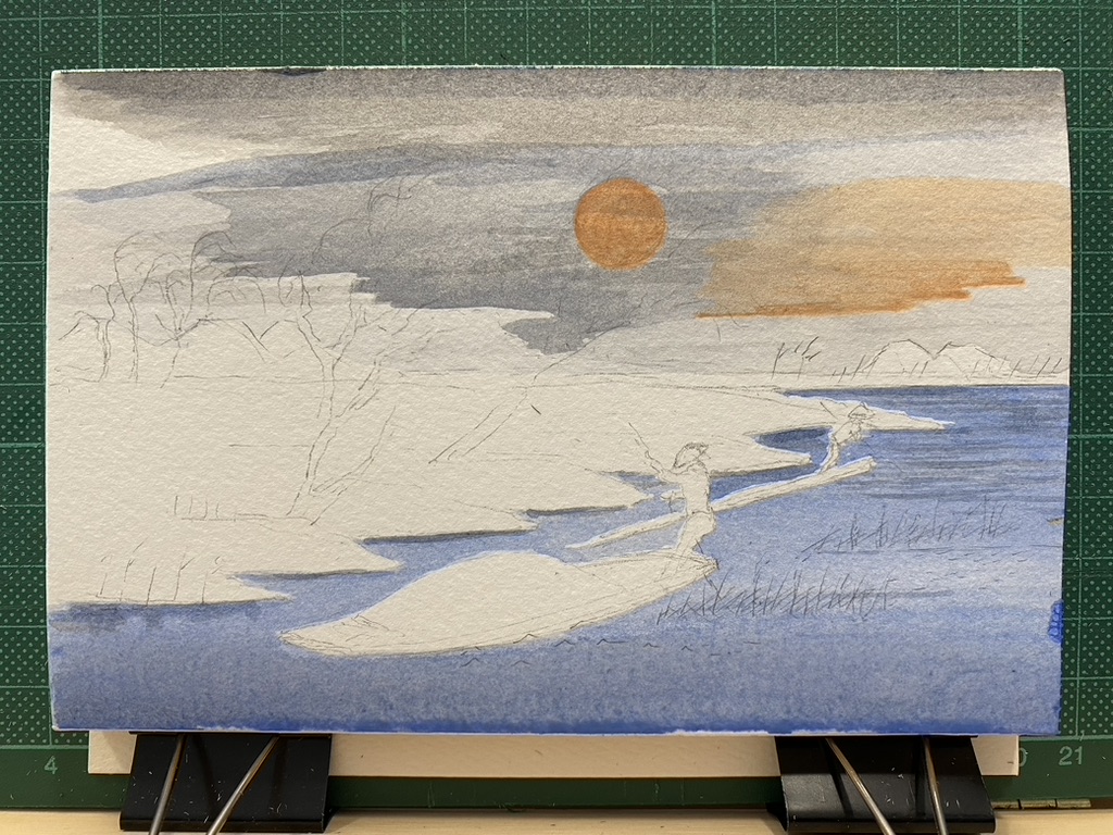
Transparent blue, grey, and orange.

This looks and feels just like watercolour.

I added patches of pale yellow where the huts are, the men's hats and the front and back of the larger boat.

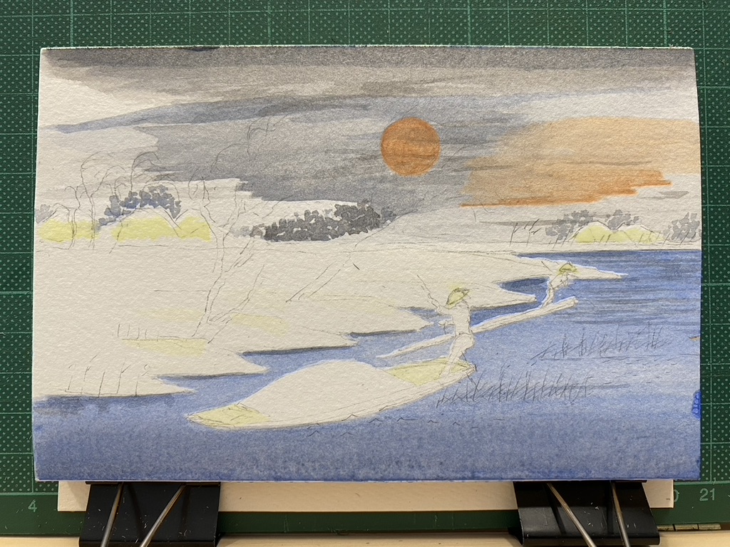
A bit more colours in small areas: specks of grey and blue-grey to add vegetation in the background, and yellow for the huts, boats and the hats.

Brown and black added for the trees, the boats, the men and their poles. Green added for the grass.

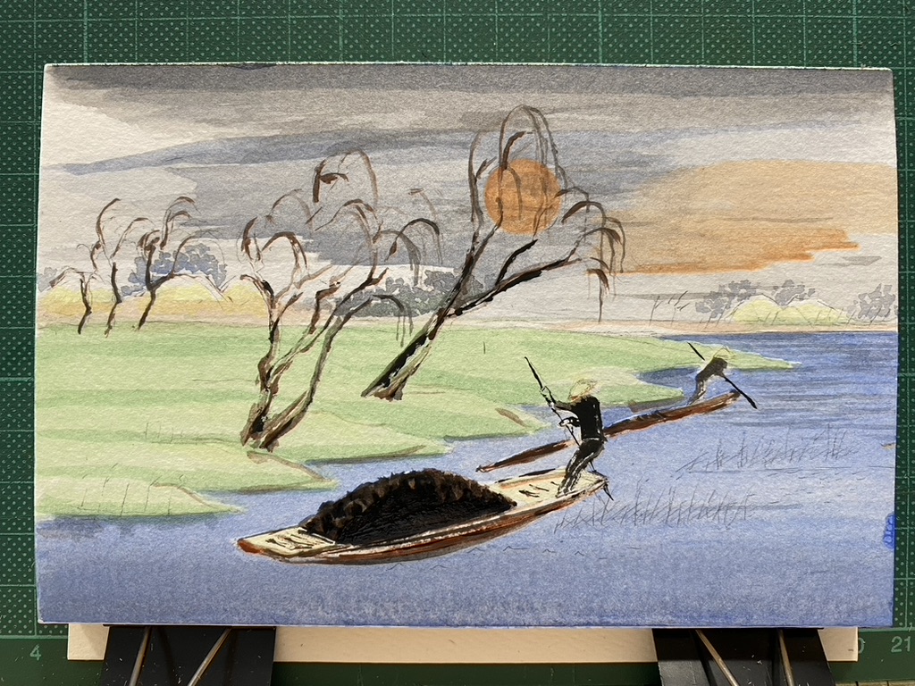
The green is now added to the meadow and another darker layer for shading. Brown and black for the trees, boats, men and their poles.

I realised this was going to lack a lot of contrast. The colours are much paler than I thought.

Thin black lines for the reed, and various outlines

I added many thin black lines in ink to try to make up for the lack of contrast.

I added my stamp, dated and signed.

Stamped, dated and signed.

Finished piece, in a little black wood frame with a white mounting card.

Art: Angela Davis (step by step)

Angela Davis.
Power To The People ✊🏿 Power & Equality ✊🏿

This took me a long time: 5 or 6 hours over two days for a rather small piece, as I drew it on my little Canson artbook (10,2 x 15,2 cm – 4 x 6 in).

Apparently this month is the celebration of Black history, so this is timely.

Very detailed pencil sketch on an open artbook of the face of Angela Davis, ornate flowers and lettering. The mechanical pencil and eraser pen are on the cutting mat.

I enjoyed doing the pencil sketch. I found it very pretty.

Black ink for the face, shadows and earrings. The black pen is next to the open artbook on the cutting board.

Black ink.

Red lettering in acrylic paint: POWER on the left side, TO THE on the top, and PEOPLE on the right side. The red acrylic paint marker is on the cutting mat next to the artbook.

Red acrylic paint and black ink.

Work in progress to paint red the ornaments at each corner. The pens are next to the open artbook.

I used a thicker black pen with an angled nib. I also had to make small corrections which I did with a red ink felt tip pen, and a think white acrylic paint marker.

Drawing finished. I put a mounting card and wooden frame on top of the open artbook to see how it looks framed.

Finished!

Trying out how it would look like if it were framed.

Close up of the finished signed work with white mounting card around it.

Art: “Stand firm!” (step by step)

I’m really enjoying myself doing these poster art piece with acrylic paint markers!

This is my interpretation of “Stand firm!”, a World War II propaganda poster during the UK war effort, 1939-1946, by Thomas Purvis.

Masking tape applied to the artbook and pencil sketch of a lion

Masking tape and pencil sketch.

Orange-brown acrylic paint applied to the drawing. Next to the artbook are my mechanical pencil and the four acrylic paint markers I will use: orange, red, black and white.

I will need four colours: orange-brown, black and red, and white.

Black added to the line for the mane and the shadows.

The lion is taking shape.

Red background added.

Red background done. I wished the tip were larger because with 1-millimeter, it took a lot of back and forth and the strokes are very visible on the paper.

White highlights added to the face of the lion and several areas of its body. The tail is now painted black.

Now that the lion is finished, I added highlights.

Black rectangle painted at the bottom.

Black rectangle at the bottom.

Block lettering done to write "stand firm!" in white in the black rectangle.

I used a different white acrylic paint marker after all.

Finished work in the open artbook on a white table, dated and signed