Art: “Soldier & Lady making a snowman” (Step by step)

I will be mailing my parents their Christmas presents this year. And since my mum was so happy last year with my drawing of the Mackintosh’s Quality Street characters Soldier and Lady, I painted her a Christmas card with them making a snowman.
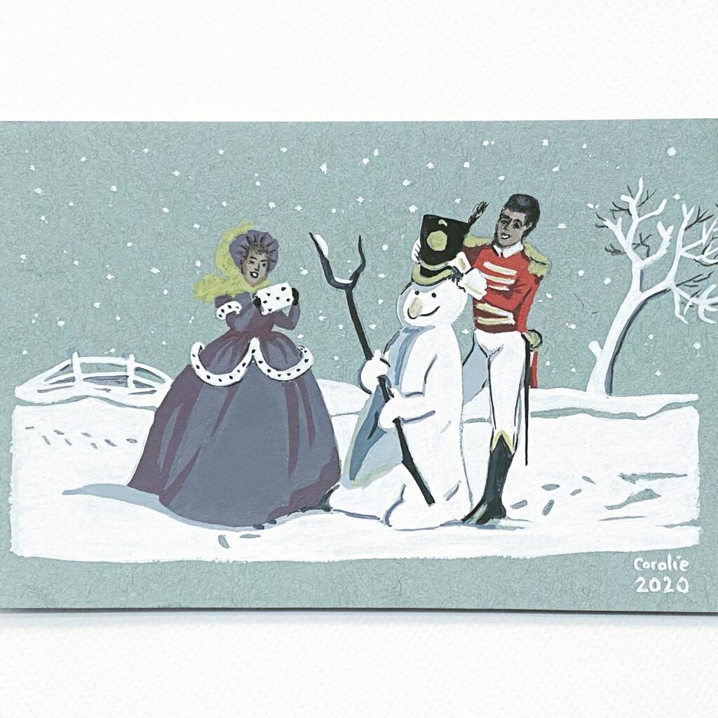
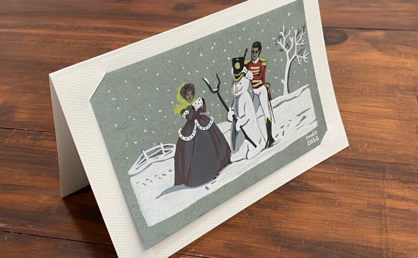
Finished version of the “Soldier & Lady making a snowman” postcard painted with gouache

This is one of their design from the 1960s, I think. From the side of a tin box.

Step by step
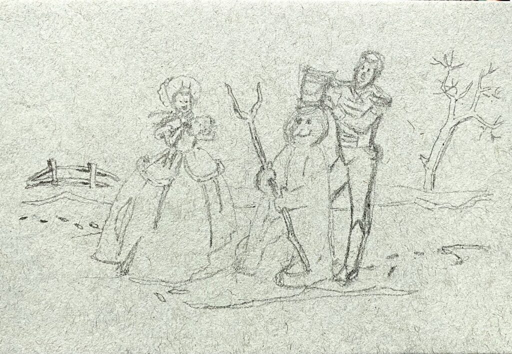
Rough pencil sketch on grey toned paper of a woman in long dress and man in uniform making a snowman

Pencil sketch. The background being grey, I chose a toned paper so that I would only have to add colours and white on top of it. It’s from a Toned Blue Mixed Media vellum surface pad from Strathmore. The blue looks more like a grey. It’s 4 in. X 6 in. (10.2 x 15.2 cm), 184 lb. (300 g/m2)
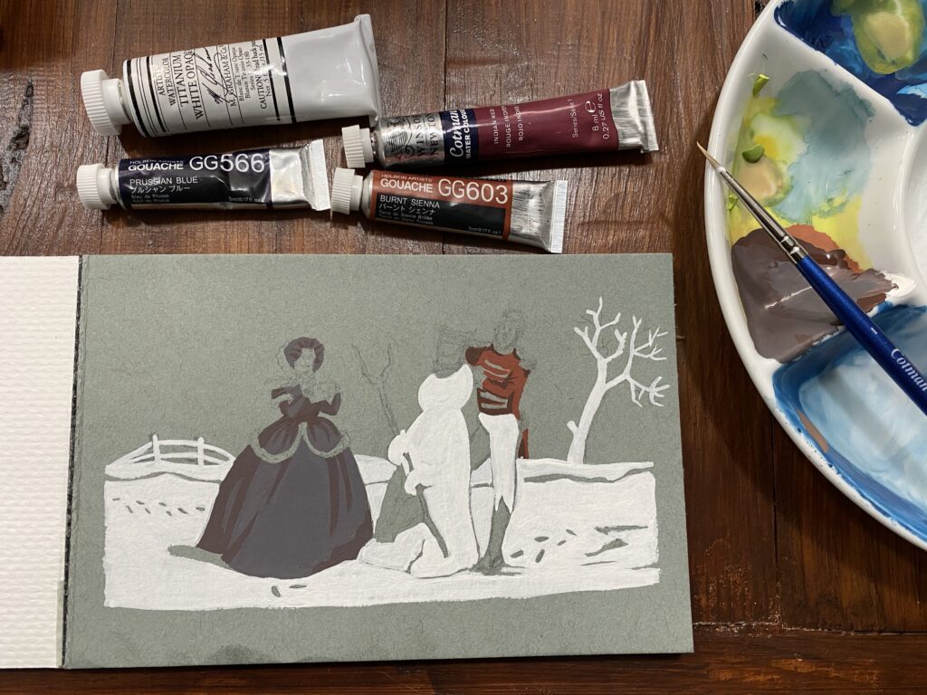
Paper pad, paint tubes, palette and brush. I've started to paint the dress and uniform, and the snow

I have only a few tubes of gouache paint and watercolour to mix colours. I knew the painting colours would not be faithful to the original, in particular the Lady’s dress which is supposed to be pink and fuchsia. For the Soldier’s red jacket, I mixed burnt sienna gouache with titanium white opaque watercolor and ended it with a pinkish orange, to which I added Indian red watercolour and was satisfied. For the dress, I added white and a little bit of Prussian blue to my orange/red mix. The resulting colour was plum, and this was fine. I added more of the red mix and used that for the darker parts of the dress. Then I used titanium white watercolour to paint the snow, leaving untouched the areas of the footprints and shadows.
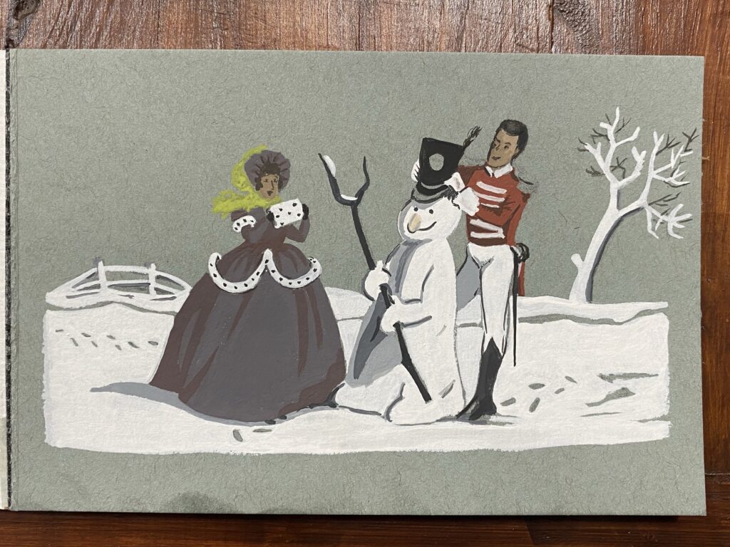
Both characters and the snowman are painted, the tree and fence as well.

I needed a few shades of grey for shadows on the snowman, under the dress, and on the soldier’s leg behind the snowman. For the faces I applied white and brown. Then I used some ivory black to decorate the dress’ fur, paint the hat, boots, Soldier’s hair, the snowman’s stick and eyes, and the shadows of the tree. The Lady’s scarf was supposed to be blue and dark green, but with a dark plum dress I thought leaf green was going to be better.
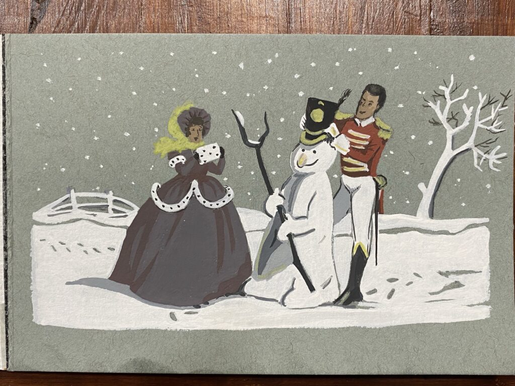
Snow added and gold details on the soldier's uniform.

Snowflakes! I used a white Posca pen to add dots that I immediately tapped with my finger to spread the ink unevenly. Then I added yellow ochre to my green to obtain something that passes for gold so I could finish the Soldier’s hat, the top of his boots, the decorations on his shoulders and the handle of his sword.
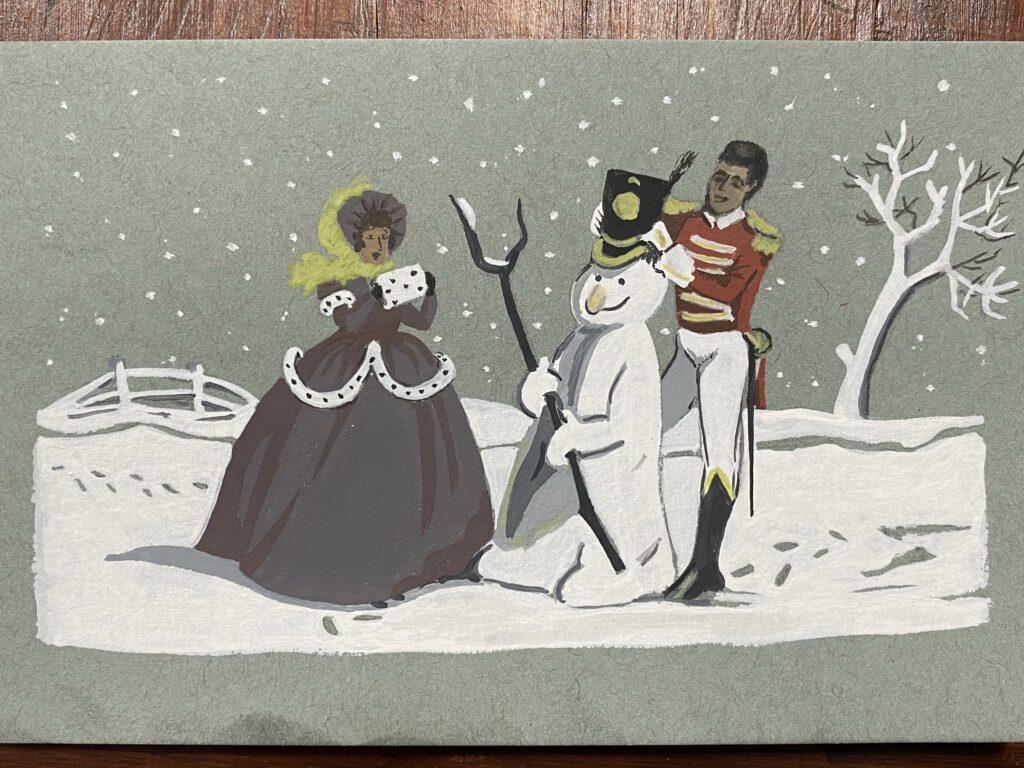
I redid their faces

I wasn’t happy with their faces so I attempted to make them better. In retrospect, the faces were fine as they were!
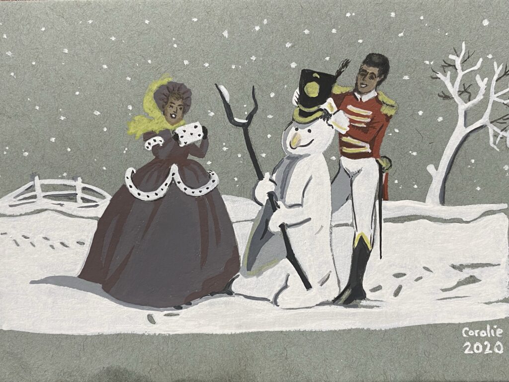
More work on their faces. I added my name and date at the bottom.

I fiddled some more with their faces and as soon as I had managed to make them look a bit less weird, I stopped. I made them look happier in the process, so it’s all good. I added a touch of white for the teeth, which aren’t visible in the original, but since their faces were so dark, I thought it would be a good alteration.
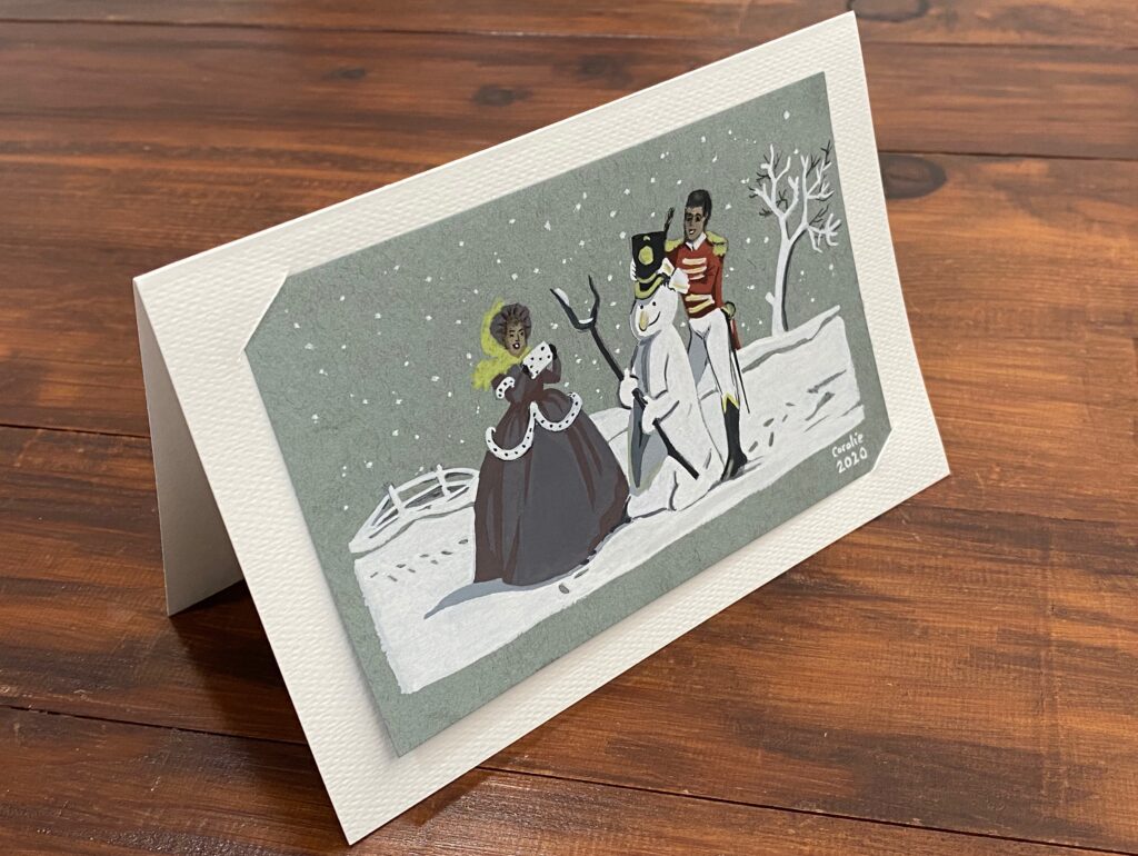
Painting inserted in two slits I cut in a white folded watercolour paper

I didn’t want to write on the painting in case my mum wants to frame it. So I folded a white sheet from my cheap watercolour paper block, cut a couple slits and inserted the painting. I will write inside and will mail everything tomorrow!
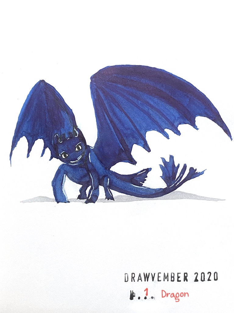
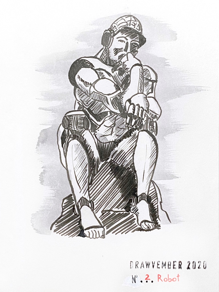
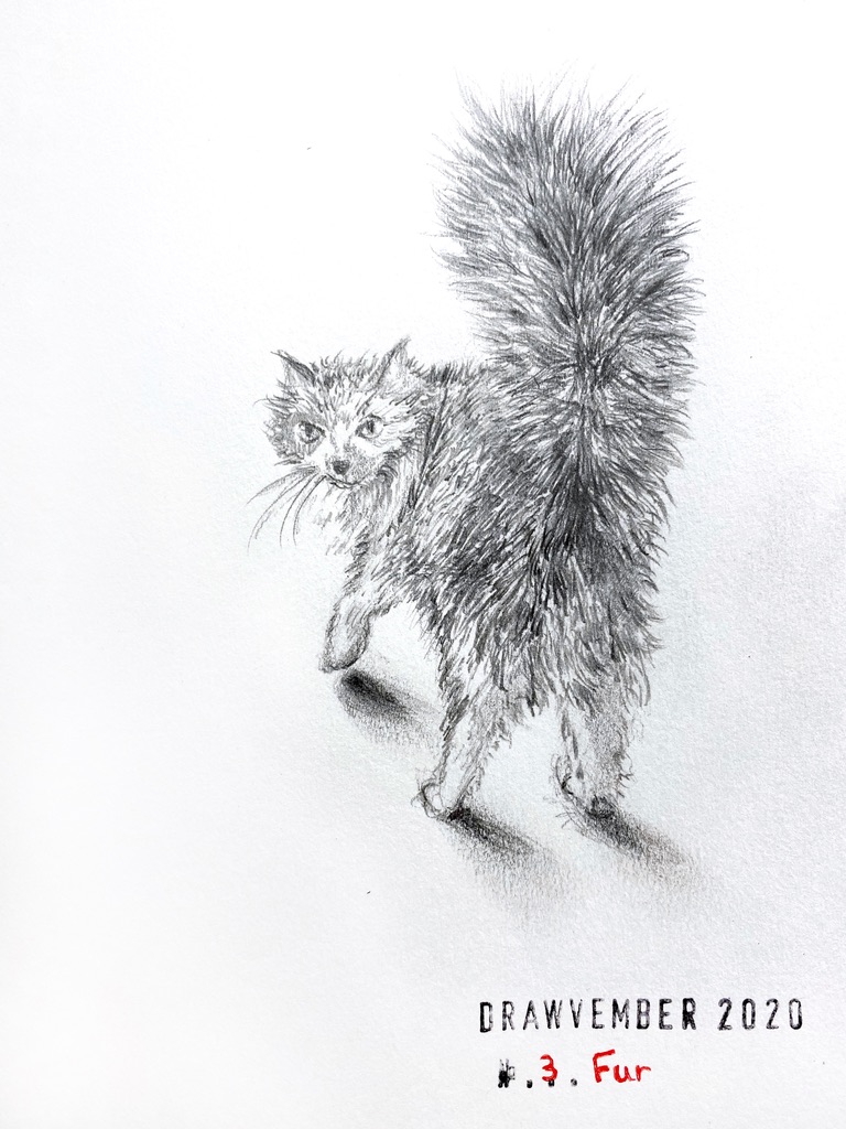
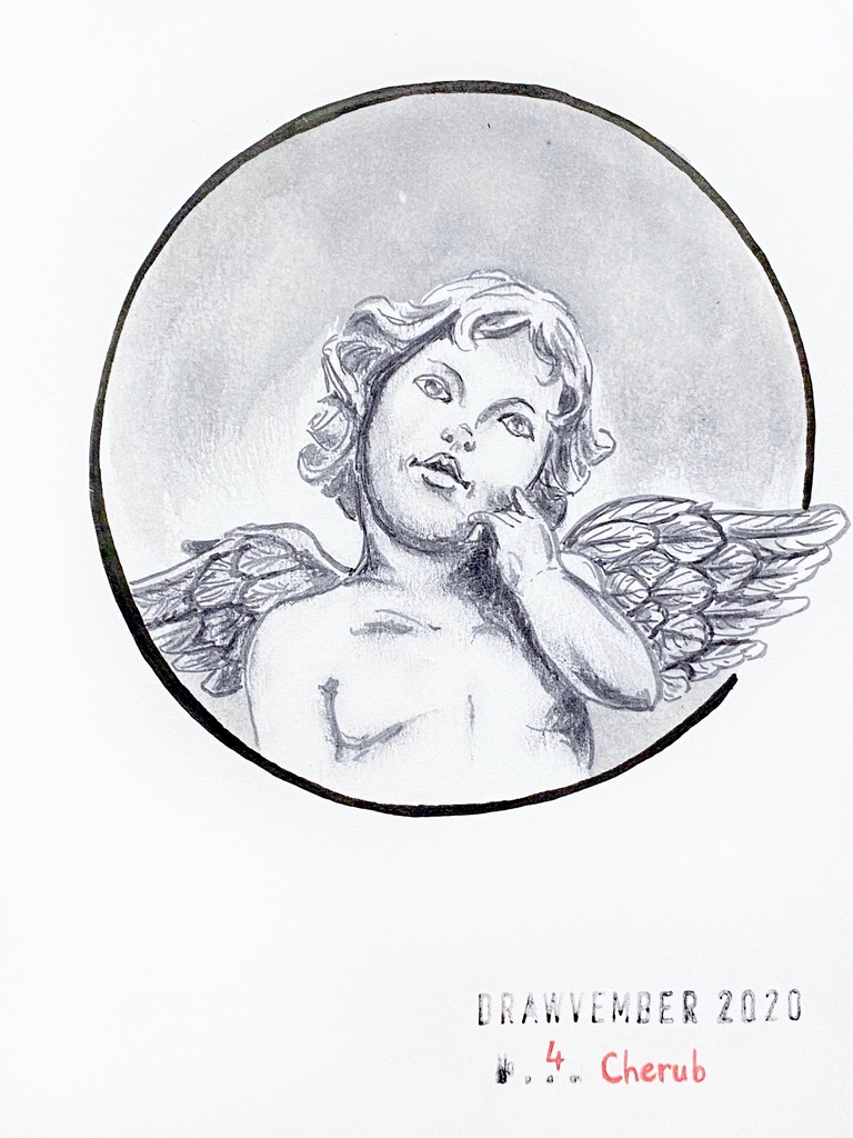
Art: Drawvember2020

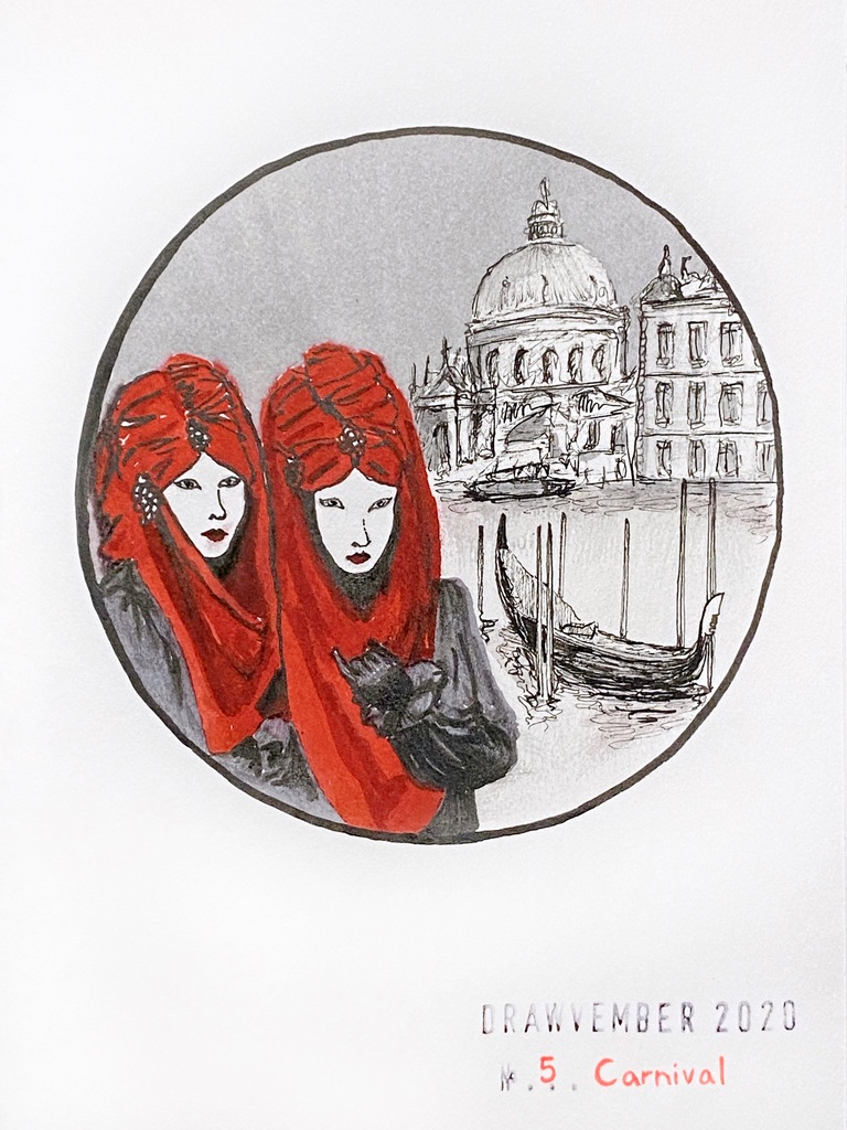
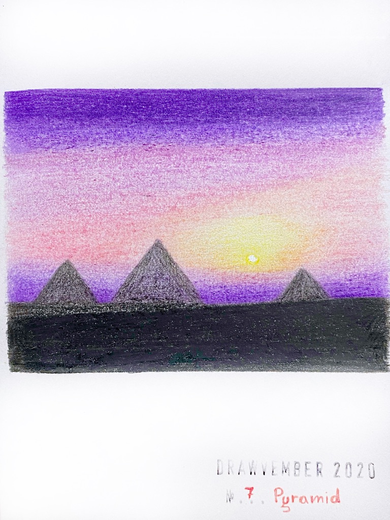
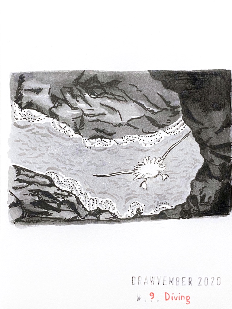
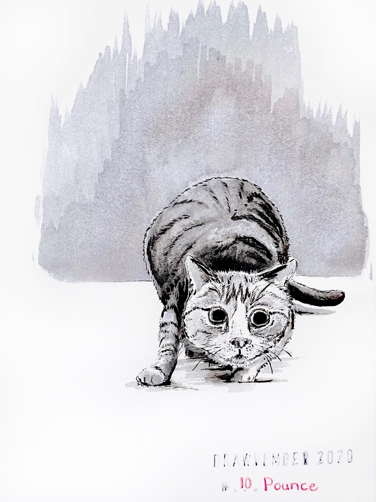
Last year I did six series of 5 drawings on a given theme or technique and I really liked it, but this year I compiled a list of prompts, and chose any medium or technique I liked:

  • Dragon
  • Robot
  • Fur
  • Cherub
  • Carnival
  • Prey
  • Pyramid
  • Crane
  • Diving
  • Pounce
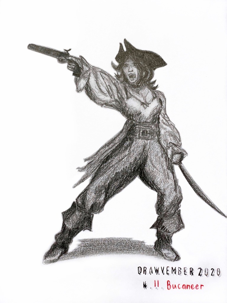
  • Buccaneer
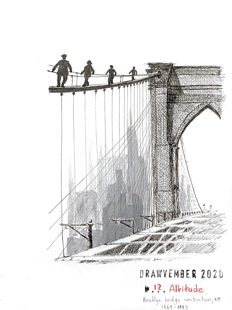
  • Altitude
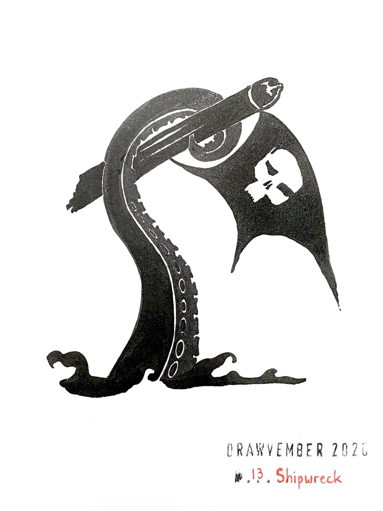
  • Shipwreck
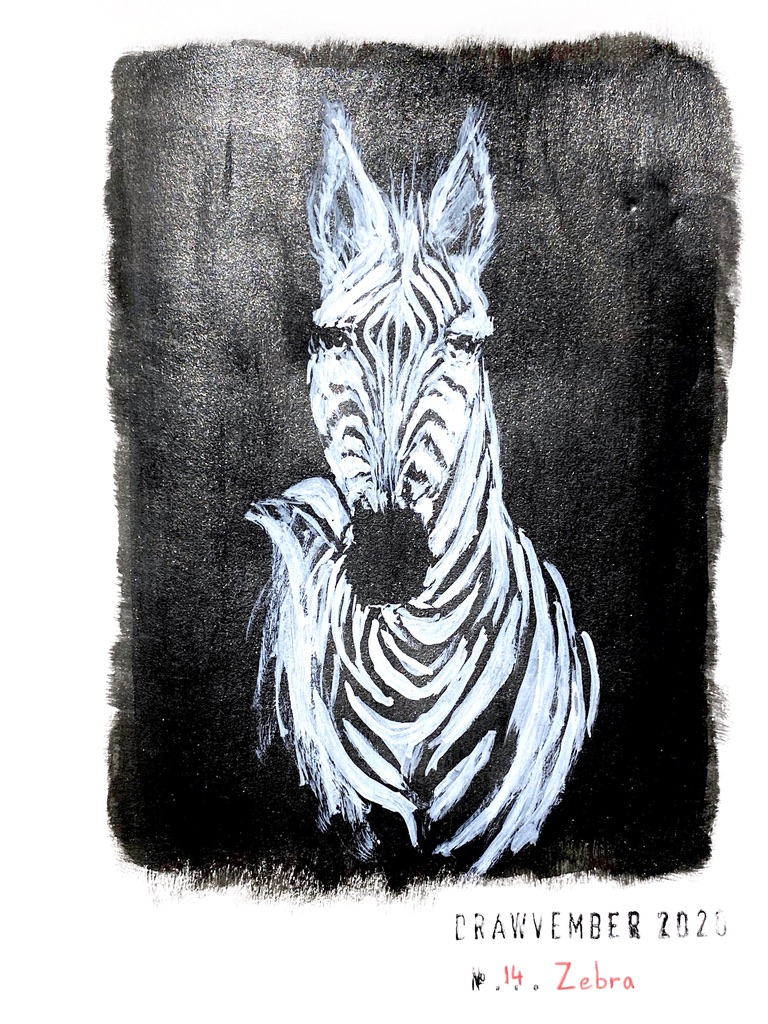
  • Zebra
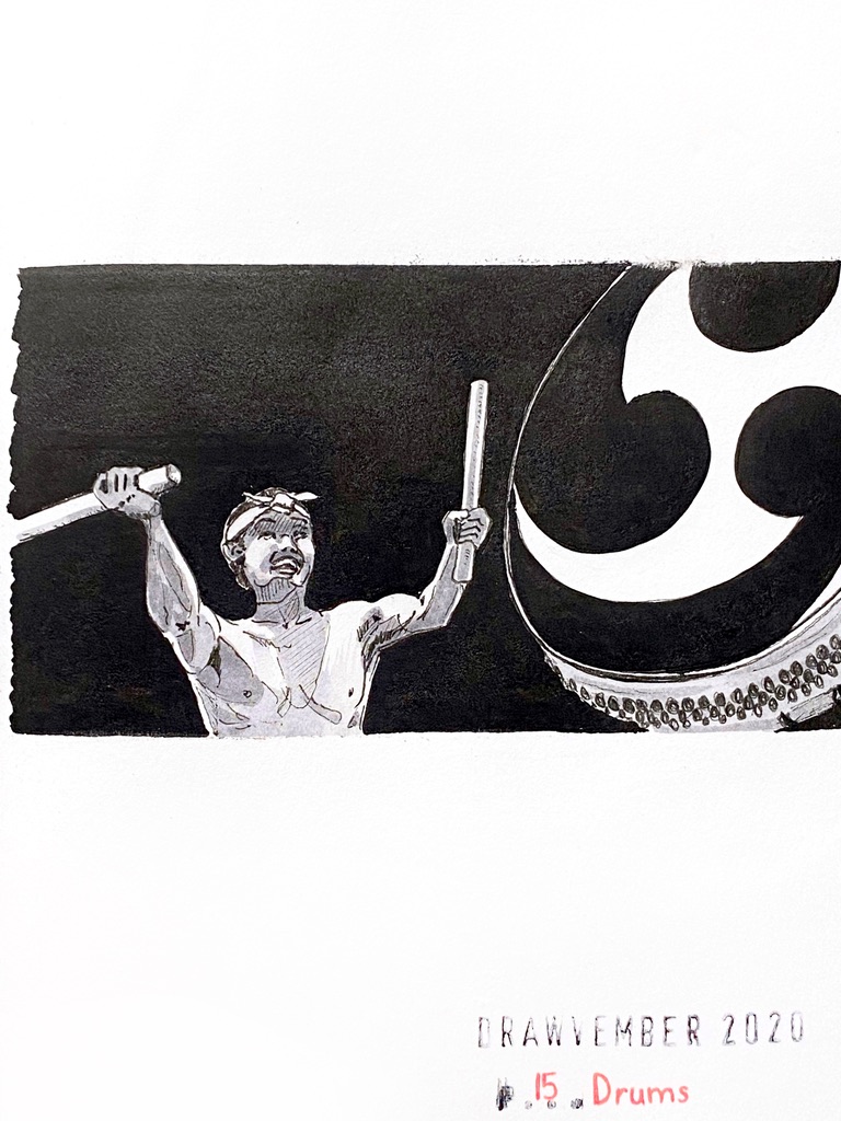
  • Drums
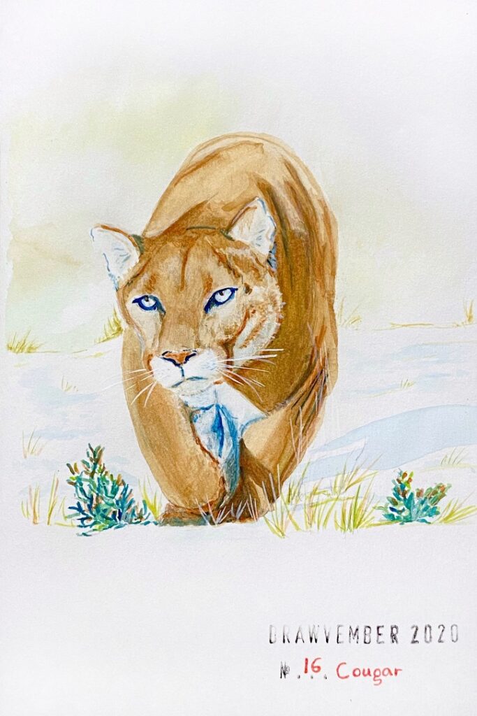
  • Cougar
  • Boat
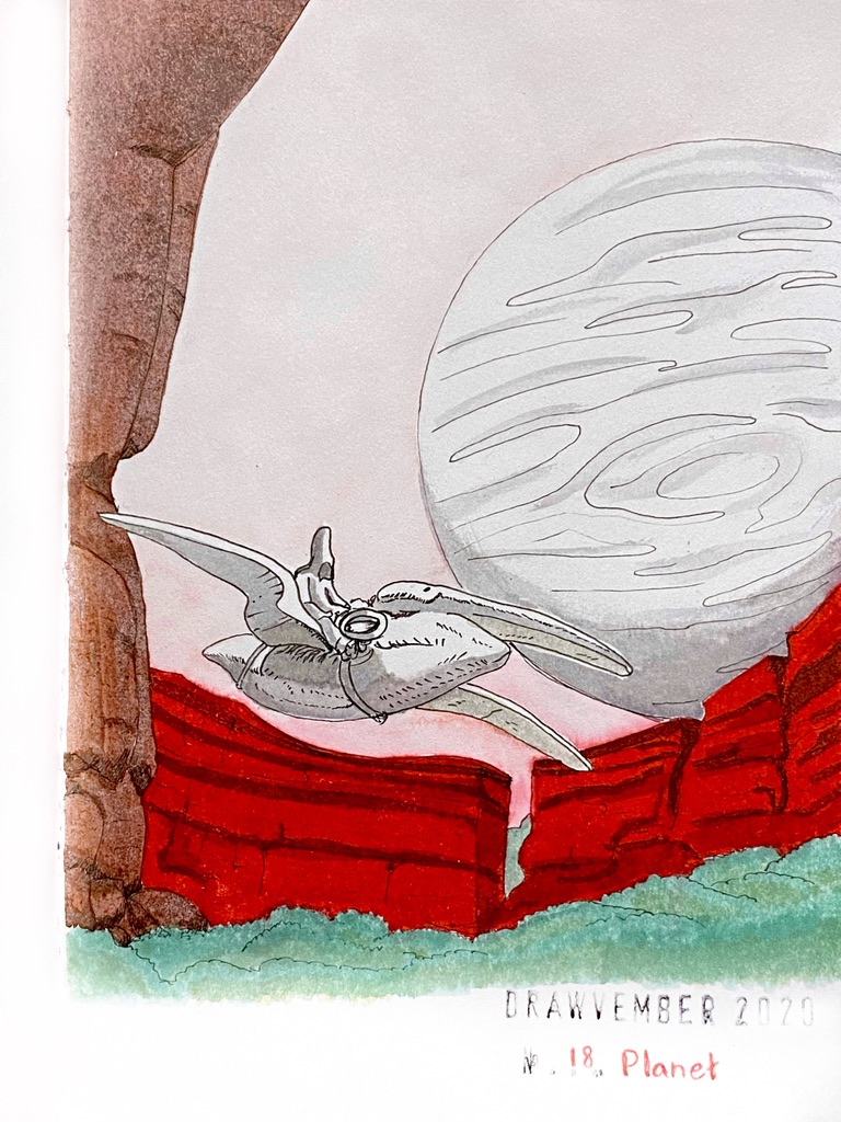
  • Planet
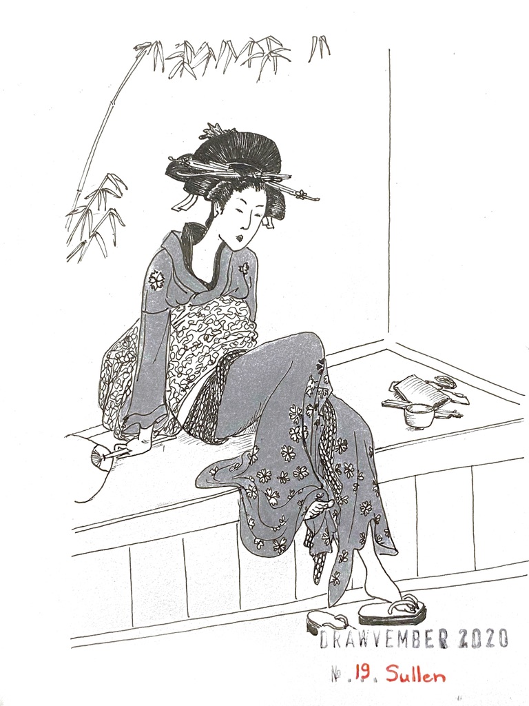
  • Sullen
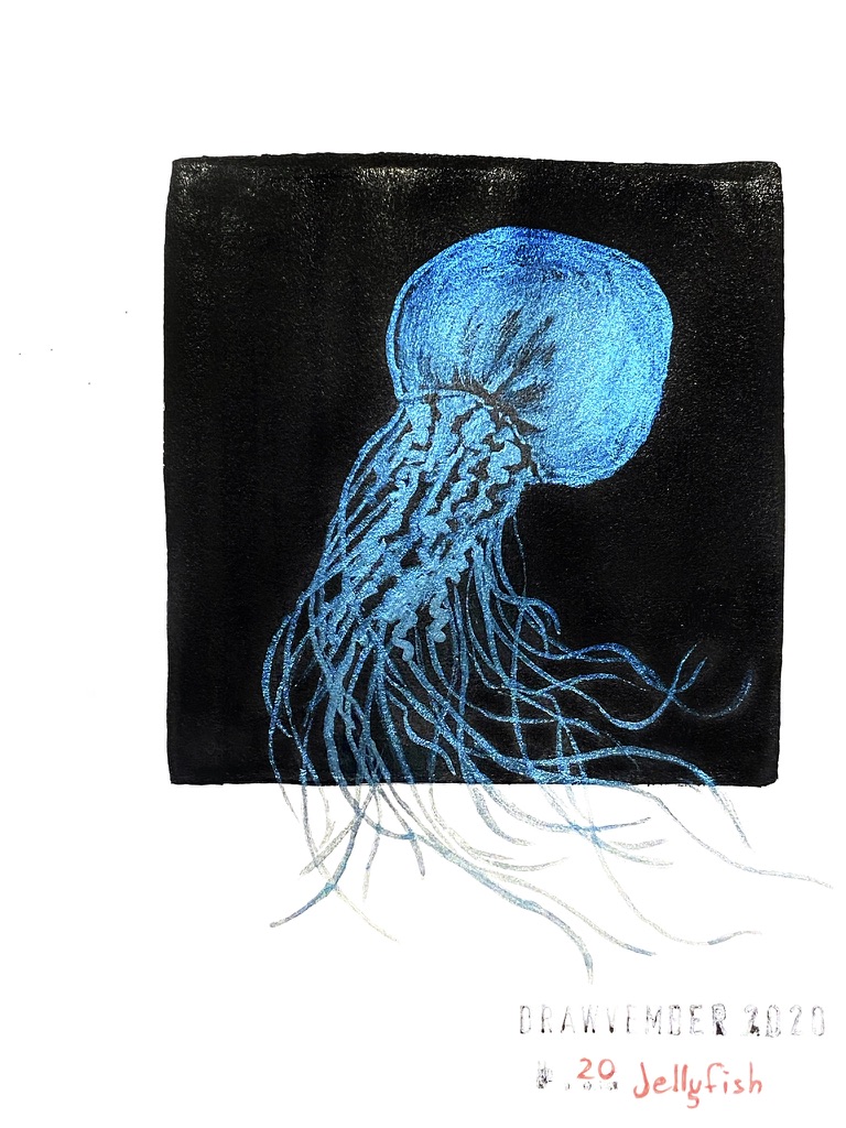
  • Jellyfish
  • Monkey
  • Angel
  • Vanquish
  • Depth
  • Villain
  • Lipstick
  • Cliff
  • Pure
  • Elf
  • Tower

All my drawings in one place

Conclusion

I loved it! I discovered in the process that I don’t really like coloured pencils, but that I absolutely love gouache painting!

I think I have improved over the years. Notably, for “sullen” I redid a drawing of “Woman Sitting on Edge of Veranda” by Utamaro Kitagawa. Four years apart, and this time the lines were crisper and there was simply more details.

Drawvember 2020 days 26-30

This year for Drawvember, I compiled my own list of prompts, to ensure that I wasn’t going to use “not inspired” as an excuse for skipping days. Drawing actually brings me joy and satisfaction, and as it’s in rather short supply at this time of year for me, I have much at stake.

This series concludes this year’s Drawvember! I really really enjoyed myself. I was looking forward to it every day.

I also discovered that gouache is a favourite. I used to be terrified of it and of paint in general, but not too much anymore.

Day 26: “Lipstick”

Black and red ink drawing of a woman in a cocktail dress

My friend Amy made me discover René Gruau last week. I had seen some of his fashion illustrations and advertising work without knowing they were his. I love his style! His work reminds me of that which Toulouse Lautrec and Alfons Mucha did in their own time.

I used the reverse side of my Copic Drawing Pen fountain pen for extra thin lines, Geranium Red ink Brush Writer from Kuretake, black ink Pentel Brushpen, and I smudged very little amounts of Light Grey ink for shading.

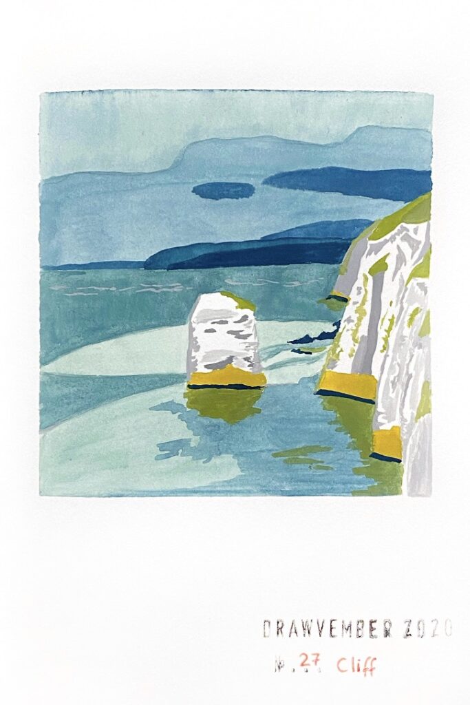
Day 27: “Cliff”

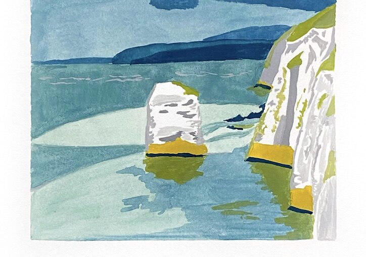
Gouache painting of white cliffs by the sea

White cliffs by the sea.

Gouache paint from the Holbein Artists tubes I got in a Sketchbox: I mixed Prussian blue, leaf green, yellow ochre and used some titanium white watercolor.

I like it well enough but recognise it’s pretty awkward and not striking enough. Perhaps the tones aren’t pastel enough. And I am certain that the artbook paper isn’t thick enough (96g/m2 – 65 lb) for the watered down colours I used.

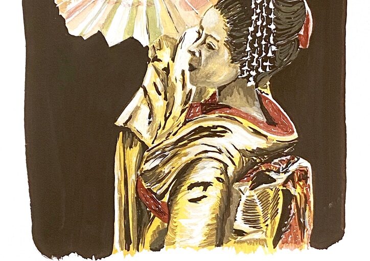
Day 28: “Pure”

Gouache painting of a geisha dancing with a fan in her hand.

Another favourite!

For “pure”, I wanted to draw a Maiko (apprentice geisha). This is from the 2005 movie with Zhang Ziyi “Memoirs of a Geisha” which tells the story of a 9 year-old girl sold by her poor family to a Kyoto geisha house, who in time becomes Sayuri, the beautiful and talented geisha, whose successful career is cut short by the outbreak of World War II.

For this drawing I wasn’t too sure which medium to use. After doing the pencil outline in my artbook, I drew it again on a scrap of paper using a Derwent sepia line maker with a bit of black and the geranium red and light grey Brush Writers from Kuretake. It didn’t work.

I chose gouache paint instead: yellow ochre, burnt sienna, ivory black from Holbein Artists, and some titanium white opaque watercolor. It took me 75 minutes (for a drawing that is only the size of my palm!)

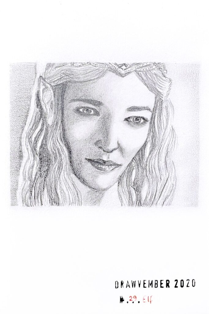
Day 29: “Elf”

Pencil drawing of the face of Cate Blanchett as Galadriel

This is a pencil drawing of Cate Blanchett as Galadriel, the Elven Queen from the movie Lord of the Rings.

It took me over 2 hours (the drawing isn’t bigger than my palm).

Portrait are really hard. Getting someone’s features is difficult for me. It just barely looks like her but I couldn’t find what to change to make it better.

Day 30: “Tower”

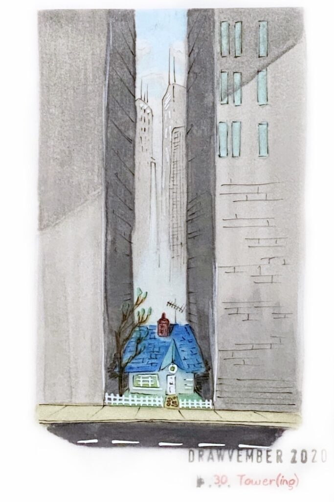
Alcohol markers drawing on tracing paper of Carl’s house from the movie “Up”, surrounded by towering buildings.

This is an alcohol markers drawing on tracing paper of Carl’s house from the movie “Up”, surrounded by towering buildings.

I went way out of my comfort zone for this last day of Drawvember! This medium requires specific paper as alcohol ink bleeds a lot, and my artbook is of regular paper. I follow someone named Mutoni on Instagram and he uses tracing paper. It looks way easier when he does it!

Today I learned that the ink does not penetrate in the paper. Therefore when I wanted to darken the tones or blend colours by adding layers, I discovered that the new layer somewhat overwrites the existing colour. So the tones aren’t at all like they are supposed to be because I didn’t have the specific colours I needed.

One thing turned out well however: I thought the ink might not dry very well and I didn’t want my fingers to smudge it once I was going to glue the sheet to my artbook page, so I was clever enough to draw on the back side of the paper and then flip it to apply think black lines and white. I spent a lot more time on this little piece than I anticipated.

Drawvember 2020 days 21-25

This year for Drawvember, I compiled my own list of prompts, to ensure that I wasn’t going to use “not inspired” as an excuse for skipping days. Drawing actually brings me joy and satisfaction, and as it’s in rather short supply at this time of year for me, I have much at stake.

I picked words that appealed to me, rather randomly, without any clear idea how I was going to develop each prompt. So far, I’m having fun.

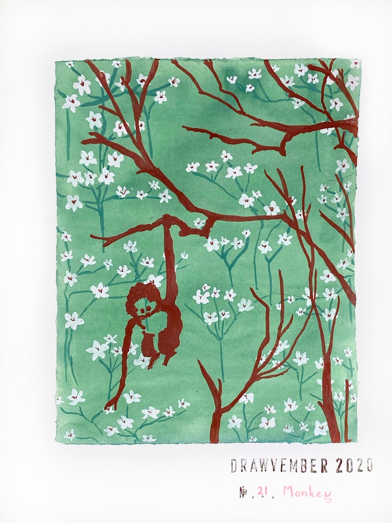
Day 21: “Monkey”

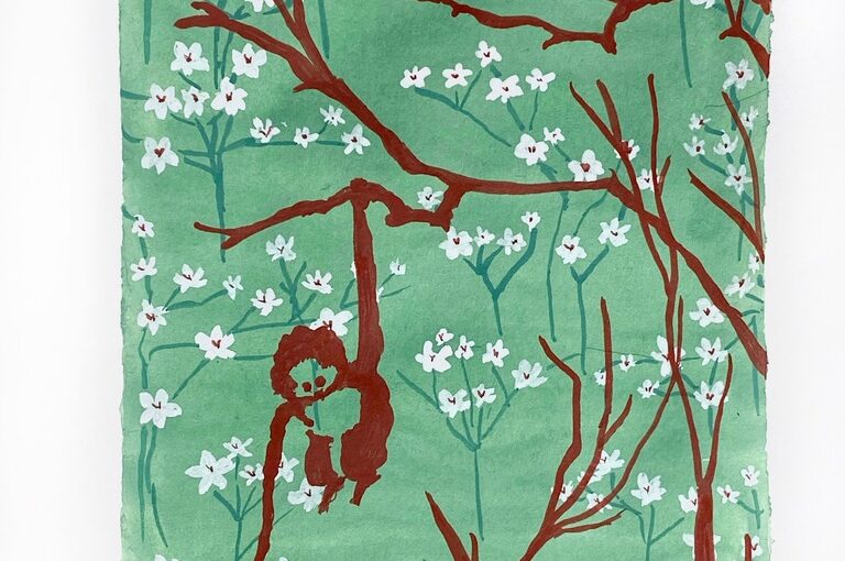
Gouache painting of a monkey dangling from a branch, against a floral background

My friend Amy shared with me a collage she created in Photoshop in her wonderful Wallpaper series, featuring a monkey silhouette. I found it beautiful and set out to interpret it.

I used exclusively gouache paint, from the few Holbein Artists tubes that I received in one of the Sketchboxes. I mixed Prussian blue, leaf green and titanium white to get the green background, darkened with more blue for the flower stems, titanium white for the flowers, and burnt sienna for the flowers centre, the tree and the monkey silhouette.

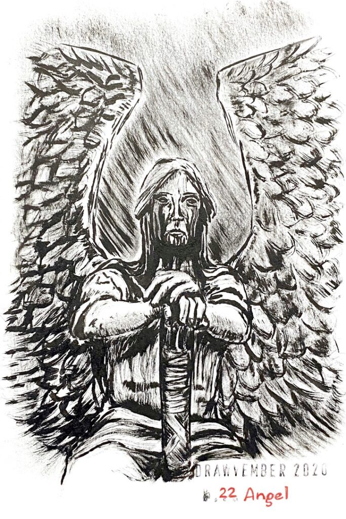
Day 22: “Angel”

Black ink drawing of a life-size angel with black tears that pour out of his eyes and drain down his neck, which appeared over time as an effect of aging bronze. His hands are resting on a post or sword in front of him between his thighs.

This is the Haserot Angel, a bronze sculpture of a life-size angel guarding the grave of Francis Haserot at Lake View Cemetery, Cleveland, Ohio, created in 1924 by sculptor Herman Matzen, who called it “The Angel of Death Victorious”.

The black tears that pour out of his eyes and drain down his neck appeared over time as the bronze aged. Definitely not the common angel! At first I was afraid by the pictures of it, then I was fascinated.

I chose to paint it with a flat brush and black Sumi ink. The bristles are unfortunately worn out and the lines aren’t so sharp and thin anymore.

(Watch the 58-second time-lapse)

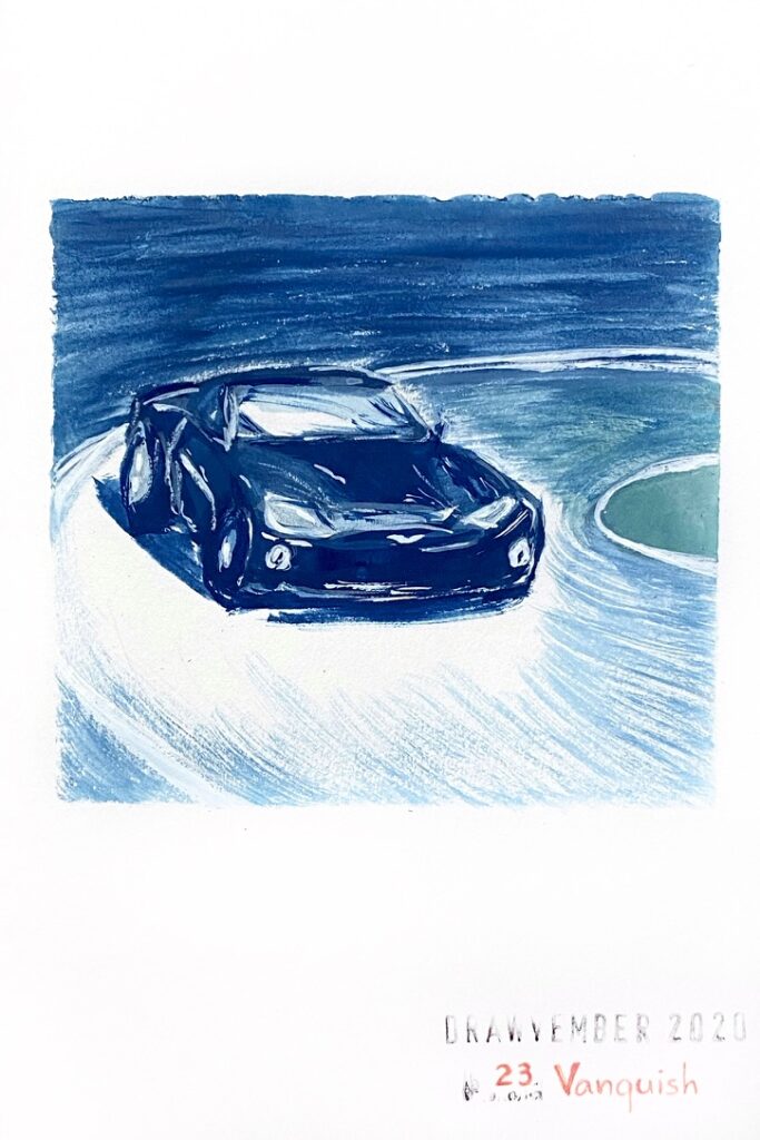
Day 23: “Vanquish”

Gouache painting of an Aston Martin Vanquish speeding in a curve

I chose the prompts somewhat arbitrarily and I had no idea how to illustrate today’s prompt, so I am very glad Aston Martin created a model called Vanquish — did they name it this way to encourage James Bond to use it? It’s a beautiful car. I never drew a car before, let alone painted one!

Gouache paint is clearly becoming a favourite medium! I used Prussian blue and green leaf with a cheap medium soft flat brush with synthetic bristles that I once got at a Flying Tiger Copenhagen shop, and a bit of titanium white watercolor in tube for the highlights.

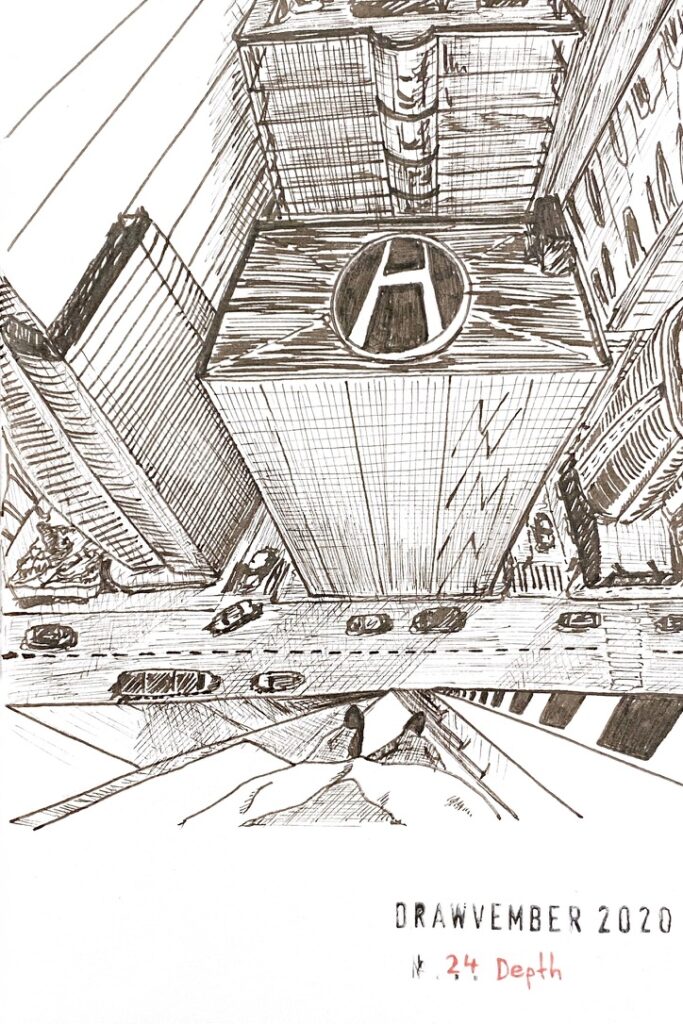
Day 24: “Depth”

Black ink drawing of a roof-topping view with perspective on the roofs of other buildings, the streets below, and the body, legs and feet of the person viewing this

Perhaps I chose “depth” as a counterpart for the earlier prompt “altitude”? I struggled a bit for inspiration. Since I am not very good with perspectives, I thought it would be challenging to draw a rooftopping point of view (it was).

I used for the first time a black Copic Drawing Pen that I received in a Sketchbox. The ink doesn’t flow very well. That’s why I haven’t used it before. I don’t know if it’s on purpose. The ink turns to some dark sepia as it dries, it’s interesting. Another interesting aspect is that the line is thick when the nib is used the right way, but it is extra thin when used upside down. I don’t really like this drawing but I don’t detest it either.

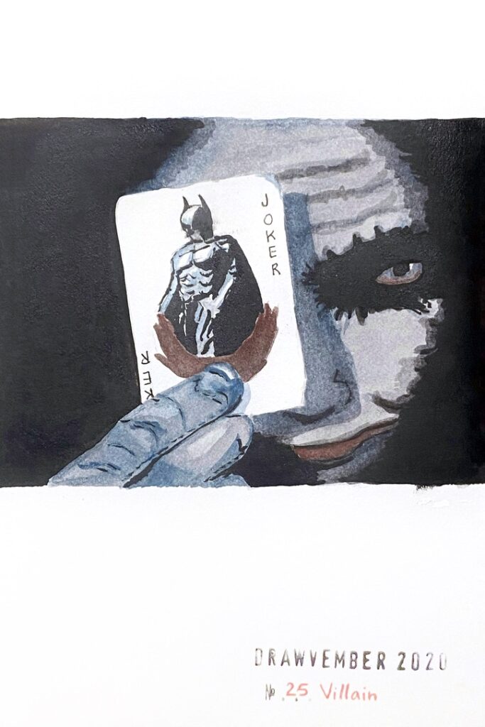
Day 25: “Villain”

Black grey and blue ink and gouache painting of the joker holding the Batman playing card in front of his face.

Black, grey, and blue ink, and gouache painting of the joker holding the Batman playing card in front of his face.

I got so carried away layering grey ink mixed with blue gouache that I misplaced the eye! Oh well, I still like it very much. It’s very bold compared to much of the stuff I usually draw.

I learned that the grey ink in the Brush Writer from Kuretake does not mix too well with the Holbein Artists gouache. And the black ink from the Pentel Brushpen does weird things with the grey ink when that brushpen is too wet.